Wednesday, 6:29am
10 October 2012
The magazine that wasn't
various designers
George Lois
Andy Warhol
David Dalton
Lynne Letterman
Quentin Fiore
Brian O’Doherty
Mel Bochner
Hetty MacLise
Design history
Graphic design
Magazines
Visual culture
Aspen, the cultural journal that challenged the limits of its form, goes on display at Whitechapel Gallery in London

To read an edition of Aspen magazine is to flip through a booklet, unfurl a concertina, shuffle some postcards or to unfold a poster, writes Elizabeth Glickfeld. Copies of the cult 1960s artists’ magazine are now so prized that the tactile experience of reading any one edition is necessarily denied the viewer of the exhibition ‘Aspen Magazine: 1965–1971’ (in the Pat Matthews Gallery at the Whitechapel Gallery in London).
Nevertheless, at a time when the conditions of reading are more varied than ever, and when printed publications are increasingly designed to enhance their material qualities, it is still a pleasure to be able to see the entire run of the ‘magazine in a box’, as it was known, even if the editions are laid out behind glass.
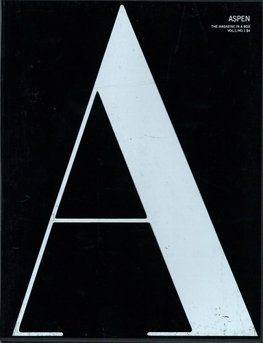
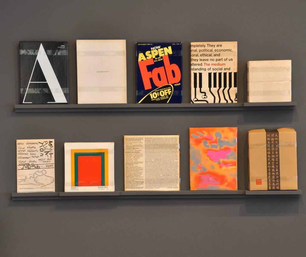
Aspen vol. 1, no. 1 of Aspen. © Aspen Magazine / The authors. Courtesy of Boo-Hooray NYC, Victoria and Albert Museum, and Museu d’Art Contemporani de Barcelona (MACBA).
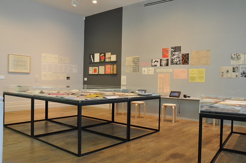
Top: view of the installation in the Pat Matthews gallery at the Whitechapel. Photograph: Patrick Lears. Courtesy of Whitechapel Gallery.
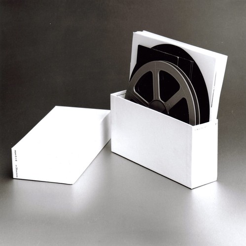
With its attention to formats – it also included sound recordings and a reel of Super-8 film – Aspen magazine prefigured more contemporary notions of multimedia engagement and interactivity.
Curated by Nayia Yiakoumaki, the exhibition translates the magazine's multimedia content into an gallery environment by including listening stations for interviews with various editors, contributors and designers.
The initiative of former Women’s Wear Daily and Advertising Age editor Phyllis Johnson, Aspen began as a lifestyle magazine about the Colorado ski resort after which it was named.
This changed from issue three whereupon Aspen became thematic, documenting various art and counter-culture movements with contributors who were the luminaries of the day. Where magazine editors and art-directors normally use their skills to balance disparate content with coherent voice and vision, Johnson was determined to emphasise the magazine’s variety.
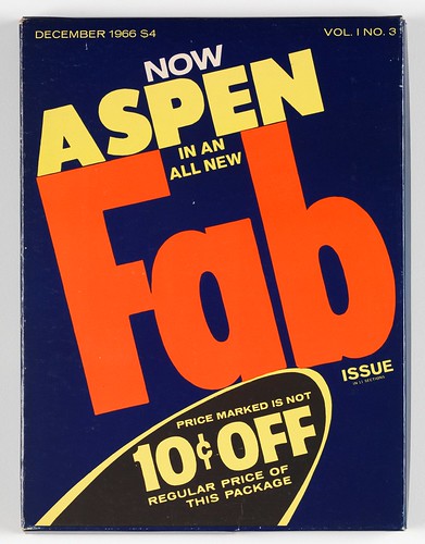
Aspen no. 3, edited by Andy Warhol and designed by David Dalton, came packaged as a box of soap powder.
© Aspen Magazine / The Andy Warhol Foundation for the Visual Arts / Artists Rights Society (ARS), New York / DACS, London 2012. Courtesy of Boo-Hooray NYC, Victoria and Albert Museum, and Museu d’Art Contemporani de Barcelona (MACBA).
Each of the ten issues was undertaken with a different editor and designer at the helm. With Andy Warhol as editor and New York-based David Dalton as graphic designer, issue 3 (above) documented the concerns of Pop Art and came packaged as a box of soap powder. A series of essays on the effects of LSD were designed as a ‘Ten Trip Ticket Book’. There was also a flip-book of art movies and a one-off newspaper from Warhol's Factory.
Issue 4 was designed by Quentin Fiore and was effectively a teaser for his collaboration with Marshall McLuhan on The Medium Is the Massage (see Eye 8). Designed with the signature combination of images and slogan-scale sans serif typography, it contained an untrimmed indigo printers proof of the book, including crop marks, to emphasise its being ‘hot off the press’.
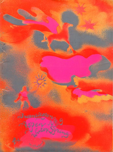
Aspen no. 9 (Winter-Spring 1970). Edited by Angus and Hetty MacLise. Folder designed by Hetty MacLise.
© Aspen Magazine / The authors. Courtesy of Boo-Hooray NYC, Victoria and Albert Museum, and Museu d’Art Contemporani de Barcelona (MACBA).
While later issues recorded the occupations of Fluxus, psychedelia, performance, British and Asian art, Johnson’s determination to keep to the literal definition of a magazine as ‘a storehouse of things’ paradoxically lead to the downfall of Aspen.
A poster on the wall of the exhibition documents the US Postmaster General’s 20 August 1971 ruling maintaining that ‘each issue of Aspen is complete unto itself and bears no relation to prior or subsequent issues’ and that ‘each issue of Aspen could be considered to be an independent work, capable of standing alone’. On this basis the postal service withdrew the lower postage rates afforded to conventional magazines and Aspen subsequently folded.
Issue 5+6 of Aspen magazine. Edited and designed by Brian O’Doherty; art-directed by David Dalton and Lynne Letterman.
© Aspen Magazine / The authors. Courtesy of Victoria and Albert Museum, and Museu d’Art Contemporani de Barcelona (MACBA).
Significantly, it was in the pages of the 1967 double issue 5+6 on minimal and conceptual art that the French critic Roland Barthes’s oft-quoted essay ‘The Death of the Author’ was first published in English. The exhibition includes archival material relating to its translation and hand-written correspondence between Barthes and that issue’s editor, the Irish artist and future writer of the seminal ‘White Cube’ essays, Brian O’Doherty.
In the 1990s Barthes’s liberation of the meaning of a text from the author’s intention was used to fuel graphic designers’ claims to their own authorship. The result was many designer-initiated publications and work that was variously idiosyncratic, expressive and opaque (see Michael Rock’s ‘The Designer as Author’ in Eye 20). Given this, it is interesting to note that on its first publication, Barthes’s essay received a wilfully ascetic design treatment in the context of a highly designed magazine.
Typeset in a small, square booklet, Barthes’s proclamation that ‘The birth of the reader must be at the cost of the death of the author’ was expressed in the visual language of conceptual art. Published alongside work by artists such as Sol Le Witt and Mel Bochner, the essay looks less the revolutionary gesture it was in literary circles. Barthes’s invocation for a more empowered and active reader fits in well with conceptual art’s disregard for conventional notions of genius based on traditional artistic skill, as well as the issue’s invitations to its readers to assemble and execute the content.
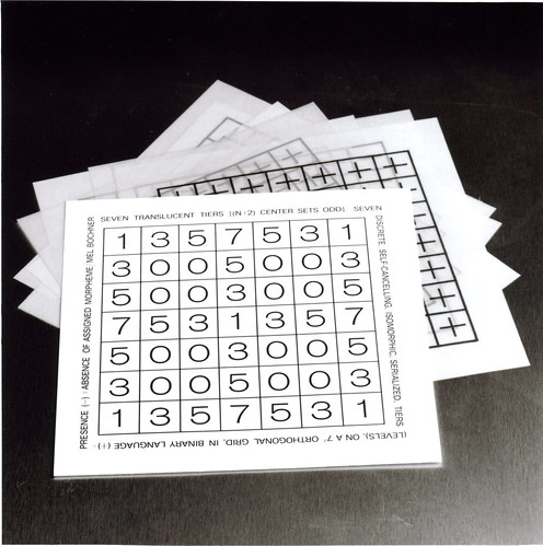
Mel Bochner, Seven Translucent Tiers [(N+2) Center Sets Odd], 1967, as published in Aspen, no. 5+6 (Fall 1967).
© Mel Bochner. Courtesy of Victoria and Albert Museum. See ‘Mel Bochner: If The Colour Changes’, also at the Whitechapel from 12 Oct–30 Dec 2012.
The exhibition ‘Aspen Magazine: 1965–1975’ continues at Whitechapel Gallery until 3 March 2013.
The exhibition curator, Nayia Yiakoumaki, will give a gallery talk on Aspen on 6 December at 7pm. Admission free, but booking necessary.
View of the exhibition at the Whitechapel Gallery.
Photograph: Patrick Lears. Courtesy of Whitechapel Gallery.
Eye is the world’s most beautiful and collectable graphic design journal, published quarterly for professional designers, students and anyone interested in critical, informed writing about graphic design and visual culture. It is available from all good design bookshops and online at the Eye shop, where you can buy subscriptions, back issues and single copies of the latest issue.

