Thursday, 8:00am
1 October 2020
Twisted characters

Hamish Smyth’s wordmarks for Gaslit Nation and Bellingcat are memorable graphic identities for organisations that fight populism and disinformation with solid research and truth.
By John L. Walters

Hamish Smyth’s identity for the Gaslit Nation podcast is a smart piece of design for a project that is playing a part in the unravelling of Trump’s presidency, writes John L. Walters.
A podcast has to be easy to find while browsing through myriad platforms, and Smyth’s reversed, red-out-of-black logo is hard to ignore. It’s a ‘word ladder’, in which each character of the title is either reversed or inverted until every letter is wrong – a vivid illustration of the process of ‘gaslighting’. The term describes the way populist politicians twist the truth and groom their uninformed followers in the manner of the manipulative protagonist of Gaslight (1940).
Smyth, an Australian who came to the United States in 2010, is the co-founder (with Jesse Reed) of Order, a design practice that grew out of Standards Manual, the company that successfully launched lavish, crowd-funded editions of identity manuals such as the 1970 New York City Transit Authority Graphics Standards Manual (2014) and the 1975 National Aeronautics and Space Administration Graphics Standards Manual (2015) and The Worm, shipping next month.
The Worm, Standards Manual’s latest publication, due to ship in October 2020. The crowdfunded book includes more than 200 images from NASA’s archives featuring the logo.

Founded in 2018, Gaslit Nation is a weekly political podcast made by Andrea Chalupa and Sarah Kendzior that brings analysis and historical background (‘deep dives’) to the processes of disinformation and election-hacking that threaten democracies worldwide. The commission came Smyth’s way through social connections; his partner Alex Daly (of comms firm Daly) is friends with Chalupa. Smyth was an ‘avid listener’ to the podcast, but thought its original artwork was inappropriate.
Gaslit Nation podcast wordmark in use on a smartphone and a tote bag.


‘Because we were fans, I offered my services to them for free,’ says Smyth. ‘It can be awkward when you offer to “fix” somebody’s branding, but thankfully Andrea and Sarah agreed, so I got to work.
‘I think designers have an opportunity – and maybe a responsibility – to help people doing good in the world. So many designers already donate their time but I think we could all do more: I’ve done some of my best work for free,’ he says. ‘I only presented one idea. Andrea was over the moon and said, “it belongs in MoMA!”. I wish all of my presentations went this way!’
When it came the typeface Smyth chose Helvetica, which he saw as a ‘global default typeface’ for governments and corporations – ‘the man’.
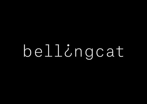
Bellingcat logo, set in Atlas Grotesk Thin with some customisations, 2014.

Another pro bono project was Smyth’s elegant logotype for Bellingcat, the investigative website that has done so much to expose corruption and wrongdoing using technological means. Smyth had been impressed by Bellingcat’s mission when he read a 2013 New Yorker profile of co-founder Eliot Higgins, and Alex Daly worked on the Bellingcat Kickstarter campaign.
Bellingcat’s Eliot Higgins (centre) at a press conference in The Hague, 2018. Photo: Remko de Waal.

‘When I saw what they had planned for the Bellingcat logo and website,’ says Smyth, ‘I felt it was my civic duty to help! Imagine a Napster style cat logo.’
Smyth used Commercial Type’s Atlas Grotesk and Atlas Typewriter. He explains that he likes the latter because it feels ‘investigative’ – ‘We use it a lot on the website for figures, captions, etc. Most of the time it’s intuition and what “feels right”.’ The Bellingcat presentation went down as well as the later one for Gaslit Nation. ‘Eliot, who is such a nice man, was quiet … then we heard “I like it”. No changes!’
When I asked Smyth whether the experience of documenting historical projects such as the famous identity manuals helped his own designs he replied: ‘Absolutely. I have a broad interest in history, and we [Order] begin every project with deep research and hands-on experience when possible. You need to truly understand the things you are working on in order to design for them. Being curious is a critical attribute for a designer.’
Bellingcat logo, 2014.

John L. Walters, editor of Eye, London
Eye is the world’s most beautiful and collectable graphic design journal, published for professional designers, students and anyone interested in critical, informed writing about graphic design and visual culture. It is available from all good design bookshops and online at the Eye shop, where you can buy subscriptions and single issues.
