Tuesday, 10:30am
13 December 2011
Type Tuesday

Paul Barnes
Type Tuesday
christian schwartz
paul barnes
type tuesday
Design history
Graphic design
Typography
Visual culture
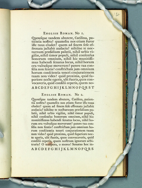
Christian Schwartz and Paul Barnes deep in the archives: Wilson, 1789

Some typefaces defy the classification of time and place. Wilson’s Roman of 1789 is a perfect example; it has features of an old style and a transitional, but it looks neither like a Caslon, nor a Baskerville.
Whoever cut the typeface had a sureness of touch that transcends time, a masterful demonstration of subtlety. It is a typeface that has inspired many revivals, and if one looks closely at the ubiquitous Georgia, one can see that some of the DNA of Wilson’s typeface lives on.
Above: Original specimen, printed in Glasgow. Collection of St Bride Printing Library.
Below: Detail.
Type Tuesday is our weekly column on typography and type design, featuring a mixture of brand new articles and material from the extensive Eye archive. For more Type Tuesday articles, click here.
‘Deep in the Archives’ by Christian Schwartz and Paul Barnes was commissioned for Eye 75, Spring 2010.
Eye is the world’s most beautiful and collectable graphic design journal, published quarterly for professional designers, students and anyone interested in critical, informed writing about graphic design and visual culture. It’s available from all good design bookshops and online at the Eye shop, where you can buy subscriptions, back issues and single copies of the latest issue. The latest issue, Eye 81, has the theme of ‘Designers and clients’.

