Summer 2015
James Mosley: A life in objects
uncredited designers
anonymous designers
Anthony Froshaug
Desmond Jeffery
Figgins
Louis John Pouchée
Through his ideas, collecting and dogged research, the former St Bride librarian has shown that printing history can be both lively and opinionated. The world of typography owes him a great debt

Today we are increasingly bound to our screens and rarely see the actual physical object in front of us. The rapid digitisation and democratisation of their archives by cultural institutions and libraries limits our understanding and appreciation of the original. In the graphic arts the production of communication is now purely digital, even if the end-product is physical.
During the age of letterpress both production and product were physical. As type historian Harry Carter said: ‘Type is something that you can pick up and hold in your hand.’ James Mosley, the typographic writer, historian, teacher and former librarian of St Bride Printing Library, London, was a witness to the prolonged demise of letterpress. Where the opportunity arose he collected and saved, and today graphic design and typography is much richer for his work.
Portrait of James Mosley.
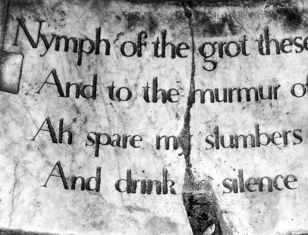
Top: Mosley’s influential essay ‘The Nymph and the Grot’ appeared in Herbert Spencer’s magazine Typographica in 1965. It chronicled the many examples of sans serif letterforms before they first appeared in type form in the 1810s. This inscription (since destroyed and recreated) was cut in 1748 at Stourhead in the west of England.

As a boy, Mosley became interested in printing and purchased a small Adana press. Later, while studying English at Cambridge University, he worked at the Water Lane Press. One summer holiday Mosley walked into one of the last surviving type foundries, Stevens, Shanks & Sons in South London. The firm was a successor to Figgins, one of the great names in type founding, and still held material dating back to the eighteenth century. At a time when products of the nineteenth century were out of fashion, Mosley could still touch and cast many great display faces of that period. These were the typefaces that Nicolete Gray had begun to re-evaluate with her pioneering book Nineteenth Century Ornamented Types and Title Pages (1938).
Just north of the Thames, off Fleet Street, was St Bride Printing Library, where Mosley could examine the specimens of the Figgins foundry, and match the material to printed examples. Stevens, Shanks & Sons invited Mosley back, and he learned the processes of type-founding and suggested types to revive.
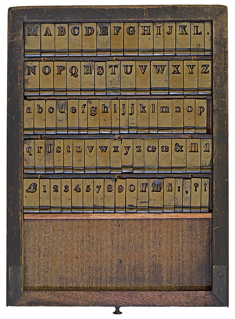
One of the great British type foundries was that of Vincent Figgins, founded in the late eighteenth century, but famed for its display typefaces of the early nineteenth century. Mosley first encountered these matrices when he took a summer job in the 1950s at the foundry of Stevens, Shanks & Sons, successors to Figgins. As the firm gradually wound up its operation in the 1960s, the physical material and various artefacts found their way to St Bride Library. These particular matrices are among the earliest of Figgins’s work, cut in the 1790s and shown in the first specimen of the foundry in 1793.
In 1956 Mosley was appointed assistant librarian at St Bride and two years later succeeded W. Turner Berry as librarian. The following years would see him save many treasures – not just paper items, but artefacts of the dying industry: presses, type, blocks, punches, matrices. These materials were not considered important when the library was founded, since they were simply the tools of the trade. Today letterpress has enjoyed a renaissance and these tools, scarce and often irreplaceable, have become valued again.
In the early 1960s Mosley acquired the blocks, punches and matrices of the influential Chiswick Press, which in the nineteenth century had begun the process of reviving old typefaces, including Caslon Old Face in the 1840s. Mosley added presses to the collection and printed more than 2000 of Chiswick’s blocks. Later, with the help of Douglas Chapman, manager of Stevens, Shanks & Sons, Mosley would bring the punches, matrices and artefacts of the type foundry to the library.
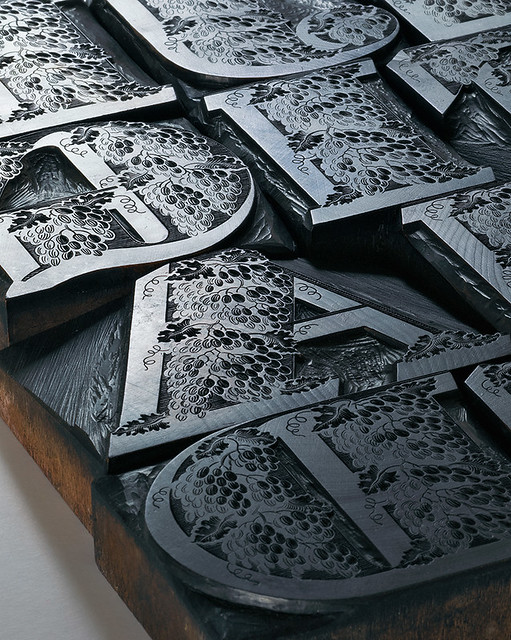
Wooden punches from the foundry of Louis John Pouchée (1782-1845). Originally cut around the 1820s, they were used to create matrices from which type was cast. Pouchée had perfected a process that allowed the wood to be driven into solidifying metal – not too hot as to destroy them, nor too cold to stop the detail being applied to the metal and the punch being damaged. Little used at the time, they were purchased by the Caslon Foundry when Pouchée’s foundry closed in 1830. When Caslon itself fell into bankruptcy in 1936, most of the punches and matrices came into the possession of Monotype, who gave them to the Oxford University Press in the 1960s, where they were catalogued by the type historian Harry Carter. James Mosley wrote about the Pouchée letters in the Journal of the Printing Historical Society (1966) and finally acquired them from Oxford for the St Bride Library in London in the early 1970s. During the 1980s and 90s, Mosley collaborated with Ian Mortimer (I. M. Imprimit) to print meticulously an edition from the remaining 23 Pouchée alphabets. The result was Ornamented Types: Twenty-three Alphabets from the Foundry of Louis John Pouchée (see ‘Pouchée’s lost alphabets’ Eye 15).
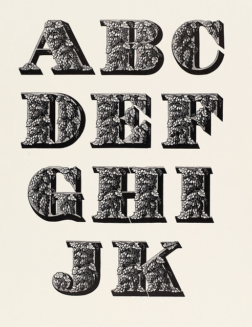
In the early 1970s he added the punches of the great Caslon foundry. After it went bankrupt in 1936 some of its material had been purchased by Monotype, who in time donated it to the Oxford University Press (OUP). Eventually more than 1000 boxes of matrices – some three tons of steel – came to St Bride. Among the collection were the famous Pouchée alphabets, which Mosley was the first to identify and which would lead to the publication in 1994 of Ornamented Types: Twenty-three Alphabets from the Foundry of Louis John Pouchée, a joint venture between the library and the printer Ian Mortimer.
During the late 1970s, OUP began to wind up its letterpress operation and dispose of its metal type, which St Bride gradually collected. Among these were the Fell types, glories dating back to the sixteenth and seventeenth century cut by Granjon and Van Dyck, as well as exotic rarities such as John Baskerville’s Greek and William Caslon’s Etruscan.
While at Stevens, Shanks & Sons, Mosley met two leading figures of the emerging British Modernist typographical movement: its figurehead, the typographer and teacher Anthony Froshaug, and the printer Desmond Jeffery. Froshaug had designed a specimen for Stevens, Shanks & Sons in 1957 – a wonderful example of asymmetric typography using traditional typefaces. Its formes were retained and deposited at St Bride. Later, the boards of an exhibition Froshaug held in Watford in the 1960s would be donated; these are a valuable record of his early letterpress work.
Jeffery produced a wonderful series of pamphlets of typefaces and ornaments, which Mosley also collected. These, like Froshaug’s work, are examples of what can be achieved in letterpress with old typefaces without having to resort to the clichés of traditional typography.
Original sketch for Gill Sans by Eric Gill. When Gill created the typeface for Monotype in the 1920s he did not produce finished drawings for production but a series of sketches, some more detailed than others. Monotype bought these and other items from Mary, Gill’s widow, and in December 1955, when Mosley was still a student, he sorted them out in collaboration with Evan (Gill’s brother) as a job for Monotype. Some of the items were used for an exhibition and a 1958 edition of Monotype Recorder. Through Mosley’s encouragement, they were donated to St Bride Library in 1976.
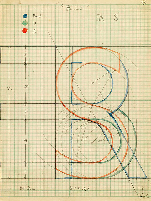
Mosley was employed by Monotype to work with Evan Gill, Eric’s younger brother, sorting out an archive of Eric’s drawings and rubbings of letters, which Monotype bought from Gill’s widow and later donated to St Bride. This is one of the most significant parts of the St Bride collection and one of the main repositories of Gill’s work. It includes the working drawings for Joanna that the Caslon foundry made under Gill’s directions in the 1930s.
Mosley’s career can also be defined by his teaching and writing. Both show his natural curiosity to discover the origin of things. While earlier historians such as D. B. Updike and Stanley Morison were comfortable making assumptions, especially where it suited their arguments, Mosley has been an attentive and unprejudiced observer. Since the 1960s he has taught at the University of Reading, where his course on the history of letterforms is without rival in its breadth and depth. Though his collecting was mainly devoted to the British Isles, his interests have been worldwide, with a particular emphasis on letterforms in France and Italy.
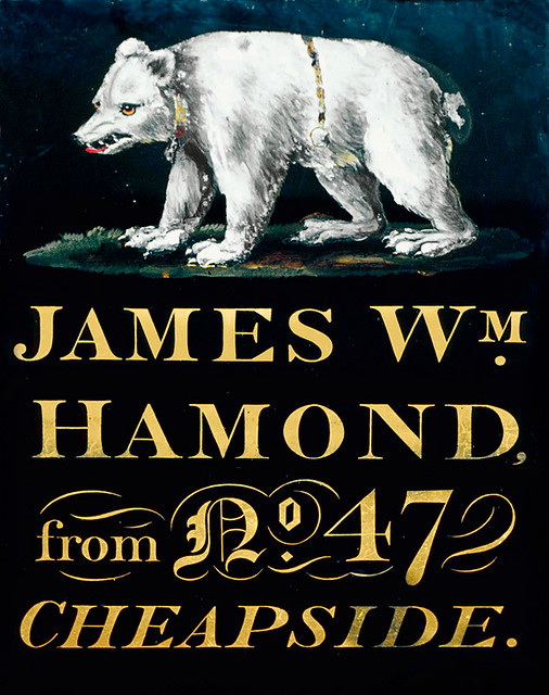
Mosley has never practised as a designer, but his writings have often touched on issues relevant to the profession. Two essays best illustrate this approach. ‘The English Vernacular’, published in Motif no. 11 (see Eye 62) in 1963, demonstrated through a rich series of illustrations that a style or tradition with remarkable homogeneity had existed in both lettering and type-founding in the British Isles from the early eighteenth to the nineteenth century, cogently arguing against the prevailing assumption of the dominance of the Trajan tradition. Mosley hoped that it would encourage designers to seek inspiration from the vernacular form, rather than from the increasingly staid model that emanated from the cast of Trajan’s Column at the Victoria & Albert Museum.
Mosley’s essay argued that examples such as this painted glass sign from the Museum of London, made around 1825, were as worthy as the tradition then elevated by Edward Johnston and his followers.
The second article looked for the origins of the sans serif form. Starting with an inscription found in Stourhead, ‘The Nymph and the Grot’, was published in Typographica 12 (New Series) in 1965. Based on painstaking research, it destroyed the notion that the sans serif form had appeared somehow ‘out of thin air’ with Caslon’s Egyptian ca. 1816, or was, as had been suggested, simply an Egyptian letterform with the slabs removed. Mosley showed that in the late eighteenth and early nineteenth centuries the sans serif form was often used by architects, stone cutters, cartographers, medal makers and others who made letterforms.
Mosley retired from the library in 2000, but has remained active as a teacher, writer and critic. In 2006 he began his blog Typefoundry: Documents For The History Of Type And Letterforms (typefoundry.blogspot.co.uk), in which he writes on a wide variety of subjects and, as usual, debunks the myths and prejudices that have developed – showing yet again that printing history need be neither dry nor unopinionated, whether it be dealing with the numbers of 10 Downing Street, the proclamation of the Irish Republic, or the materials of type founding.
Paul Barnes type designer, Commercial Type, London
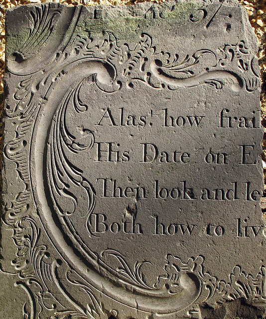
Mosley contributed to various printing and design journals in the 1960s. To Motif in 1963 he contributed ‘The English Vernacular; A study in traditional forms’. Collecting many examples, historical and contemporary, he expanded the theory that in Britain a form had developed in letters and type that was remarkably stable yet would allow the experimentation of the nineteenth century to flourish. This example from the eighteenth century is a fragment of a gravestone that Mosley saved from certain destruction in a Nottinghamshire churchyard.
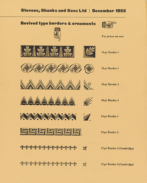
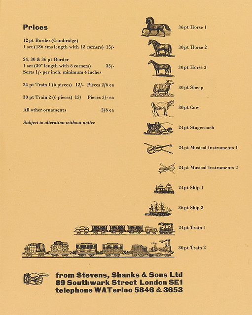
Specimen and price list, Stevens, Shanks & Sons, 1955, printed by Desmond Jeffery. In the 1950s Mosley worked during the summer at Stevens, Shanks & Sons in Southwark, South London, one of the last foundries in operation. Here he came into contact with the printer Desmond Jeffery, who produced much of the promotional material for Stevens, Shanks & Sons from his small workshop in Marylebone Lane, London. Mosley was attracted by what he described as Jeffery’s ‘humanised Modernism’, asymmetrical settings of long-forgotten nineteenth-century type, and began a correspondence with Jeffery. Over the following years Mosley avidly collected the work of both Jeffery and his fellow Modernist printer, Anthony Froshaug.
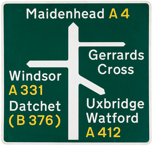
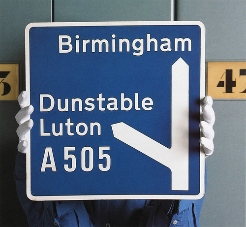
Handmade maquette for ‘all-purpose’ primary route sign for Britain’s national road signing system. Designed by Jock Kinneir and Margaret Calvert, ca. 1962. This was used for a presentation to the Worboys Committee on road traffic signs in Britain. The letters were based on the designs that Kinneir and Calvert had already created for the British motorway signs in the late 1950s (see below right), which show clearly the influence of continental European sans serifs. Kinneir donated several such maquettes (see Eye 34) to St Bride Library in the late 1970s, before the winding up of Kinneir Calvert Tuhill Ltd. Calvert says: ‘Fortunately, Jock had the foresight to invite James Mosley round to take anything stored in the attic relating to the road signs that he thought might be of value.’ Many other Kinneir Calvert items ended up in a tip.
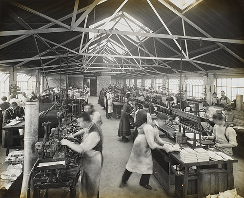
Photograph of the Caslon foundry in Stratford, London in the early twentieth century. During the 1980s Mosley acquired a collection of images of the Caslon foundry that made clear the huge size of the manufacturing and distribution operation. Within a few decades of the photographs being taken, the Caslon company – and type founding in general – would disappear.
First published in Eye no. 90 vol. 23, 2015
Eye is the world’s most beautiful and collectable graphic design journal, published quarterly for professional designers, students and anyone interested in critical, informed writing about graphic design and visual culture. It is available from all good design bookshops and online at the Eye shop, where you can buy subscriptions, back issues and single copies of the latest issue. You can see what Eye 90 looks like at Eye before You Buy on Vimeo.
Links
James Mosley’s typefoundry blog
‘Pouchée’s lost alphabets’ by Mike Daines, Eye 15
‘A design to sign roads by’ by Phil Baines, Eye 34
Eye 84, Monotype special issue
‘Why we love St Bride’, Eye blog post, 2011
‘Back to front’, Eye blog post by Michael Salu, 2010
‘Temple of type’ by Robin Kinross, Eye 02

