Tuesday, 12:44pm
4 October 2011
Who’s who
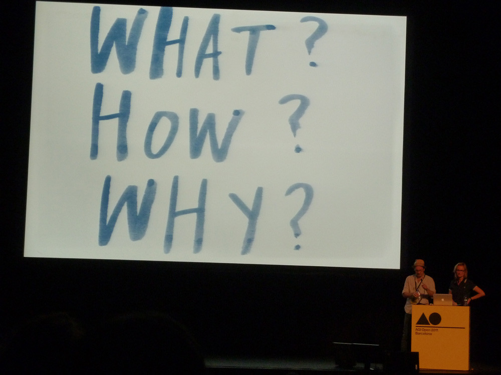
High-octane graphic design in Barcelona for AGI Open

AGI Open is a high-octane assemblage of graphic designers with international reputations, performing to a packed gathering in Barcelona’s Coliseum Theatre.
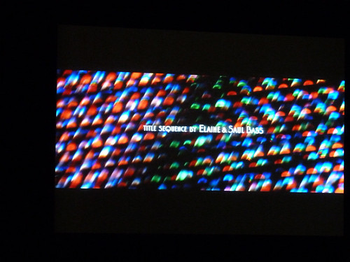
Each speaker had twenty minutes, which gave the event a certain urgency: we heard fourteen designers, plus a sequence of Saul Bass movie titles (including Vertigo and Casino, below) to replace the absent Steven Heller at the end of the long day. Report by John L. Walters.
After preliminaries (by local hero Javier Mariscal, AGI chair Paula Scher and tireless organiser Patrick Thomas), the proceedings began with Christoph Niemann’s urbane account of life as an editorial illustrator, and his move into more self-directed projects such as Abstract City for the New York Times website, and children’s books. He showed us his map for Reserve Battery Park (the first of many AGI Open maps, of which more later), a recent autumnal post using foliage and an assignment to report on the Venice Biennale.
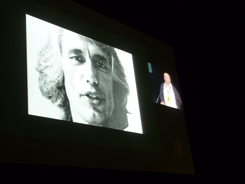
Tony Brook, of Spin and Unit Editions, compared himself to a stalker who obsessed over Madonna suddenly being invited into to her home, being offered a cup of tea and asked to co-produce her album. Brook was talking about his dream job: curating the recent Wim Crouwel exhibition at London’s Design Museum. He concluded by comparing the Barcelona football team’s use of the grid to that of Crouwel and Ben Bos: ‘Total Design = Total Football.’ (See above).
Paula Scher showed two examples of her designs on New York buildings: Bloomberg and Queens Metropolitan Campus, the first time she’s applied her highly personal hand-drawn maps to a client commission. She compared this to the ephemeral projects of her earlier career, saying she thought that, ‘if I stuck stuff on buildings it might actually stay there.’
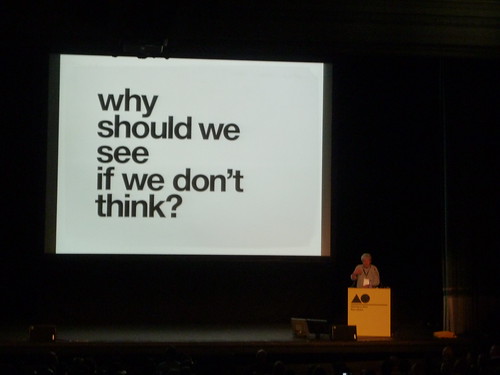
Lars Müller (below) urged the designers in the audience to read more and to think about content: ‘Don’t forget to think about what lies behind all that exciting design.’ He talked us through the ideas behind his ‘visual readers’ he makes with his company Lars Müller Publishers (which he bought back from Birkenhauser two years ago). These cover broad subjects such as Human Rights, Water and now Faith and Time, using eloquent photographic sequences and texts that he measures in time rather than words: ‘A page should not take more than two minutes to read.’ He calls the statements in big type the ‘hammers’.
Marian Bantjes showed self-directed projects made for Varoom and some charming lettering presents for friends such as Doyald Young and Seymour Chwast – who claimed not to have liked his name before seeing Bantjes’ rendition. ‘These things I do for the pure pleasure the other person gets in receiving it,’ she said.
Bill Drenttel and Jessica Helfand steered the conversation away from visual design towards what they called ‘post-client design’, in which the designer takes the lead. ‘We’ve been going to conferences where we’re the only designers in the room,’ said Drenttel.
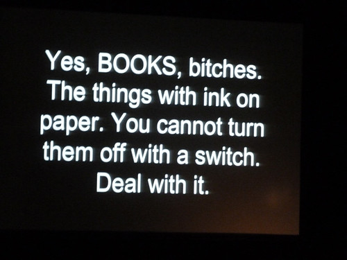
Chip Kidd radically changed his presentation after discovering a Barcelona eating place almost entirely decorated in enlarged versions of his own work, including rejected book covers that must have come from his 2006 monograph Book One – maybe Kidd has a stalker, too. He showed us an image of the layered, tactile cover he designed for Haruki Murakami’s new novel 1Q84: ‘This is “book as object”, you really want to hold it in your hands.’ (See above.)
Kyle Cooper had the moving image equivalent of Lars Müller’s ‘hammer’: the pounding titles, assembled from news footage of two Gulf Wars, 9/11 and the war on terror, that he had proposed for Peter Berg’s movie The Kingdom. ‘I wanted to scare myself,’ said Cooper. Berg didn’t go for it, saying: ‘Are you out of your mind.’
Joost Grootens (above) brought us back to maps and the qualities of books, citing Wittgenstein’s Tractatus as an exemplar, ‘so rich with hyperlinks.’ He explained that his monograph I swear I use no art at all is an ‘atlas of my own work,’ noting that ‘I cannot make a book without maps.’
Isidro Ferrer, speaking in Spanish, showed us his poetic theatre posters, wine labels and children’s books with the help of a charming, subtitled video, set to the eccentric music of Pascal Comelade.
Angus Hyland and Marion Deuchars gave an entertaining illustrated account of their relationship, and some recent work for two clients: Cass Art London and Laurence King Publishing, all four of them within walking distance of each other in North London. The products of this symbiosis included art materials, colouring books and Deuchars’ new book Let’s Make Some Great Art.
‘I believe anyone can learn to draw, even graphic designers,’ said Deuchars.
Jan Wilker (above) of KarlssonWilker promised us two and a half projects: a book cover; the practice’s twelve-day trip to Serbia, where they were fêted like celebrities; and a launch for the new Mini Coupe 2011, still in progress, which involves a road trip from Munich to Istanbul, titled ‘Another day, another adventure.’
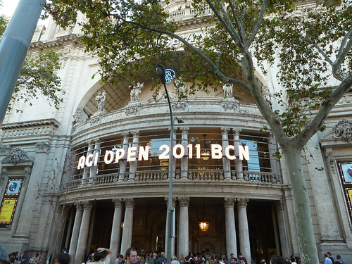
AGI Open continues today at the Coliseum Theatre (above) in Barcelona.
Eye is the world’s most beautiful and collectable graphic design journal, published quarterly for professional designers, students and anyone interested in critical, informed writing about graphic design and visual culture. It’s available from all good design bookshops and online at the Eye shop. For a taste of the new issue, see Eye before you buy on Issuu. Eye 80, Summer 2011, is out now. Eye 81 is on press soon.

