Thursday, 11:00am
12 March 2015
Codex lives on as a book
Linda Florio
Paul Shaw
Cyrus Highsmith
Carol Twombly
anonymous designers
Book design
Design history
Graphic design
Typography
The Eternal Letter, edited by Paul Shaw, was launched at the Type Directors Club in New York

Last month MIT Press launched the book The Eternal Letter: Two Millennia of the Classical Roman Capital at the Type Directors Club in New York City, writes Doug Clouse.
Editor Paul Shaw, producer / editor Scott-Martin Kosofsky and book designer Linda Florio spoke to the crowded room about their reasons for making the book, the production process, and their plans for an ongoing series of lettering and type books from MIT and a group called ‘Codex Studies in Letterforms’.
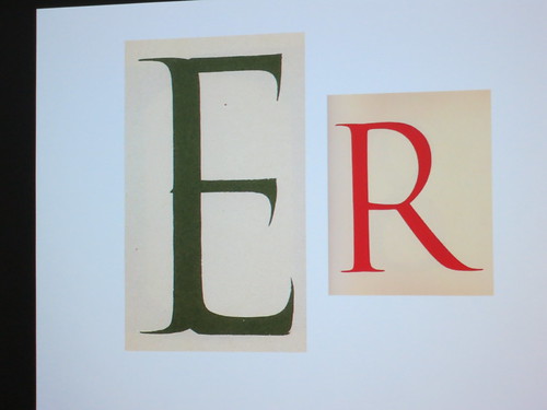
Slide showing the Trajanic ‘E’ and ‘R’ by Father Edward Catich from The Origin of the Serif.
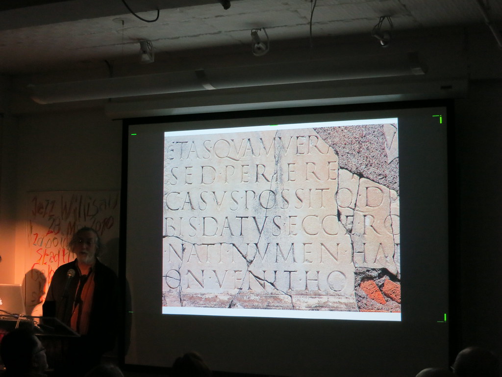
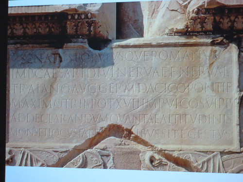
Top: Slide showing the inscription on the tomb of the children of Sextus Pompeius Justus on the Via Appia, Rome, second century AD used for the frontispiece of The Eternal Letter.
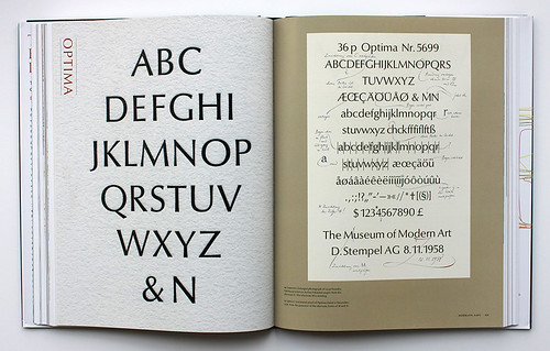
Spread from The Eternal Letter showing an enlarged photograph of 24pt foundry Optima (left) and an annotated proof of Optima dated 11 December 1958 (right).
When the journal Codex ceased publication, the third issue evolved into The Eternal Letter, once MIT press had agreed to publish it as a book. Florio described the book as a true ‘indie project’, driven by the determination of a small group to present history and analyses of letterforms in a way that interests a broad audience.
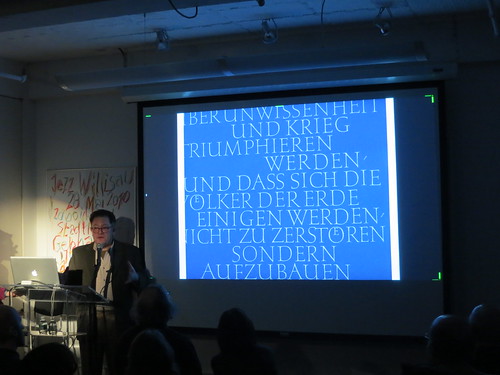
Scott-Martin Kosofsky speaking at The Eternal Letter launch event showing Werner Schneider’s Louis Pasteur broadside, 1988.
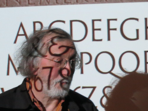
Editor Paul Shaw.
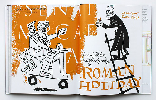
Opening spread for Cyrus Highsmith’s essay ‘Learning from Chairs’.
Shaw said that The Eternal Letter is not about ancient history, and that it focuses instead on two periods when the classical Roman letter was popular: the Renaissance and the twentieth century. He said that this focus on the ongoing importance of Roman capitals is an attempt to answer a challenge from designers to make history interesting and relevant.
Slide showing the inscription at the base of Trajan’s column.
Spread showing a rubbing of the Trajan inscription by Father Catich, 1966, selected ‘Es’ traced by Father Catich from his rubbings of the Trajan inscription with outlines of Adobe Trajan ‘E’ (in turquiose) overlaid (left) and a portrait of Carol Twombly, 1989 (right).
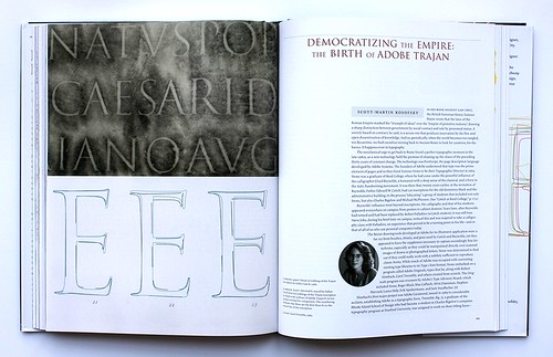
One of the ways the book answers this challenge is with a variety of essays about the influence of Trajan’s Column on generations of historians, type designers and calligraphers – from the Renaissance to today. Scott-Martin Kosofsky tells of the birth of Adobe Trajan; Shaw and Gregory McNaughton both write about Father Edward Catich’s fascination with the Column in the middle twentieth century; and Yves Peters reminds us of the ubiquity of Trajan in Hollywood in the typography of movie titles.
The Eternal Letter is lushly illustrated, thick with essays, and supplemented by valuable lists and appendices. It is an important and valuable addition to a library about letters.
The Eternal Letter. Editor Paul Shaw, producer / editor Scott-Martin Kosofsky and book designer Linda Florio.

Doug Clouse, graphic designer, letterpress printer, curator, writer and educator, New York
Eye is the world’s most beautiful and collectable graphic design journal, published quarterly for professional designers, students and anyone interested in critical, informed writing about graphic design and visual culture. It is available from all good design bookshops and online at the Eye shop, where you can buy subscriptions and single issues.
