Wednesday, 12:00pm
1 April 2020
Culture in colour

Tereza Bettinardi designs ‘Cursos e Oficinas’, an abstract and vibrant book series for São Paulo organisation Sesc. By Jan Middendorp

Tereza Bettinardi is from Santa Maria, in the centre of Brazil’s southernmost state, where she studied journalism and graduated in graphic design in 2006, writes Jan Middendorp.
She supplemented her thorough (local) writing and design education with summer schools in Berlin and Porto, and was selected for the SVA design criticism programme in New York. Bettinardi has been running her own studio in São Paulo since 2014, where she has developed a multi-layered approach to editorial design, packaging and more. Although firmly rooted in Brazilian visual tradition, her work is utterly contemporary – conceptually and technically sophisticated, stylistically adventurous, yet meticulously executed. In today’s Brazil, working independently is not easy. President Bolsonaro’s neocon callousness has triggered a brain drain.
‘In less than three years,’ says Bettinardi, ‘our perspective has changed drastically. Many of my designer friends are moving abroad. For those of my generation who are still here, it has become challenging to make quality work due to the many adversities and governmental cuts.’
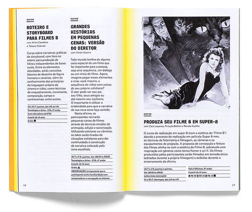
An opening spread showing one of the gatefold die-cut covers against the book’s bright yellow internal pages. Series design by Tereza Bettinardi.
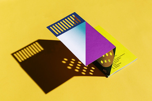
Top. Bettinardi’s Covers for a series of books for non-profit institution Sesc that use a simple but effective colour systems of one fluorescent Pantone with one solid colour.
 The project shown here is an ongoing series of books she embarked upon early last year. The client, Sesc, is a non-profit institution that values education as a prerequisite for social transformation, and provides courses aimed at all age groups and social strata, and are often free. The bi-monthly booklets announce the courses and workshops offered at Sesc 24 de Maio, a São Paulo chapter of the organisation. Its programme ranges from silkscreen workshops to open talks about LGBT and civil rights, and classes given by indigenous people of Brazil sharing their culture. Because of this diversity, a design was called for that was both abstract and colourful, so Bettinardi designed a series of varying abstract patterns.
The internal pages of the series were designed using Commercial Type’s Atlas Collection.


‘Since several workshops continue from one month to another, I thought it would be interesting if there was some sort of interference from one issue cover to the next. So I proposed these cuts that reveal a different pattern – the next month’s cover.’ The covers were printed using only a few spot colours at a time. ‘I love creating colour systems,’ says Bettinardi, ‘trying to make as much as possible from only a few resources. The colours were chosen by combining one fluorescent Pantone with a solid one, experimenting with overprinting.’ The idea did not stop with the cover; Bettinardi likes to establish a strong relation between outer and inner pages while keeping the content system organised and simple to navigate. The internal pages were designed using Commercial Type’s Atlas Collection.
The gatefold die-cut cover for one of the Sesc series books designed by Tereza Bettinardi.

Jan Middendorp, designer, writer and author of Dutch Type, Berlin
First published on the Eye blog, 1 April 2020
Eye is the world’s most beautiful and collectable graphic design journal, published quarterly for professional designers, students and anyone interested in critical, informed writing about graphic design and visual culture. It is available from all good design bookshops and online at the Eye shop, where you can buy subscriptions and single issues.
