Wednesday, 12:55am
15 July 2020
Fill the white space
Anette Lenz
Graphic design
New media
Posters
Reviews
Typography
Events and exhibitions
‘À propos’, Anette Lenz’s first major exhibition in her homeland, is an immersive, virtuoso response to Richard Meier’s MAK building in Frankfurt. By Jan Middendorp

After a two-month Covid-related delay, one of the most remarkable exhibitions of a contemporary graphic designer’s work has now opened at Museum Angewandte Kunst (‘applied art’), aka MAK, in Frankfurt / Main, writes Jan Middendorp.
Anette Lenz in the Repetition hall of her exhibition at MAK, Frankfurt. Photo by Selina König.
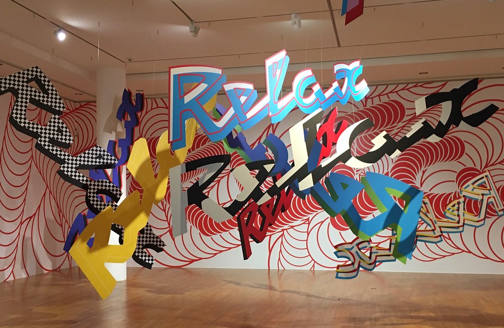
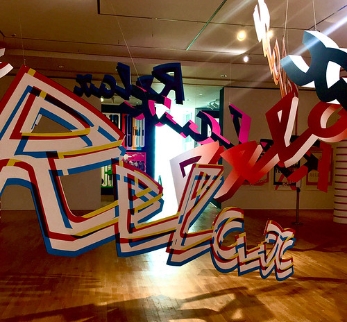
Top. The Relax hall in the exhibition multiplies and celebrates the logo of a theatre in Chaumont, based on the broken neon sign of the cinema the building once hosted. It is also an ironic game with the word itself, sometimes abused in our current troubling times. Throughout the 2000s Lenz designed the venue’s identity and material, working with Vincent Perrottet. Photo by Wolfgang Günzel MAK.
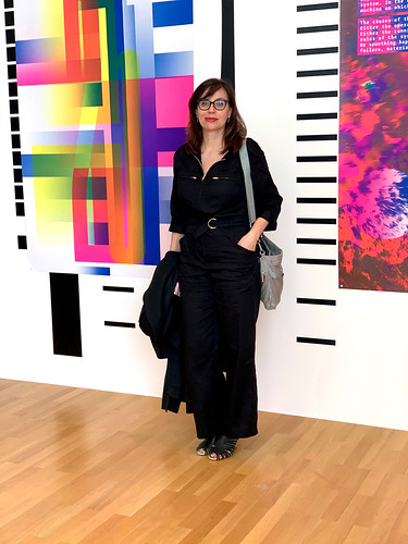
Over the past 30 years, German designer Anette Lenz has created most of her impressive work – posters, publications, identities – for French museums and theatres, media and public institutions. Having moved to Paris in 1990 to work with socio-political design group Grapus, she has continued to focus on socio-cultural projects, bringing charming and intelligent work into the public space. Besides the messages her sophisticated and lively designs communicate on behalf of the client, each work is also a reply to, or a statement about, its context: a building, a city or neighbourhood, an audience.
Identity for the poetry festival Expoésie, 2019. © Anette Lenz.

And this is exactly what she has done when conceptualising her first major exhibition in her native Germany. While many retrospective exhibitions of a graphic designer’s work are a collection of a career’s high points, Lenz’s show ‘À propos’ (a title suggesting ‘by the way’ or ‘speaking of’) is something completely different. Instead of presenting her body of work as its only content, the exhibition spars with its context: the city, the audience and the building designed by Richard Meier. Her poster series (often screen-printed in several colours at the large French standard size, 175 cm high) are perhaps its ‘by-the-way’.
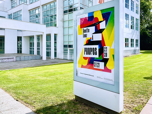
Lenz’s poster for her exhibition, in front of the Museum Angewandte Kunst (MAK). Photo by Anette Lenz.
Exhibition space on the theme of repetition. Photo by Wolfgang Günzel MAK.
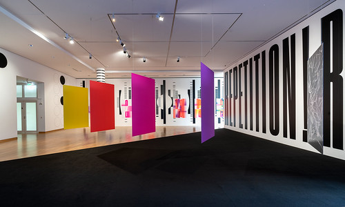
The exhibition modifies the spaces that host it, changing its connected rooms and hallways into graphic environments that challenge visitors to develop their own ideas and opinions. Her techniques and ingredients are similar to those used in her printed work and spatial interventions: layering and overlap of images, colours, lively typography, and projection. But in the new context of its Modernist museum space this has been scaled to monumental proportions, seducing spectators to join an intense visual and conceptual game. In the words of its curators, Peter Zizka and Matthias Wagner K, ‘her works do not transform us into consumers, but allow us to partake in graphic design’s inventiveness and power of expression.’
One of Lenz’s more recent projects is the identity of the national choreographic centre Le Phare (The Lighthouse) in Le Havre. Invited to develop a new identity and coordinate all elements of its visual communication, she first focused on the location itself. She proposed various drastic changes to modify the building – a former storehouse in the rather bland environment behind Le Havre train station – and become as noticeable as a lighthouse. Not only did she suggest painting the front in a saturated red, she also turned the raster of glass tiles in the façade into a back-projection screen for a dynamic, ever-changing light projection from within. The printed matter changes each season, and the undulating pattern of the glass tiles set the theme for one of its series. The ingenious backgrounds are layered with processed photographs of moving people, sometimes monochrome, recently as multi-coloured outlines that simulate aura pictures. Always intriguing, Lenz’s drastic restyling represents exactly the kind of communication a contemporary dance centre needs.
Image for Pharenheit, Le Phare’s dance festival, 2020. © Anette Lenz.

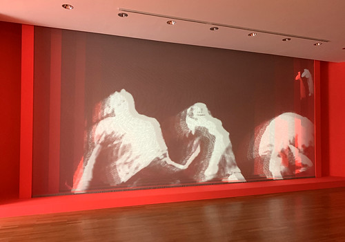
To represent the Phare project, Lenz’s exhibition does not limit itself to showing the original work for the dance centre. An entire wall was covered with one of the colourful aura-style photos of a dancer. Opposite, one of the original videos for the glass front, is projected from behind on a textile screen consisting of four enormous sheets, hung at small distances from each other, so that the movements of a dancer are modified into a layered projection, which changes the spectator’s perspective when moving in front of the screen.
Quadruple projection. Images shot for the projections on Le Phare’s glass façade, customised for projection on four-layered screen. Photo by David Beikirch MAK.
Lenz included the elevator [lift] in her visual poem. Her own thoughts on this installation: ‘As soon as you enter and leave the elevator, light and water can be traversed as central elements of life. Cosmopoem. Theme with variations … yin / yang, warm / cold, tangible / intangible, micro / macro …’
Photo by Wolfgang Günzel MAK.

Anette Lenz’s ‘À propos’, a complex show that required (and received) the devoted collaboration of the Museum’s technical staff, was not completely finished when the Museum Angewandte Kunst opened its doors after two months of shutdown. It will run until 3 January, 2021. And although each current space breathes, well, playful perfection, Lenz decided the show could use some changes and new features. She will be adding new elements, possibly including performances, accentuating her process-oriented approach to design and her ability to avail herself of unexpected circumstances.
As curators of Lenz’s vision, Peter Zizka and Matthias Wagner K – the latter being the museum’s director – have helped make possible a unique exhibition joining the influences of French esprit and German precision. They can have the last word: ‘In a communication world still dominated by men and determined by economic factors, Anette Lenz has always trusted in her own distinctiveness, making her a pioneer of a new generation of female graphic designers.’
Relax once more. Photo by Jan Middendorp.
Jan Middendorp, designer, writer and author of Dutch Type, Berlin
Eye is the world’s most beautiful and collectable graphic design journal, published for professional designers, students and anyone interested in critical, informed writing about graphic design and visual culture. It is available from all good design bookshops and online at the Eye shop, where you can buy subscriptions and single issues.
