
Tuesday, 11:25am
19 May 2026
Life of the line
Lecture by Ged Palmer (Lettering Artist, Signwriter, Designer, Educator) for Letter Exchange
The Art Workers’ Guild, London, 6 Queen Square, London WC1N 3AT. Wednesday, 15 April 2026. Reviewed by Ross Clifford.Ged Palmer at Letter Exchange
In a talk for Letter Exchange’s 2025-2026 Lecture Series, Ged Palmer discussed his various roles as lettering artist, signwriter, graphic artist, teacher and designer. For the past decade and a half he has been on a mission to master his craft.
Palmer has had a fascination for letterforms since he was a teenager. An obsession for comic books and skateboard graphics got him hooked on drawing, but choosing the correct tools changed everything.
‘I focused on working with a brush early on. When you paint by hand and get the perfect stroke, you breathe life and bounce into it. If you digitise it, it loses a bit of life and purity of the line.’ Soon he became intrigued by how you could make a living out of doing this.
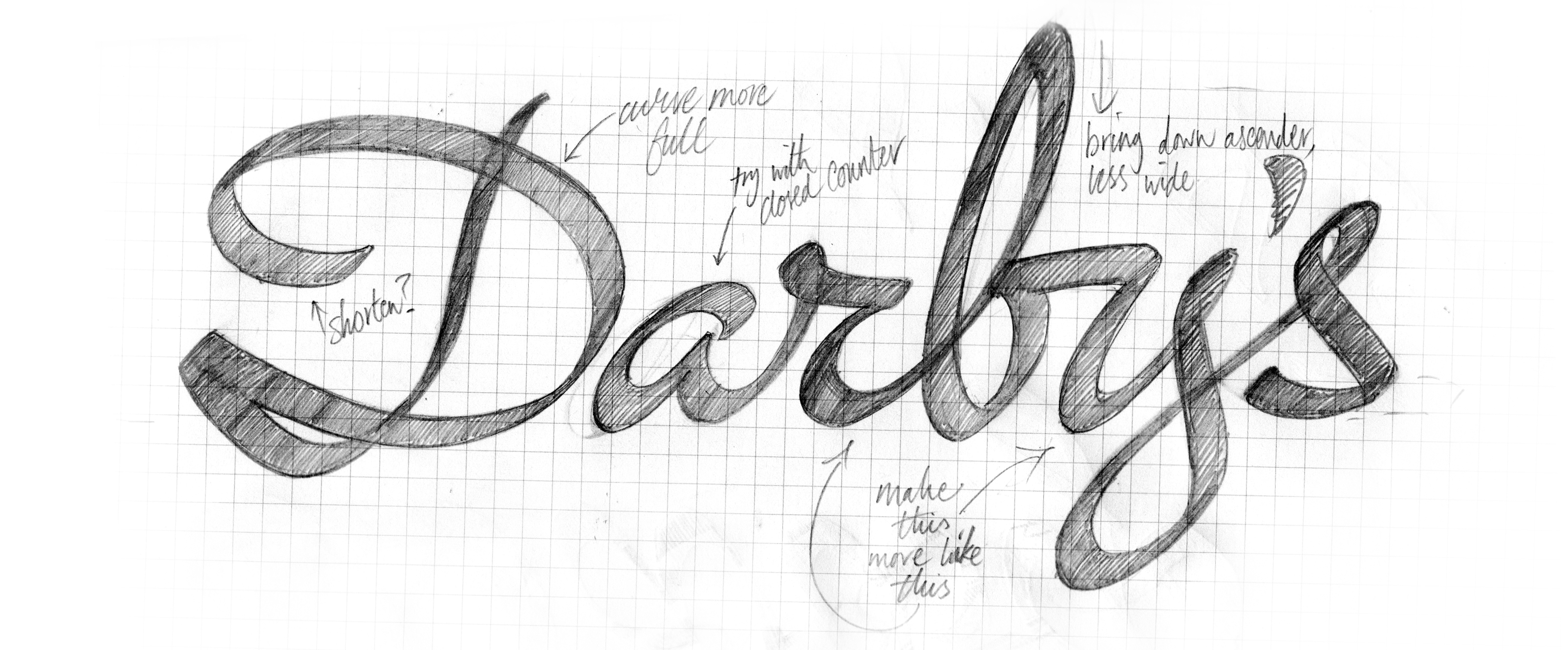
Process sketch for London restaurant Darby’s, and final logo, 2019.
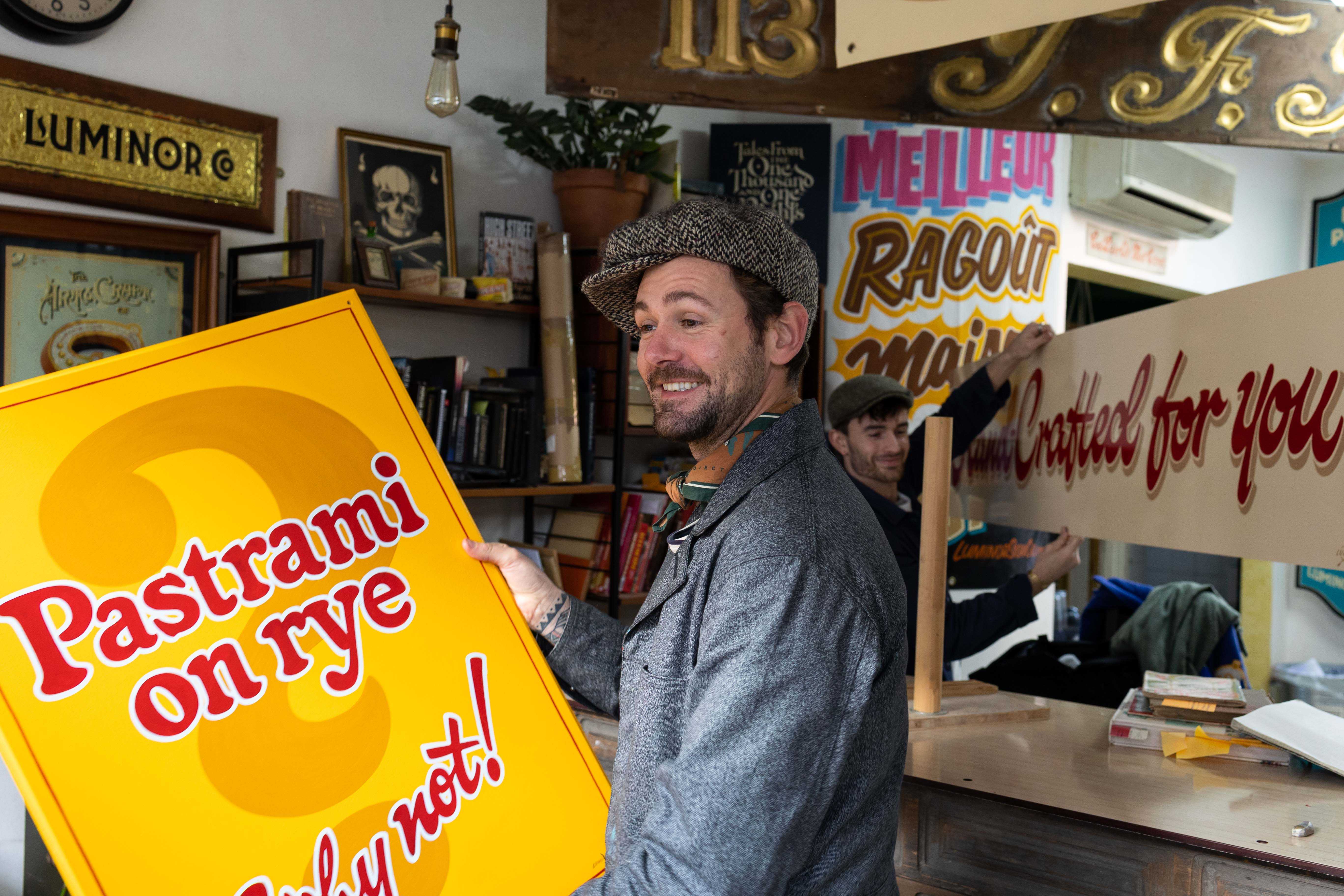
Top. Photo of Palmer with signs for Brick Lane Bagels.

‘Dad had started a photographic career in New York in the 1970s on a whim and a hope, so I thought maybe I could do the same.’ While studying design at Bristol’s UWE (2007-10) he travelled back and forth to the United States, hawking his physical portfolio around Manhattan agencies, hunting down his heroes to learn how they had forged viable practices.
Back in the UK, the late lettering artist James Cooper (Dapper Signs) was a big influence on Palmer. Cooper taught him to ‘go for it’, to be more ballsy with a brush. ‘James embodied the rock’n’roll style,’ says Palmer. With the brush, you commit to the line you make. There is no ‘Apple-Z’, there are no second chances.
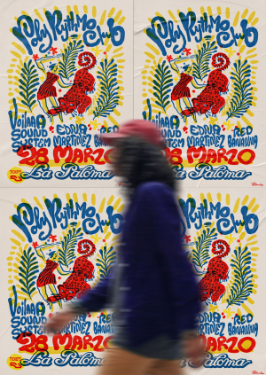
Poster for Poly Rhythmo Club, Barcelona, 2026.
After graduating, Palmer made his living from designing logotypes and in 2012 went out to California for a stint with Derek McDonald at Golden West Sign Arts. He recalls that McDonald would sleep on the shop floor, wake up, fix a coffee and put on an old shellac of Billie Holiday. ‘We’d spend the whole day painting – productivity was crazy – then go off to a job in an old van. You have to be a bit of a romantic to get into signwriting in the first place.’ Except that this was not foppish romanticism but hard graft, sometimes dirty (some of the processes are extremely toxic) and downright focused.
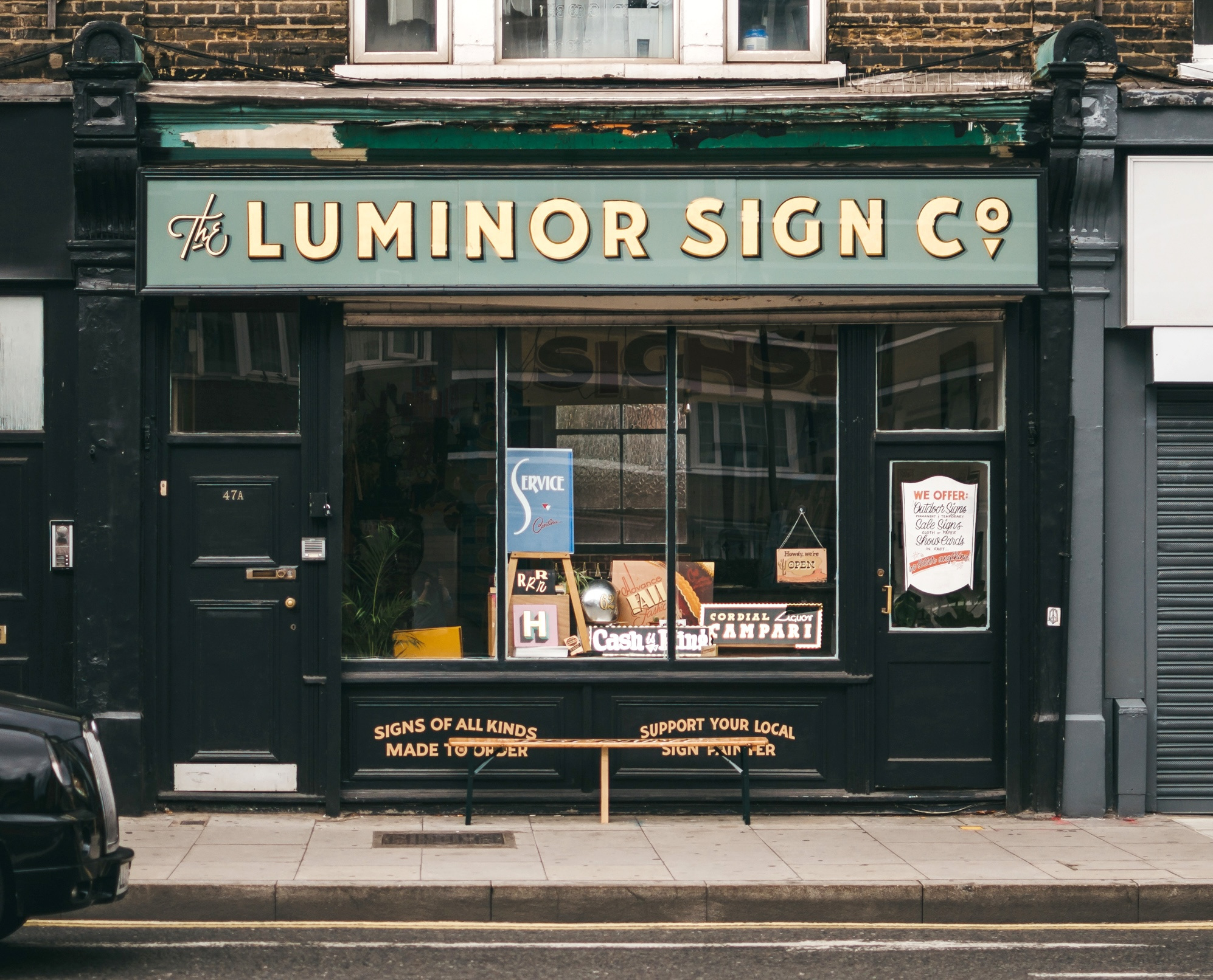
Shopfront for The Luminor Sign Co., 2016-24, named after one of the shops shown in High Street by J. M. Richards and Eric Ravilious (see Eye 95).
Back in London, he redesigned the Folio Society’s monogram while working in-house for the publisher. Then Palmer set up The Luminor Sign Co. in London’s East End, a neighbourhood sign shop and design studio that he ran with a small team from 2016 until it closed in 2024. Luminor was a typophile’s shrine to old-world aesthetics and the beauty of imperfection as well as a buzzing studio, creating work that ranged from headstones to signs for Brick Lane bagel shops.
Right. Monogram for the Folio Society drawn by Ged Palmer, 2013, when working for the publisher’s in-house team.
Left. Original by designer and engraver Reynolds Stone.
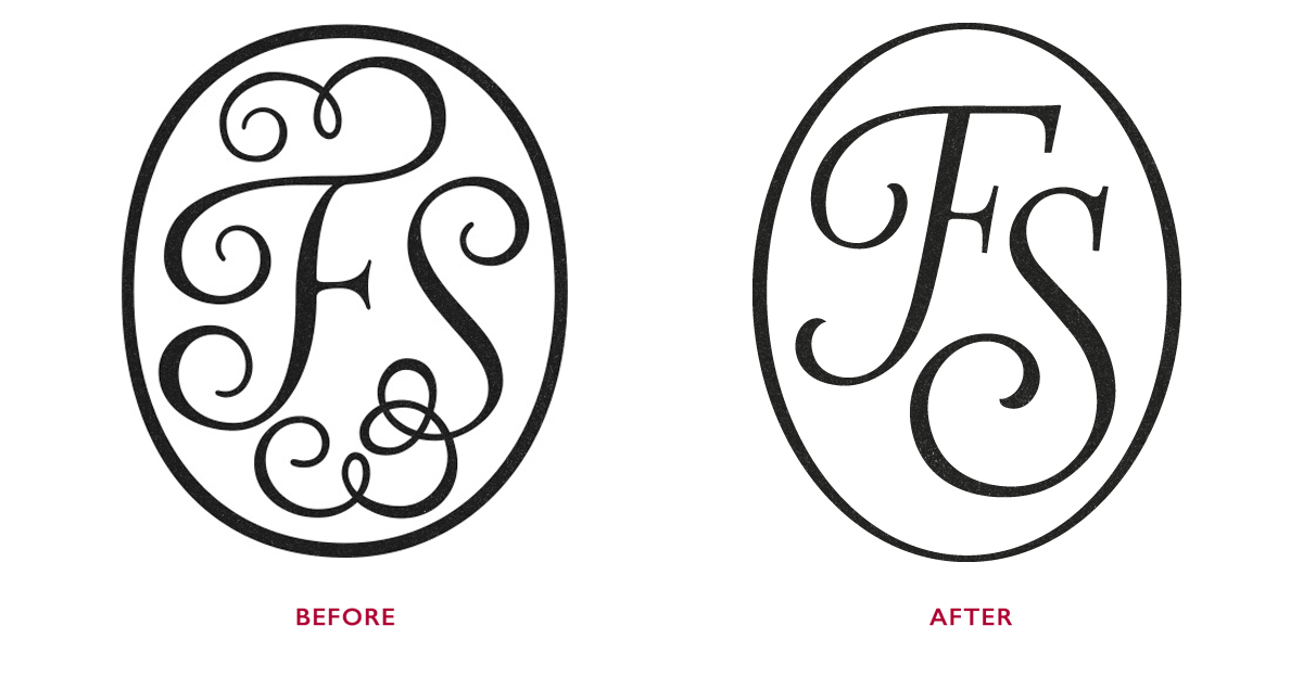
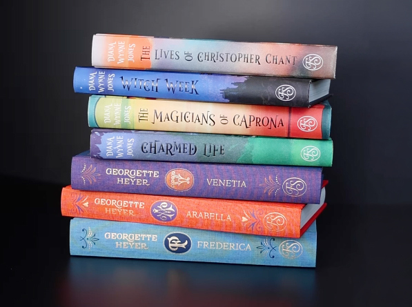
Monogram on spines of Folio Society books, 2013.
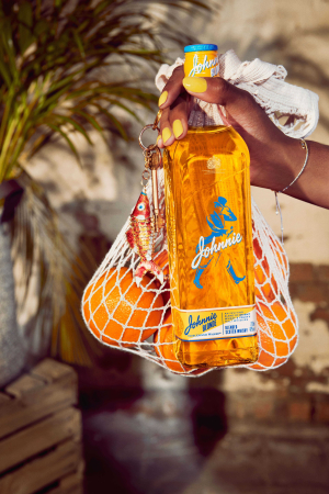
Johnnie Bottle. Art direction and brand identity for Johnnie Walker Blonde, 2021
More recently, Palmer designed a custom wordmark and packaging for whisky brand Johnnie Walker. As creative director for campaigns, packaging and merchandise for coffee artisans Belleville, in Paris, he sketched and art directed Belleville Sans, a custom typeface for the brand. (Further design and development was carried out by Bobby Tannam, with whom Palmer teaches at NCAD Dublin.)
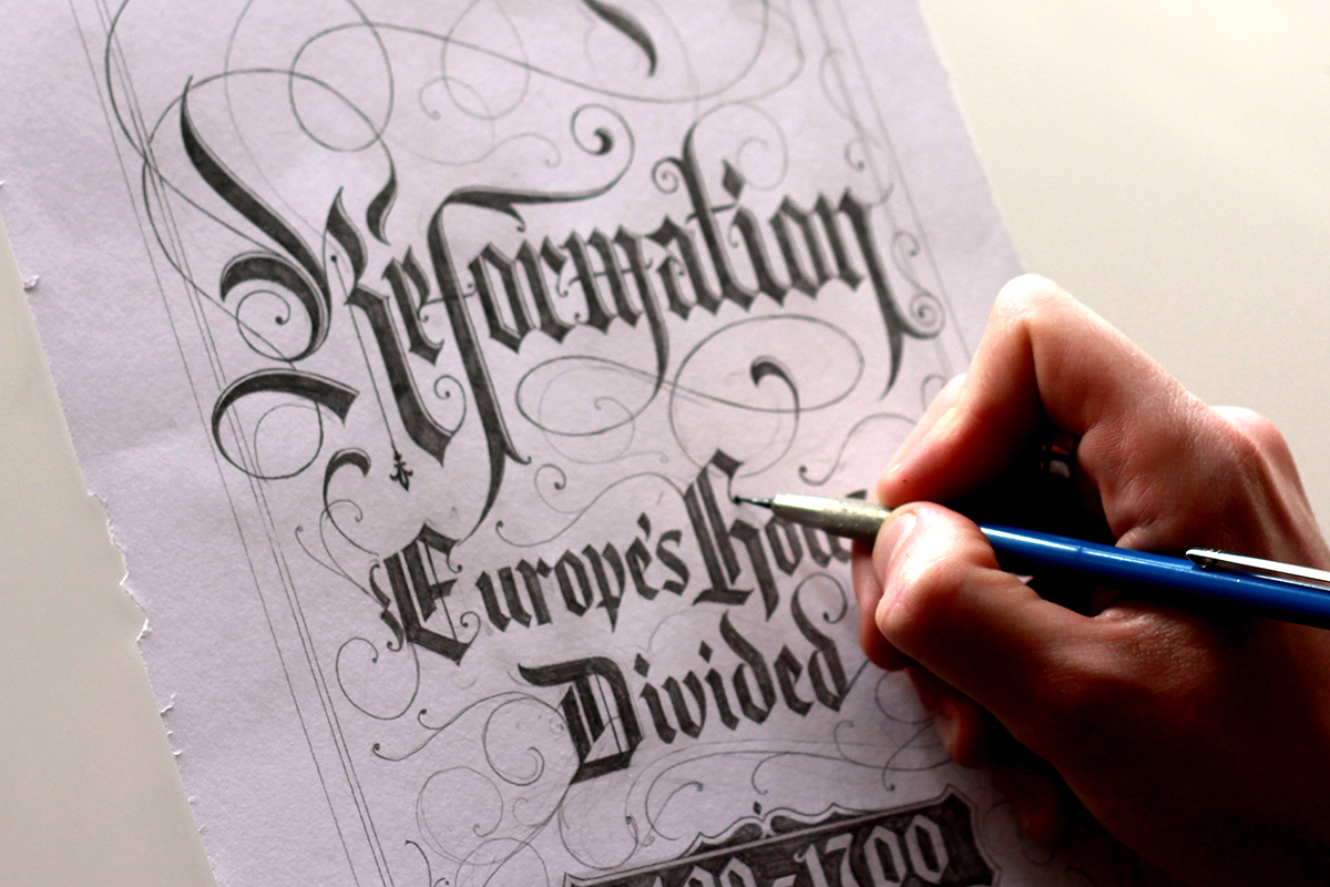
Blackletter hand-lettering for Diarmaid MacCulloch’s Reformation, made in-house at the Folio Society, 2014.
With Palmer’s work, especially now, there is a gravitational pull back towards that starting spark, that unfiltered mark that honours the impulsive gesture. He will soon be launching a series of silk squares, featuring his lettering, imagery and patterns, as ’Palmer Editions’. After the talk, we discussed the idea that ‘perfection is unlovable’. Rapidly executed sketches are, ‘more honest, more unfinished … good enough.’ Palmer’s lettering has something special – it has the life of the line.
Ross Clifford designer, writer, Hastings
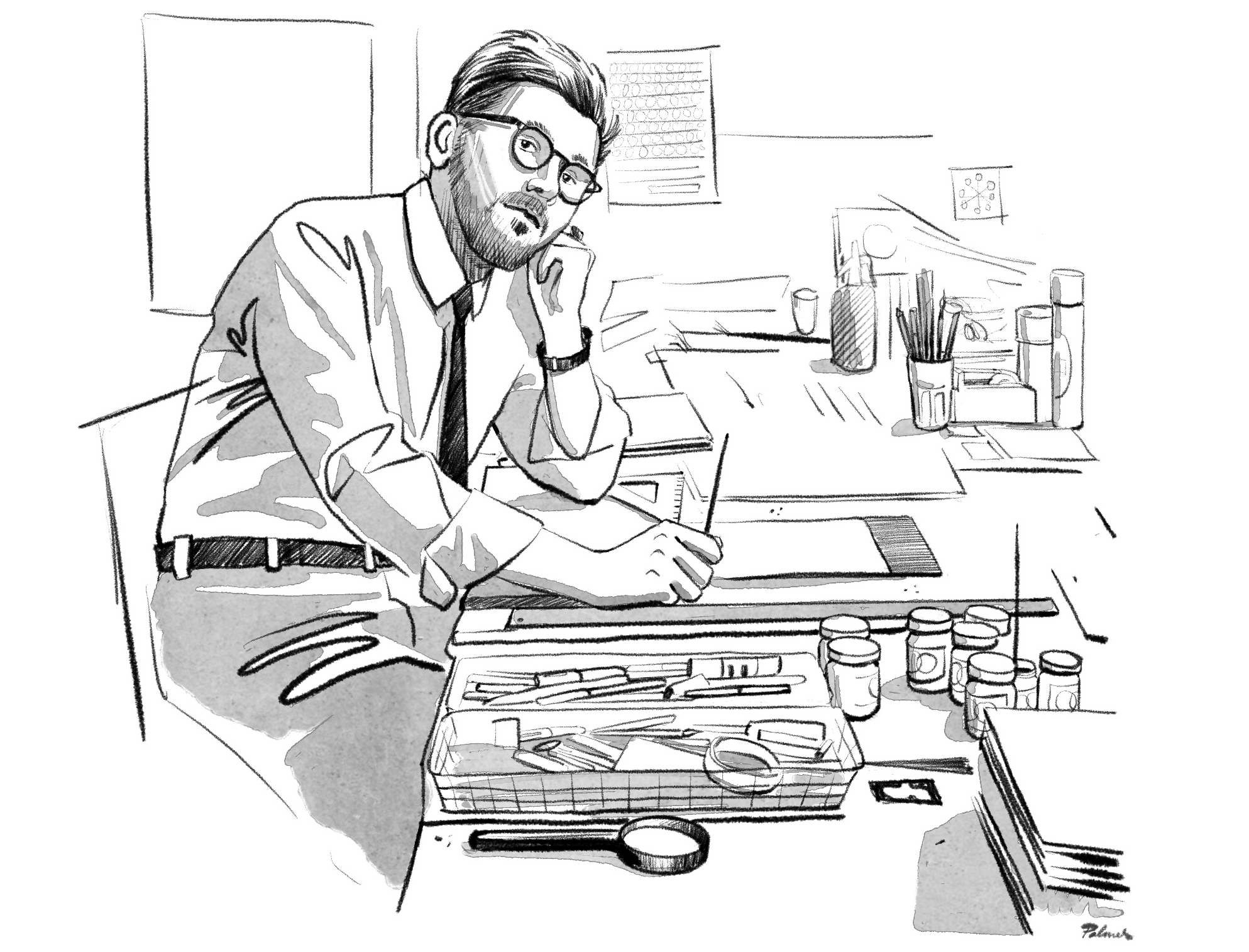
Self-portrait, 2026.
Eye is the world’s most beautiful and collectable graphic design journal, published for professional designers, students and anyone interested in critical, informed writing about graphic design and visual culture. It is available from all good design bookshops and online at the Eye shop, where you can buy subscriptions and single issues.