Monday, 4:39pm
9 January 2012
‘Need a new toolbox.’

Type Tuesday: Made by Many chat about the challenges of webfonts

Eye has covered webfonts several times, most recently in ‘Andmoreagain’ a blog about the 2011Ampersand conference, and ‘New dawn’,Jack Yan’s excellent article in Eye 79, writes John Ridpath.
But as non-system fonts crop up on more and more websites, what are the realities currently faced by practitioners?
I spoke to developer Andy Walker and designer Conor Delahunty from London digital agency Made by Many about their working methods and the (missing) tools of their trade.
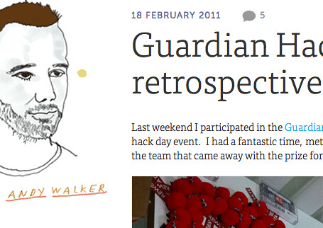
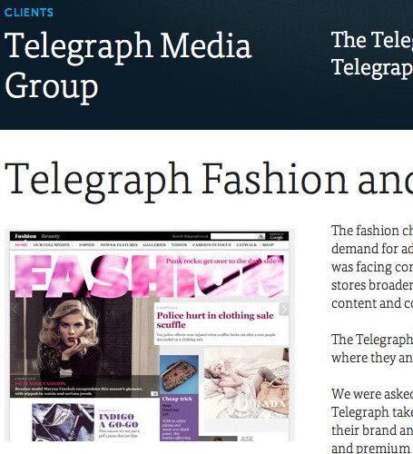
Above and below: Screenshots from Made by Many’s website. Typefaces used: FF Tisa Web Pro and Museo Sans. Portraits by Paul Davis.
John Ridpath: How ready are we for webfonts? Lots of typefaces haven't been optimised for the Web or properly hinted yet, for instance, so they still don't work consistently for all users.
Andy Walker: There are issues that still need to be understood and addressed by type designers, Web designers and developers. @font-face has come of age, and this is my method of choice, because it does not perform any text replacement. This means that the text is still searchable, it’s much more accessible to users with screen readers, and it’s more easily styled (via CSS).
From a developer point of view there are strategies for implementing @font-face in a cross-browser compatible way. Tools such as Font Squirrel make it easy for developers to generate ‘bullet-proof’ code and enough format variations of a font type to be able to provide maximum compatibility. Similarly, Typekit provides a brilliant API [application programming interface] for embedding, and all of the available fonts have licences compatible with the Web.
From a designer’s point of view, it’s important to know the limitations of the font they want to use before getting too attached to it or making it integral to the design. Does the licence allow embedding as a webfont? Is the font optimised for display on Windows (the Windows font-drawing algorithm relies on certain hinting in order to display legibly)? How does it look cross-browser?
JR: And what about from the design perspective?
Conor Delahunty: We need a new design toolbox. The tools we use at the moment are bloated and not fit for the task. Photoshop, for example, is the main tool used by most Web designers, but it tries to be all things to all people. You can choose a font from Typekit (or similar) and produce a nice-looking design in Photoshop, but often when that is translated to a webpage it looks completely different, is difficult to read, and is inconsistent across browsers.
We need a program which understands the Web, understands mobile, and renders fonts true to how they will appear online. Also, Web designers need to become less precious about their work and collaborate with developers if they want to achieve the best possible results.
JR: Any thoughts for the future?
AW: My hope for the future is that browsers and operating systems get better at rendering font-face and that inconsistencies continue to diminish. I don’t think Windows is going to change the way it draws fonts to the screen any time soon, but maybe type designers will become more attuned to the need to test for cross-browser and OS compatibility.
Font foundries seem to be getting much better at providing fonts with licences for Web and making terms much clearer to developers and designers, but I think there is still some way to go in terms of providing a wider range of compatible font formats.
See also: ‘End of default’ by Simon Esterson and Jay Prynne in Eye 75.
Eye is the world’s most beautiful and collectable graphic design journal, published quarterly for professional designers, students and anyone interested in critical, informed writing about graphic design and visual culture. It is available from all good design bookshops and online at the Eye shop. The new issue, Eye 81, is out now – see Eye Before You Buy for a visual sample.


