Monday, 8:05am
16 September 2013
Even further beyond Beck
Harry Beck
Maxwell J. Roberts
anonymous designers
Critical path
Design history
Graphic design
Information design
Reviews
Underground Maps Unravelled: Explorations in Information Design
Maxwell J. Roberts, £45Extended review: Rob Waller takes a closer look at Underground Maps Unravelled by psychologist Maxwell Roberts

Harry Beck’s underground map has to be the most celebrated and discussed instance of information design, writes Rob Waller.
Not just celebrated but fetishised – fake tube maps have become an advertising cliché, and the Internet is replete with tributes, histories, attempted improvements and spoofs. The ruder ones are a little harder to find after Transport for London’s lawyers apparently had a sense of humour failure a few years back.
One of the first of the spoof versions was by Beck himself – a 1933 version drawn as a electrical wiring diagram. It is reproduced in Ken Garland’s classic Mr Beck’s Underground Map, through which many of us came to know much more about the man behind the famous map. Garland recounts how the problem of navigating an increasingly complex network of railways was solved by realising that connections are more important than geography. Because tube passengers are passive, and cannot see the outside world, they don’t need to see it referenced accurately on the map, as they do when walking or driving. By distorting geography, direct connections could be made more obvious, the centre enlarged to accommodate more stations, and long distances compressed so they fit on the page. As Ken Garland points out, although it is universally known as the tube map, it is actually a diagram: it solves the problem of planning travel between places, rather than depicting where they are.
The tube map is iconic partly because many of us are so familiar with it (or with its equivalent in other capital cities with metros). We are used to looking at most visualisations or diagrams, evaluating them aesthetically but not really reading them. But we experience the tube map viscerally – to travel on the tube is to travel the map, and problems are experienced as a waste of time or money, or the distress of lostness, rather than just a brief bafflement before turning away. So we pay attention to it, and share an understanding of it at an especially detailed level.
The detail is important. Small changes have a significant effect, and as a result the tube map has become a rich case study of the importance of competent execution of design concepts. Everything matters: whether stations are shown as blobs or ticks, and the size of those blobs and ticks. Designers and commentators, including Beck himself, have worried away at this micro-level, as much as they have thought about the overall shape.
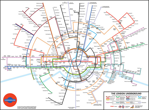
While Ken Garland’s book, as its title suggests, focused on Harry Beck himself, and the story of his achievements and struggles, Maxwell Roberts’ new book is comparatively encyclopedic in its scope. It includes a history of the tube map, a detailed analysis of Beck’s design system, a critical review of transit maps from other cities, and a considerable number of experimental versions which explore alternative aesthetics: different geometric rules, curvilinear versions, different degrees of topographical accuracy. In fact it is noteworthy that almost all the maps in the book have been digitally drawn by the author, including historical examples, a considerable cartographic achievement in itself. While we lose historical clues such as printing flaws, folds and damaged paper, this enables us to directly compare the communicative impact of the various versions. Particularly interesting are attempts to apply systems designed for one city to another – for example, the London map is redrawn according to the principles of Massimo Vignelli’s New York map. This is a rare practical example of the semiologist’s classic commutation test – in which signifiers are systemically removed or changed in order to detect their significance.
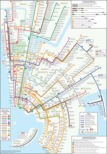
Roberts’ circular design for the New York Subway network.
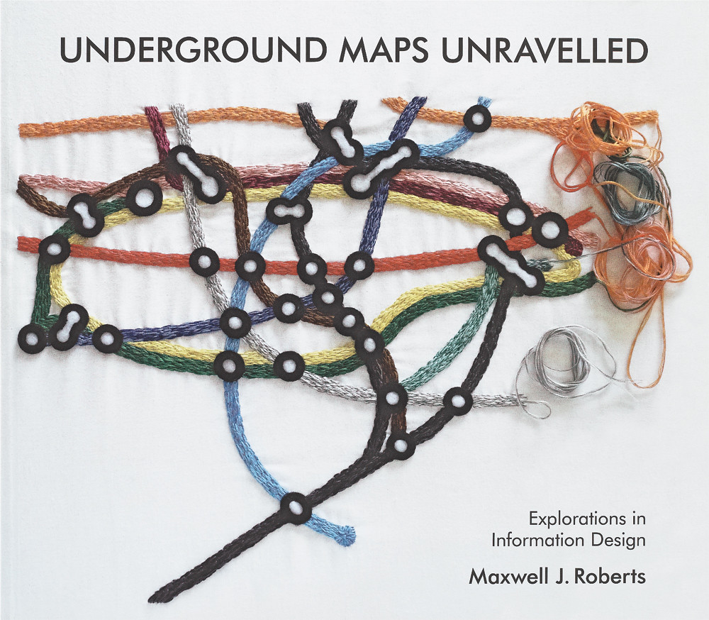
Top: cover of Underground Maps Unravelled: Explorations in Information Design.
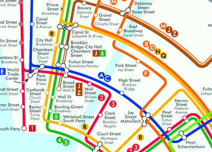
Detail of Roberts’ proposed design for the New York Subway network, showing interchanges and station markings.
Starting with precursors to the modern tube map, including some early attempts at simplified diagrams, Roberts traces the history of the Beck map to the present day. It is a story of a project narrative many designers are familiar with – in a nice subversion of a design process flow chart, Roberts characterises it as ‘problem --> solution --> drift’. New versions were developed for new document formats, new train services, or just because someone thought they had a better idea. As Roberts nicely puts it: ‘The individuals who comprise an organisation are often nice, reasonable people, but put them together, and the result is nearly always an unassailable, collective, corporate vanity’ – as good a characterisation of corporate clients as I’ve seen outside a Tom Fishburne cartoon.
Any map is a graphic argument as much as it is a depiction of reality – it has a point of view, and it is selective in the prominence it gives particular features, places or themes. But a diagrammatic map is especially so, and graphic arguments invite disputation as much as verbal ones. Over the years, people have continued to fret about the tube map’s geographic distortions, what they mean for our mental map of London, and how they lead unsuspecting visitors to take complex journeys underground to destinations that turn out to be just a few minutes away on foot.
There’s also been a concern that the tube map is incomplete. There are many conventional rail services in London as well as the underground, but attempts to integrate them with the underground map have not been successful. For one thing, the resulting map presents more information than we can reasonably manage, suggesting that, as Roberts puts it, ‘Beck’s design rules seem well-suited for small to medium-sized networks’, which itself is an interesting comment on the limits of systematic thinking in design. What works for London may be overly complex for a much smaller system, or just not workable in a more complex one – and Roberts demonstrates how poorly the Beck system deals with the particularities of the Paris Metro.
This issue of the limits of complexity is at the heart of Roberts’s argument, and he suggests two possible responses. Firstly, Beck’s rules may be the right ones, but they need to be properly understood, taking account of the ‘cognitive psychology of map interpretation’. Alternatively, ‘the space of possibilities has been insufficiently explored’. That is, Beck’s principles have so dominated transit map design that a more creative exploration of alternatives is needed. Roberts then pursues each of these directions of thought through a series of visual experiments in which he redraws the map using different design assumptions.
This mention of cognitive psychology is important, as Maxwell Roberts is himself a psychologist, and while only a few experiments are cited, he does reference his background from time to time, and deploys it to explain why some versions of maps seem to work better than others.
But he also contrasts the evidence-based theories of psychologists with what he feels is the poor state of the graphic design industry as he has presumably experienced it. In particular Roberts claims that Beck’s principles have been regarded as a ‘gold standard’ by designers, and applied dogmatically, inflexibly, uncritically, and without regard to relevant principles of cognitive psychology (which he briefly lists as cognitive capacity, cognitive load, expertise and attention). He suggests this belief is ‘very widespread among graphic designers, researchers, commentators and users’. This line of thinking turns into something of a rant about the skills, attitudes and education of graphic designers: ‘we might wonder whether the skills needed to create a logo, lay out a magazine page or even develop a corporate identity are sufficient to create a schematic map’; ‘training to become a graphic designer rarely encompasses the more specific and subtle skills associated with the psychology of information interpretation’.
Across the hundreds of graphic design courses that exist at all levels from A-level to PhD, there’s some truth in this, but readers of Eye magazine will probably see themselves as part of a much richer critical tradition within graphic design than Roberts seems aware of. There are specialisms within graphic design, just as there are within psychology. And of course there are other traditions of systematic thought that sit alongside cognitive psychology as sources of insight into user needs. One wonders if Massimo Vignelli realised his profession is traduced in this way when he wrote the glowing endorsement that appears on the back cover.
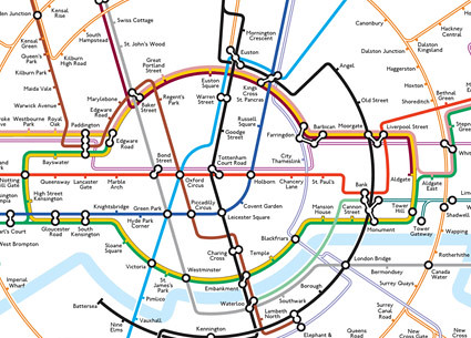
Detail from Roberts’ version of the London Underground map.
A running thread in this book, to my mind somewhat unresolved, is that Roberts, a psychologist, appears to wish for a scientific method to resolve design choices, in contrast to this dogmatism that he attributes to graphic designers. For example, he suggests that to reject 60° line angles on a transit map just because Beck’s experiment was not successful, is to violate a basic rule of scientific method: ‘namely, test all manipulated variables systematically using all possible combinations’. But designers know, and Roberts clearly understands, that it is just not possible or fruitful to take this suggestion literally – each factor you include (line thickness, colour, angle of line, etc) multiplies all the other factors and the experiment soon gets out of hand. Instead, designers make limited visual experiments, and evaluate them using an educated critical judgement, honed through debate and occasional forays into testing with real users. And this is exactly what Roberts demonstrates through an intriguing set of visual experiments that test Beck’s design principles, or at least his interpretation of what he claims that strict Beck advocates say are the rules (do these people exist? where?). By ‘test’ I mean, for the most part, ‘demonstrate’, because only a handful of actual experiments which gathered performance data are alluded to.
The largest set of visual experiments explores different permissible angles for lines on the tube map. The classic Beck map is octolinear: there are eight possible directions for lines to go (up, down, left, right, and four 45° diagonal directions). Roberts shows a range of alternatives: different angles, and different numbers of permitted directions. It’s a magnificent effort in term of sheer scale and effort, although rather baffling in the context of the book’s overall argument. Having railed against design dogma, the author now takes on the role of designer, rigorously exploring alternative designs, but all within the (to my mind dogmatic) design principle that all lines in a diagram have to conform to standardised angles. In the absence of a psychological explanation, this would appear to be an aesthetic principle. For all the allusions to psychological explanations, Roberts’s judgements seem as much based on critical thinking and educated connoisseurship as any other writings on design. That’s not a criticism, by the way – it’s ‘welcome to the club’.
But the most systematic of designers are usually pragmatic enough to break rules such as grid systems, when there’s a compelling reason to. The tube map could be alternatively analysed as a classic design compromise, perfectly illustrating design realities such as trade-off, visual argument, affordance, genre conventions, the importance of detail, and flexibility. These realities are as theoretically underpinned as you’d want – not always in terms of cognitive theories, but through discourse theories, systems thinking, sociology, and design methods, and by the increasingly well-document craft of user experience design.
This will be an information design classic. I havve taken issue with an important aspect of its argument, but much remains that makes it a hugely valuable resource, not least the particularly rich set of illustrations. It is a fascinating and often witty book, even venturing some subtle visual humour: at least, I am assuming that the awful optically condensed type on the page headed ‘Breaking the Rules’ is ironic. I am tempted to conclude that Roberts’ book is the last word on the subject, but knowing the tube map I somehow doubt it.
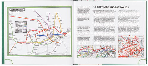
Spread from Max Roberts’ Underground Maps Unravelled.
Rob Waller, information designer, editor, educator, Reading
The original, shorter version of this review ‘Beck and beyond’ can be read in Eye no. 85 vol. 22, 2013
Eye is the world’s most beautiful and collectable graphic design journal, published quarterly for professional designers, students and anyone interested in critical, informed writing about graphic design and visual culture. It is available from all good design bookshops and online at the Eye shop, where you can buy subscriptions, back issues and single copies of the latest issue. You can see what Eye 85 looks like at Eye before You Buy on Vimeo.

