Spring 2013
Beck and beyond

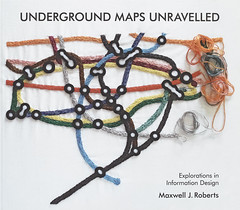
Underground Maps Unravelled: Explorations in Information Design
Maxwell J. Roberts, £45

Harry Beck’s underground map must be the most celebrated, discussed and fetishised instance of information design. Introduced in 1933, the design was an immediate hit with the public and inspired similar maps in other transit systems.
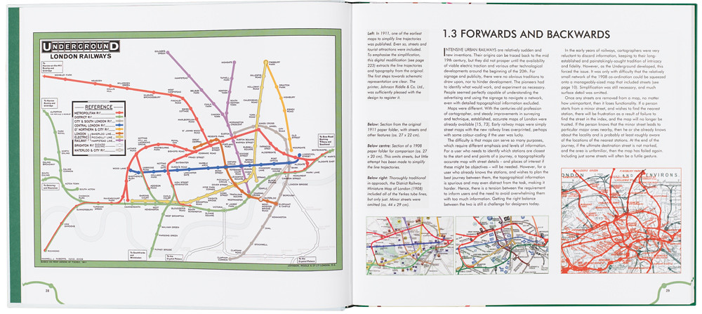
It’s an icon not only because it works but because it encapsulates key debates about information design. Like any map, but more so, it is a graphic argument, not a depiction of geographic truth – a truth each generation of critics rediscovers. It is also a rich study in the importance of competent execution of design concepts. Detail matters: whether stations are shown as blobs or ticks, and the size of those blobs and ticks. And it makes us consider the role of criticism, research and evidence, a running theme in Maxwell Roberts’s self-published book Underground Maps Unravelled: Explorations in Information Design (£45). We experience the map viscerally, travelling on the map as much as on the train, and misreadings leave us late or out of pocket. So alterations to the map are instantly exposed to millions of experienced critics.
The classic history of the map is Ken Garland’s Mr Beck’s Underground Map (1994), which, as its title suggests, focuses on the original designer and the story of his achievements and struggles. Roberts’ scope is wider, with a detailed history, analysis of Beck’s design system, a critical review of other transit maps, and a considerable number of visual experiments with alternative aesthetics: different geometric rules, curvilinear versions, different degrees of topographical accuracy. Almost all the maps in the book have been digitally drawn by the author, including historical examples – a considerable cartographic achievement. Particularly interesting are attempts to apply systems designed for one city to another – for example, redrawing the London map according to the principles of Massimo Vignelli’s New York map. It becomes clear that Beck’s rules are not universal principles but apply very specifically to the size and density of the London system.
A running thread in this book – to my mind somewhat unresolved – is that Roberts, a psychologist, appears to wish for a scientific method for resolving design choices, in contrast to the dogmatism that he attributes to graphic designers (he is blunt in his assessment of what he sees as our poorly trained and unthinking profession). But his own design experiments, exploring a range of standard angles for lines on the map, reveal a visual dogmatism as strong as any grid-bound Modernist, are untested with users, and refer to cognitive theory in no more depth than many basic design textbooks.
This is a substantial and fascinating book, but (knowing the tube map and its adherents) not the last word on the subject.
Rob Waller, information designer, editor, educator, Reading
First published in Eye no. 85 vol. 22 2013
Eye is the world’s most beautiful and collectable graphic design journal, published quarterly for professional designers, students and anyone interested in critical, informed writing about graphic design and visual culture. It is available from all good design bookshops and online at the Eye shop, where you can buy subscriptions, back issues and single copies of the latest issue. You can see what Eye 85 looks like at Eye before You Buy on Vimeo.


