Thursday, 10:11am
28 July 2011
Lost in space
anonymous designers
archive
homepage
Design education
Graphic design
Information design
Visual culture
Why do architects believe their wordless buildings are easy to read?

‘Sign designers are convinced that architects don’t like them,’ writes Rob Waller, in his provocative Monitor piece in the latest issue of Eye (no. 80 vol. 20).
In ‘Places need signs’ he argues that ‘just like handles on doors, signs should be there from the start.’ Here, exclusively for the Eye blog, are some choice examples of wordless buildings, accompanied by Rob Waller’s comments.
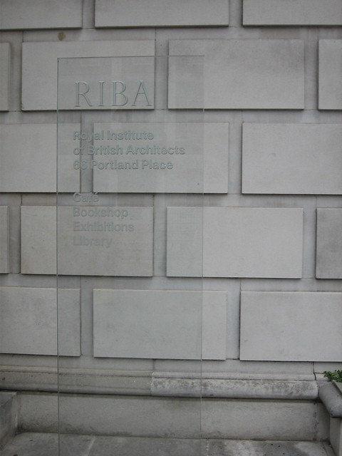
Top: Royal Institute of British Architects, Portland Place, London. This transparent sign perfectly shows off the appearance of the building while barely murmuring its identity.
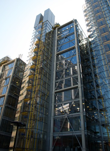
Below: 88 Wood Street, London (Richard Rogers Partnership, 1999). Users are in little doubt about the location of lifts or stairs here, but truly transparent buildings are rare.
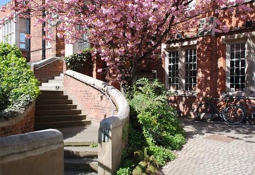
Above: Camden Arts Centre, Finchley Road, London. The entrance is not up the steps, as the architecture positively shouts, but behind the tree.
Below: Barbican Centre, London. Two possible entrances communicate themselves: up the grand steps, or the glass doors in the centre. Neither is correct – you go down some steps to the right.
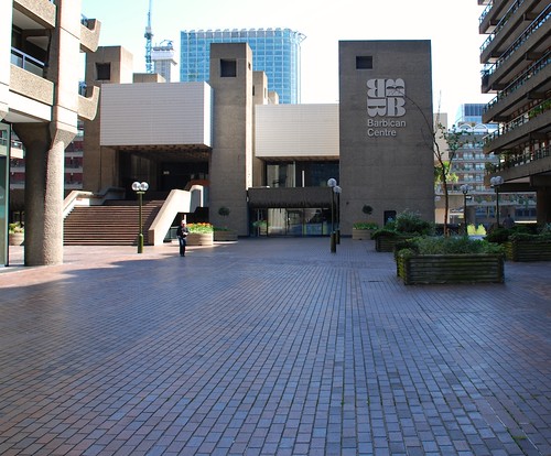
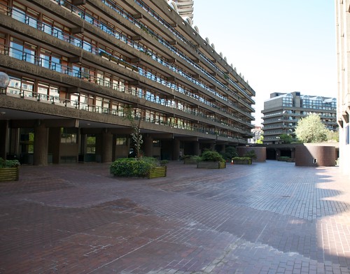
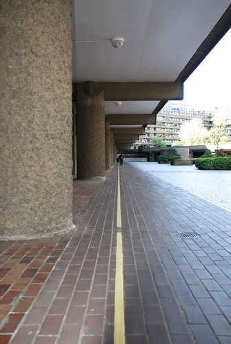
Above and below: Barbican Centre, London. The Barbican in London is notoriously illegible – with no obvious exit (above) the yellow line is an essential lifeline for visitors moving between the Tube station and the concert hall.
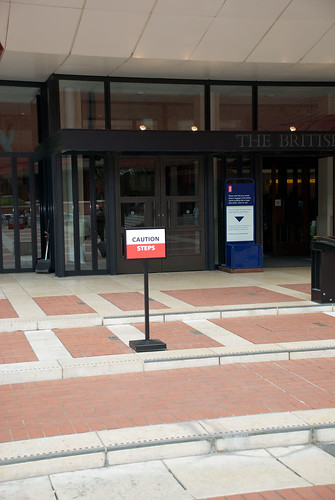
Above: The British Library, St Pancras, London. Signs like this signal a failure of affordance. The steps are insufficiently communicative on their own, so need an extra sign – adding cognitive work to the physical work of climbing them.
Below: ICMA Centre, Henley Business School, University of Reading. The tiny signs on some modern buildings communicate only grudgingly – you almost have to commit to walking through this door before you find out where it goes.

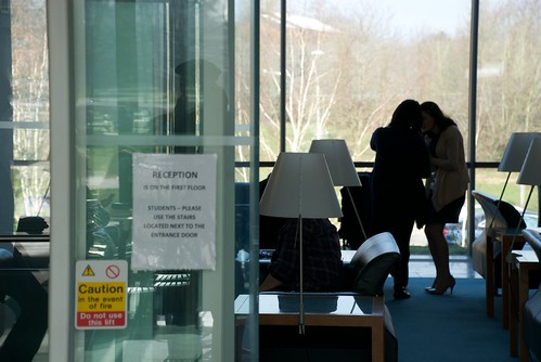
Above: ICMA Centre, Henley Business School, University of Reading. Even the most beautiful of buildings are overlaid with health and safety notices, applied without specification, even though they are mandatory and inevitable. And failures in architectural transparency are soon remedied by temporary signs.
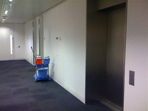
Below: 6 More London Place, London. There are no signs pointing to the loos in this building, so we have to find them through inference: they are customarily near the lifts, because they share the same service shaft; and the cleaning trolley is an extra clue.
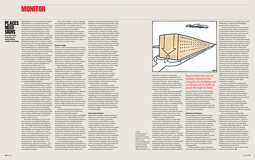
See ‘Places need signs’ (below) in Eye 80.
Rob Waller is an information designer, writer and educator based in Reading. See also his occasional blog, The Simpleton.
Eye is the world’s most beautiful and collectable graphic design journal, published for professional designers, students and anyone interested in critical, informed writing about graphic design and visual culture. It’s available from all good design bookshops and online at the Eye shop. Eye 80, Summer 2011, is out now.
