Monday, 11:00am
4 November 2019
Tokyo two-track

John Maeda
Rathna Ramanathan
Sébastien Morlighem
Matthew Carter
John Dreyfus
Petra Černe Oven
Akihiko Morisawa
Jason Pamental
Sumanthri Samarawickrama
Alexandra Korolkova
Sofie Beier
Petra Dočekalová
Jaroslav Benda
Charles Peignot
Yin Qiu
Chorong Kim
Aaron Bell
Laura Meseguer
Veronika Burian
Hyewon Han
Chorong Kim
Design education
Design history
Graphic design
Typography
The scripts of East and Southeast Asia came to the fore at the annual ATypI conference. John D. Berry reports

Not surprisingly, the 2019 ATypI conference in Tokyo had a large participation by East Asian type foundries, and a significant amount of programming on the various scripts of East and Southeast Asia. This was only the second time ATypI had held its annual conference in Asia, writes John D. Berry.
Morisawa was a key sponsor from the first and essentially hosted the event. One of the principal talks, Akihiko Morisawa’s ‘Type. My Life,’ traced the history of Morisawa’s long involvement in type design and typesetting in Japan. In addition, the Korean type foundry Sandoll had a large presence, as did Fontworks (Japan), Hanyi Fonts and Founder Type (China), and Arphic Types (Taiwan). The top-level (‘Super Titanium’) sponsors, Adobe and Google, maintain significant operations in Japan and have collaborated on the pan-CJK font family Source Han Sans.
The main conference program featured a single track of talks, but it was divided by language: in the main hall, a session would be presented in one language or the other, while simultaneous translation was provided in a second hall nearby. Talks were grouped into morning and afternoon sessions, so attendees wouldn’t have to jump back and forth between the two halls. But it did mean that the conference tended to split, at least during the daytime talks, into Japanese- and English-speaking groups.
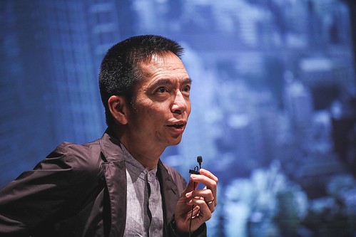
John Maeda at ATypI Tokyo, 2019. Photo by Luke Garcia.
Top. Attendees examine ATypI Tokyo goodie bags handed out to them. Photo by Rodrigo Esper.
Endangered or suppressed languages and scripts were one recurring theme of the presentations. Another was the practicalities of designing typefaces for complex scripts; there were two separate talks, for instance, about techniques for simplifying the production of Korean Hangul fonts. Rathna Ramanathan highlighted the decades-long project of the Murthy Classical Library of India, which publishes classics of Indian literature both in English and in the original languages (of which there are many).
At the same time, there were forays into the printing history of Japan, from lettering for sumo posters (Japanese ‘fat face’) to Modernist typography in Japan both before and after the Second World War.
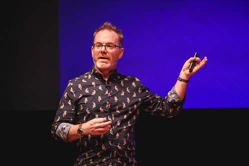
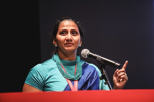
Jason Pamental and Sumanthri Samarawickrama at ATypI Tokyo, 2019. Photos by Luke Garcia.
The focus was not solely on Asian scripts. The very first talk on Friday was Sébastien Morlinghem’s examination of the early years of sans serif type in France. Alexandra Korolkova spoke about the development of modern styles of Cyrillic type, which dovetailed with the ‘Modern Cyrillic’ type-design exhibition that was on display. Sofie Beier reported convincingly on how ageing eyes read differently compared to younger eyes, and what that means for typography.
A team from Morisawa, guided by Matthew Carter, presented an extensive new type superfamily, Role, Morisawa’s first Latin-only type project. Petra Dočekalová drew our attention to Czech handwriting-based scripts; she also showed an advance copy of an impressive book about the work of prolific Czech typographer Jaroslav Benda. (The Czech edition of the book has been published; an English edition will be out shortly.)
As a prelude to the Annual General Meeting, I gave a short talk about my research into the history of ATypI. The early years, in the 1950s and 1960s, are sparsely documented, so the project involved discovering overlooked archives from founders Charles Peignot and John Dreyfus, as well as interviewing as many as possible of those who still remember ATypI’s beginnings. The first of a series of small books on the subject will be published in time for next year’s conference in Paris. A draft of my account of the origins of ATypI is available now on Medium.
John D. Berry, author of this blog post, at ATypI Tokyo, 2019. Photo by Luke Garcia.

Outstanding presentations included Jason Pamental’s talk on variable fonts and the future of flexible publishing, Underware’s understated tour-de-force (as always), and Petra Černe Oven’s closing keynote, which situated typography plainly in the currents of the contemporary environmental and political situation.
The venue for the conference was the Miraikan, a museum of ‘emerging science and innovation’ in the Daiba district near Tokyo Bay. Somewhat like Docklands in London, Daiba is not near the centre of the city, but it is easily accessible by rail. Attendees could get away from the conference centre location for events such as the Morisawa Awards ceremony, next to the Kanda Myoujin shrine in Chiyoda, or an exhibition of Matthew Carter’s letters at the Book&Design gallery, or visit the remarkable Printing Museum. And of course attendees spent plenty of time exploring the bars and restaurants of Shimbashi, Shiodome, and other lively districts of Tokyo. (The retro-80s music bar that Rainer Erich Scheichelbauer discovered was a personal Tokyo-pop-weirdness favourite.)
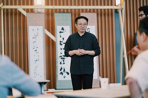
Yin Qiu demonstrating as part of the ‘Chinese Calligraphy Workshop’ at ATypI Tokyo, 2019. Photo by Rodrigo Esper.
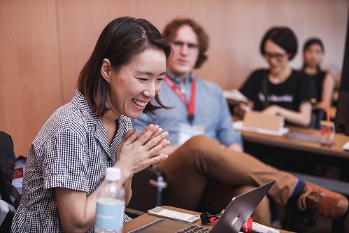
Below. Chorong Kim and Aaron Bell leading the ‘ᄀ to ᄒ: An Intro to Hangul Design’ workshop at ATypI Tokyo, 2019. Photo by Luke Garcia.
The conference was very well attended, and it suffered remarkably few glitches. Getting around was surprisingly easy for a non-Japanese-speaker – much easier than on my previous visit twelve years ago. (Some of this may be a result of preparations for the 2020 Tokyo Olympics.)
Next year, ATypI returns to its roots: ATypI 2020 will take place in Paris. And, as announced in Tokyo, the host of the 2021 conference will be Stockholm. It will be interesting to see where, and when, ATypI’s next Asian conference will be held.
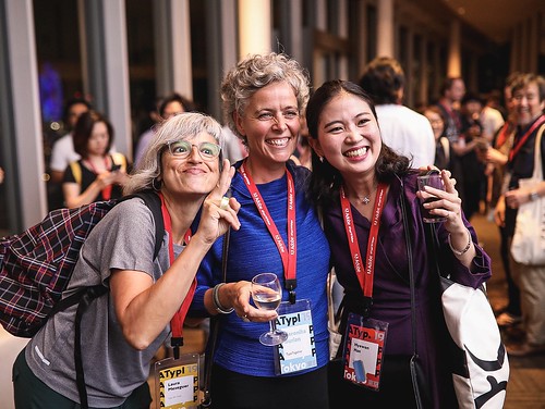
Laura Meseguer, Veronika Burian and Hyewon Han at ATypI Tokyo, 2019. Photo by Luke Garcia.
John D. Berry, editor and typographer, Seattle, United States
Eye is the world’s most beautiful and collectable graphic design journal, published for professional designers, students and anyone interested in critical, informed writing about graphic design and visual culture. It is available from all good design bookshops and online at the Eye shop, where you can buy subscriptions and single issues.

