
Wednesday, 3:00pm
11 March 2026
Shape shifters
Chermayeff & Geismar & Haviv
Chermayeff and Geismar
Ivan Chermayeff
Jesse Reed
Order
Wiedemann Lampe
Design history
Graphic design
Posters
Identity: Chermayeff & Geismar & Haviv
Curators: Benji Wiedemann, Jesse Reed, Tom Geismar and Sagi Haviv. Wiedemann Lampe Gallery, 41 Hoxton Square, London N1 6PB. Until 19 March 2026.Quentin Newark salutes ‘the most perfect compressions of visual metaphor, reference and formal strength’ in the short history of graphic design
Last Thursday I went to a launch of a book of the most select symbols by Chermayeff & Geismar & Haviv (CGH), writes Quentin Newark.
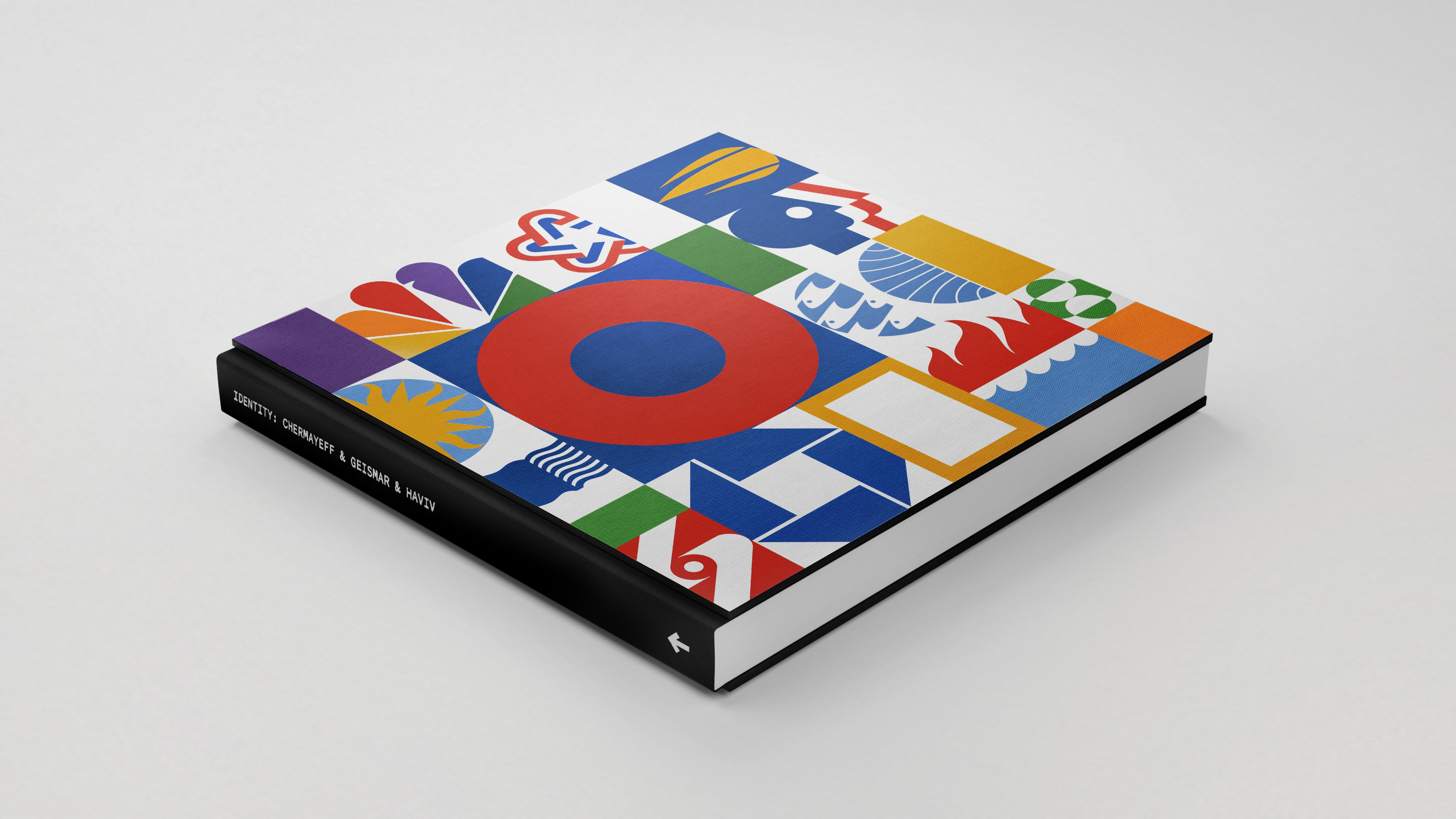
The book – Identity: Chermayeff & Geismar & Haviv – is a ‘compact, expanded’ edition of what is possibly Standards Manual’s best-selling book. Identity was first published in 2018, a year after the death of founding partner Ivan Chermayeff (1932-2017). Tom Geismar (b.1931) and Sagi Haviv (b.1974) are still going strong.
Cover of the Compact edition of Identity: Chermayeff & Geismar & Haviv published by Standards Manual (2025). Book design by Order.
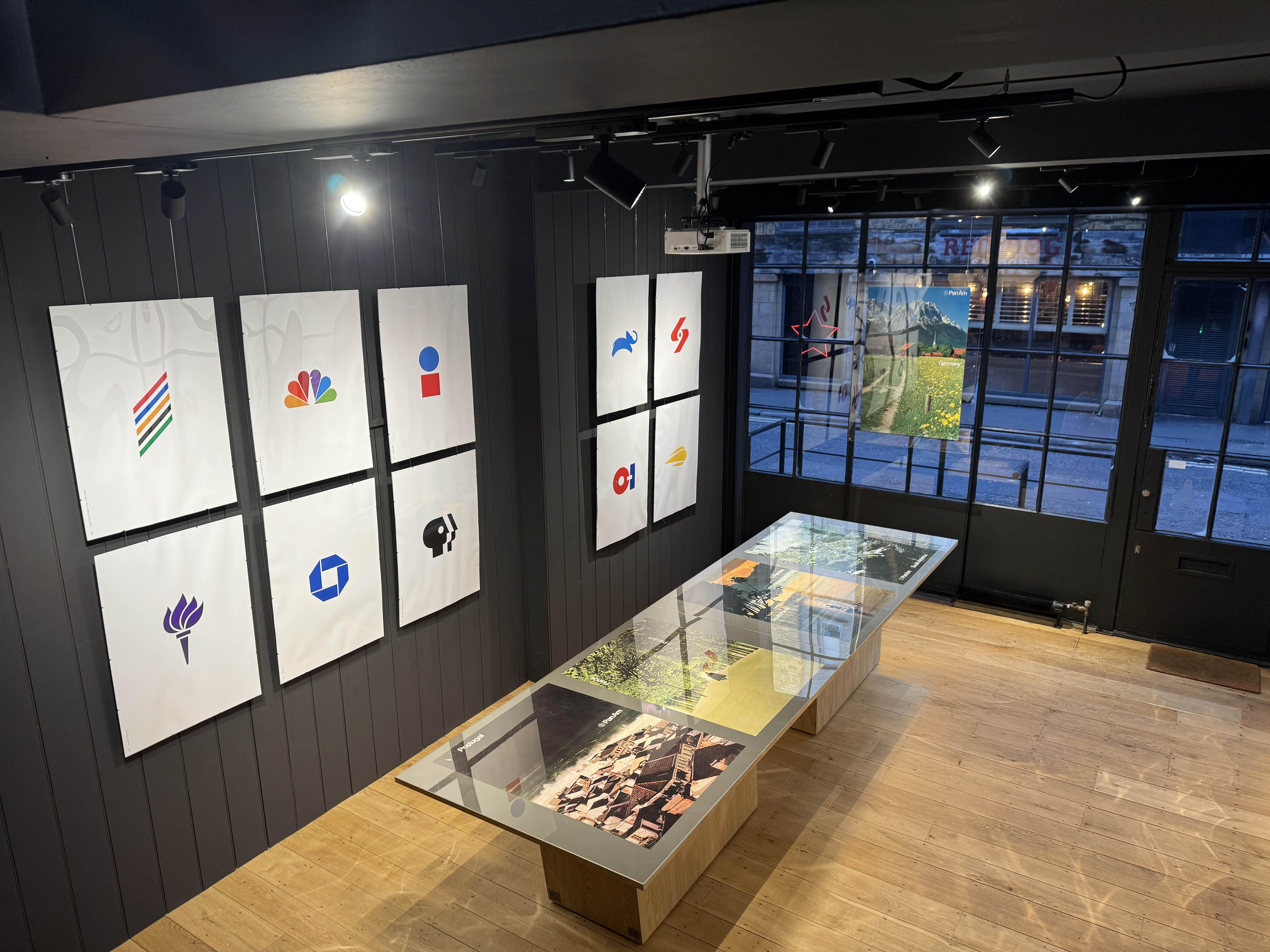
Top. Wiedemann Lampe Gallery. Although small, the exhibition is intense.
Banco Multiva (2025) combines ‘m’ and ‘b’ to capture the Mexican bank’s core business, the growth of money, also adding what Paul Rand called a ‘mnemonic’, a twist that sticks in the mind.

Standards Manual was started by New York agency Order (founded by Jesse Reed and Hamish Smyth) to make a crowdfunded reprint of the New York City Transit Authority Graphic Standards by Unimark, the subway sign scheme that is as much a part of the fabric of New York as Frank Pick’s scheme is for London. Standards Manual has gone on to show us the guidelines for NASA’s ‘worm’, literature from America’s National Parks and Coke / Coca Cola, all immaculately done.
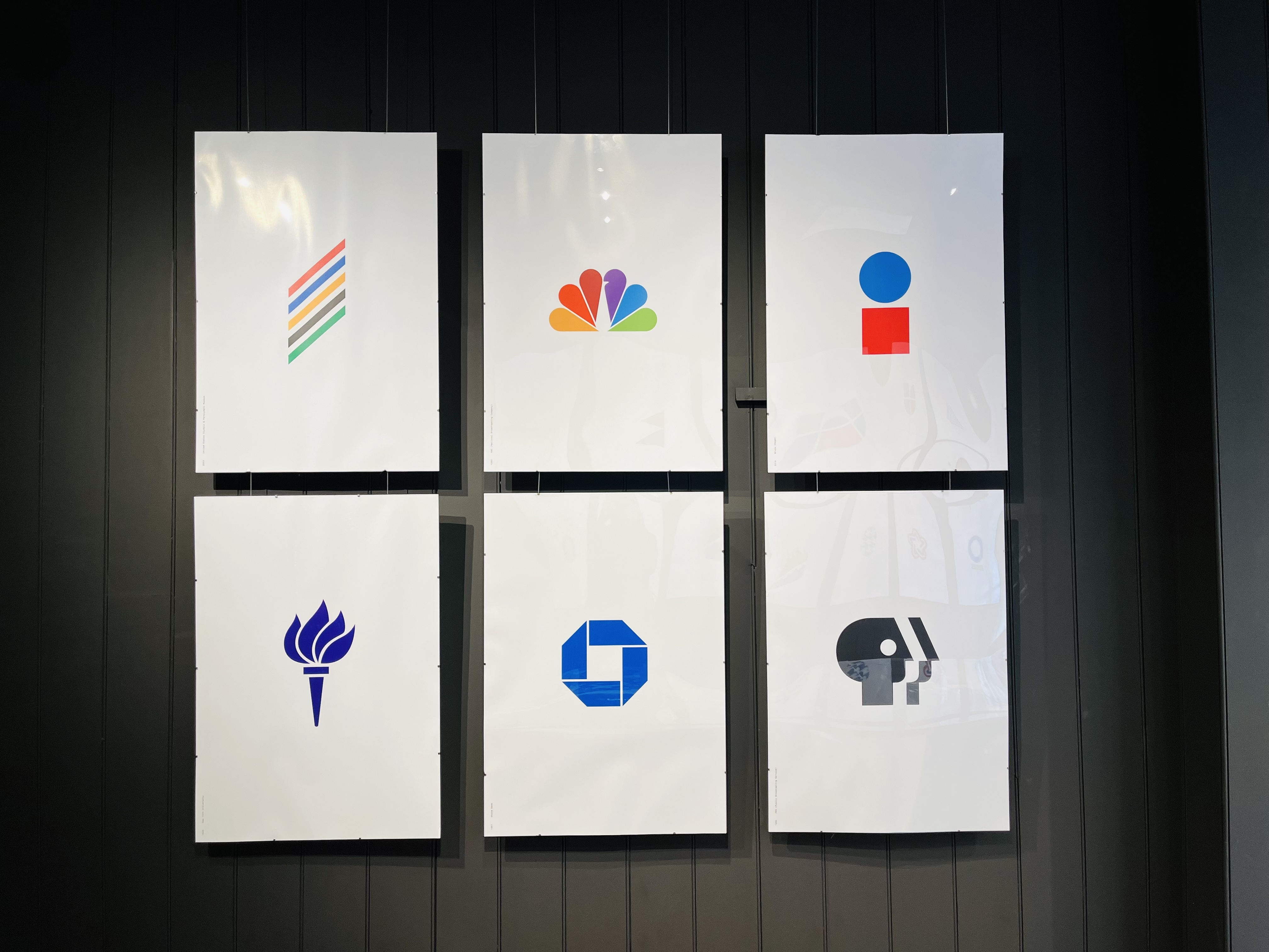
CGH’s mark for the USA’s 1976 bicentennial is a study in reduction, a single star from the ‘Star-Spangled Banner’, wrapped by Verner-Panton-style curves. The stripes form the star, which isn’t actually there.

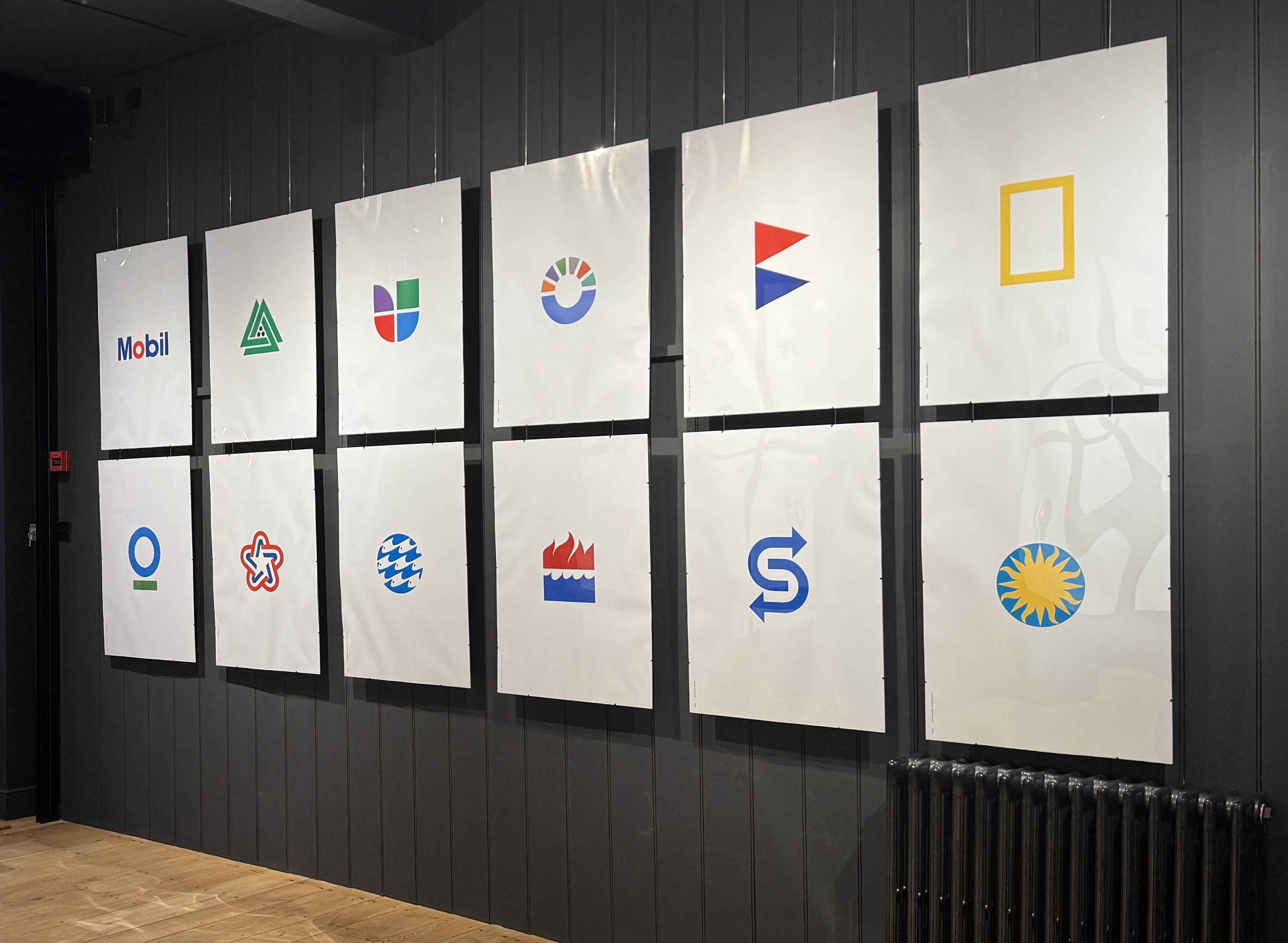
CGH uses geometry as relentlessly as the Swiss, but adds metaphor and humour, like the ‘o’ in Mobil becoming a car wheel, and the end of a petrol nozzle.
The walls of Wiedemann Lampe’s bijoux, ground-floor gallery are emblazoned with CGH’s intense graphic forms. I could go on and on about the gems you can gaze upon if you go, or buy the book.
Spreads from Identity include the celebrated ‘Pan Am’s World’ Posters (see Eye 73) and applications that show the symbols in use, the true test of whether a logo works.
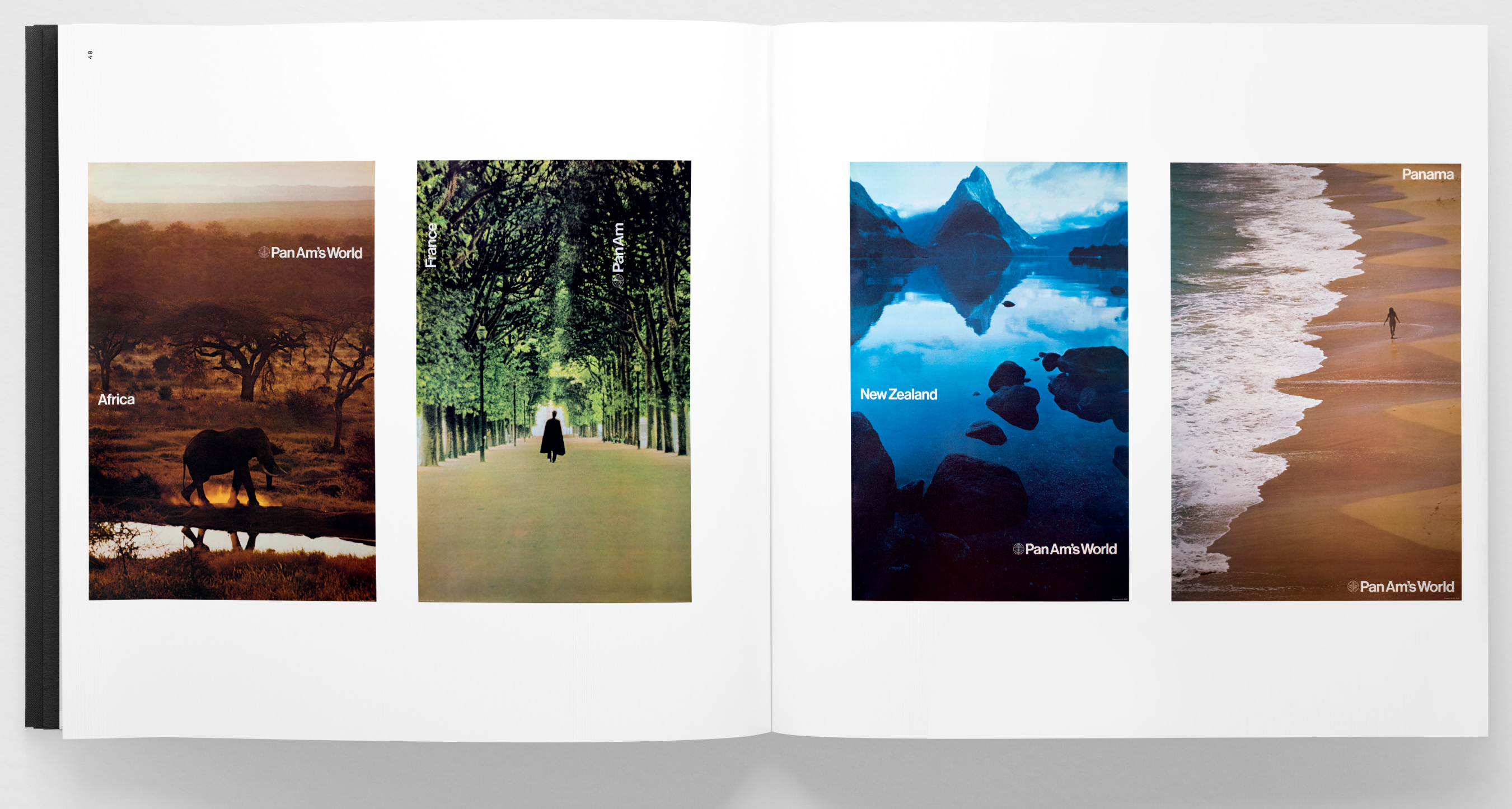
Pan Am, 1971.
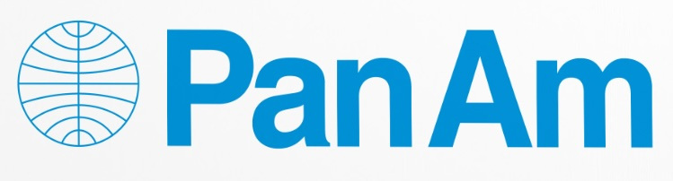
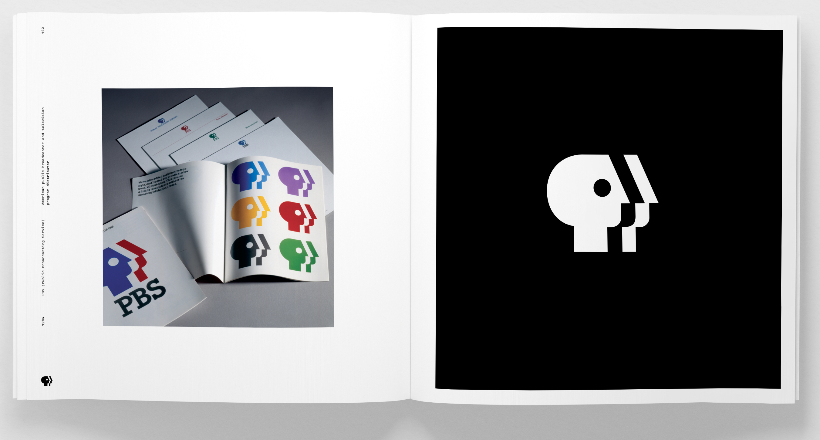
Pan Am with its globe made of flight-paths. Public Broadcasting System (the United States’s BBC) with its trio of viewers. The incredible Celtic-interlacing of an eye and an ear, television and radio, for CBS. And the one that started it all, their first breakthrough symbol of 1961, the Escher-like winding-ribbon octagon that nestles a square, of Chase Manhattan Bank (below, lower row centre).
This initial for Mexican TV brand Grupo Imagen (2016) plays with two shapes that have intrigued artists since Leonardo da Vinci. The circle is perfection, the square imperfection. CGH uses them to make an ‘i’.

Why are these symbols so good?
The Swiss of the 1950s were very concerned to create a kind of graphic design that was neutral, devoid of the human hand, of authorship. Max Bill wrote that the aim of design was to be ‘objective’.
In my opinion, CGH goes further than the Swiss. They take simplified graphic shapes, triangles, circles, etc. and turn those elemental forms into a metaphor. A picture. A circle and a square become a letter, a person. A star becomes a celebration and a people. There is an air of humour, of wit – some sense of a game being played. The noses of fish become a river. Two shapes, an octagon and a square, somehow convey efficiency and security. An eye unravels into an ear. There is shape-shifting magic afoot.
If one had to show just one set of work (impossible request) that showed graphic design as an art every bit as complex, clever and visually impactful as any art perfected by humankind, what would it be? The sketchbooks of Alan Fletcher? Jock Kinneir & Margaret Calvert’s road sign system? Shigeo Fukuda’s drawings? Russian Revolution posters from David King’s collection? (Actually the last ones actually are accepted as art, they are in the Tate.)
I would choose the symbols of Chermayeff & Geismar & Haviv – the unquestionable peak of what symbols can be, the most perfect compressions of visual metaphor, reference and formal strength in the short history of our trade.
Quentin Newark, graphic designer, London
Eye is the world’s most beautiful and collectable graphic design journal, published for professional designers, students and anyone interested in critical, informed writing about graphic design and visual culture. It is available from all good design bookshops and online at the Eye shop, where you can buy subscriptions and single issues.