Monday, 7:16pm
22 November 2010
The science of magazine design

Richard Turley
the magazine department
Graphic design
Illustration
Magazines
Posters
Typography
Stack America’s infographic explores the fundamentals of art direction

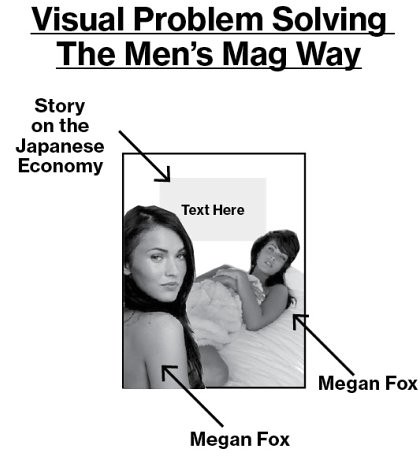
Few people outside the hothouse world of magazine production realise what a difficult and intellectually demanding job editorial art direction can be, so we are deeply grateful to Eye contributor Andrew Losowsky (of Stack America) for this carefully researched chart by Richard Turley and his team (Rob and Kenton) at Bloomberg Business Week.
You can see the full infographic here or here.
It’s an essential guide for freelances, salaried drudges and students alike, with practical advice on ‘Visual Problem Solving’ (above) and a handy Glossary (below).
Not to mention detailed analysis of some key differences between editors and designers (below).
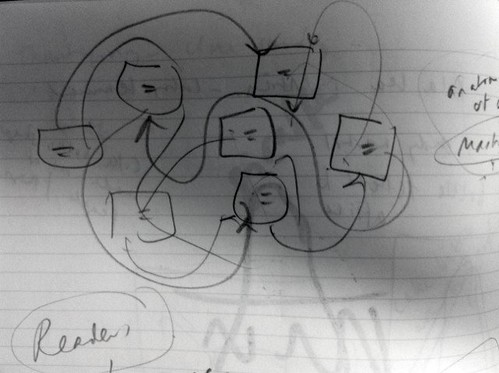
We contacted Turley for some insights into his team’s research process: ‘The big loss was not finding a home for one of those charts (rough diagram, below) with boxes of text with lines and arrows pointing everywhere, which distils the entire experience of working in a magazine down into one easily unnavigable chart.’
Turley continues: ‘We also struggled to deal appropriately with chronic alcoholism and the large portion of the day given over to “balanced critical evaluation” of other magazines’ work, especially those posted on Magculture and SPD.’
Here at Eye, alcoholism notwithstanding, we’re preparing a big section about information graphics for the Winter issue, so we’re glad to have such a clear explanation of the process. Particularly now that we’ve reached the ‘Dicking Around’ stage (below) of the Eye production cycle. Stack America, we salute you.
Eye magazine is available from all good design bookshops and at the online Eye shop, where you can order subscriptions, single issues and back issues. The Autumn issue, Eye 77, is out now. See Eye before you buy on Issuu for a taste of its contents.
For regular updates, please sign up for the editor’s newsletter.


