Summer 2005
Aggravation
London 2012 Olympic bid campaign
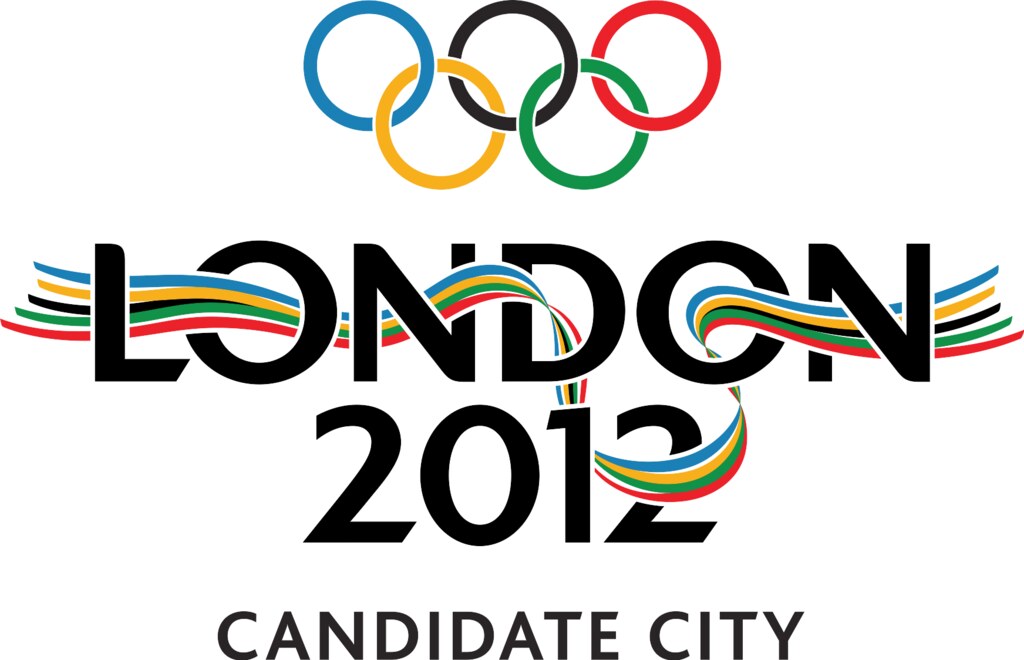
In November 2004 the logo for the London bid for the 2012 Olympics was launched on a vast banner across the front of the Tate Modern building. Now the logo and its attendant slogans can be seen on buses, the underground, even on train seats, on hoardings and fluttering from lamp posts lining the capital’s streets. In various incarnations it encourages Londoners and the capital’s visitors to ‘Back the Bid’.
‘Our aim was to create a flexible logo that was integrated into the words “London 2012” but would be strong enough to stand alone,’ says Andy Stanfield of Kino Design, who came up with the logo. ‘We chose the River Thames because it flows through the centre of London and is the point at which many of the city’s waterways and communities meet. It is also symbolic of the people from all over the world that flow in and out of London, defining its style, personality and vibrancy.’
The design seems considered and effective – hence its success against 1000-plus other entries – and the logo combines symbols of the local and the ‘Olympic’ with lettering that combines international blandness with the London Transport typeface. The fact that it doesn’t work is down to context.
There are so many graphic designs that look similar, and say so many similar things that they become white noise. The London 2012 graphics are part of a trend towards designs that are so general that they lose all meaning. The logo is identifiable if you recognise the shape of the Thames; for everyone else, it could represent toothpaste, trainers, panty liners, an economic regeneration area or a low-cost airline. Perhaps the failure of the 2012 London bid campaign is simply logo fatigue, the result of a market flooded with aphorisms. The fault lies not with well meaning selection committees, but with designers who try to please them rather than communicate with the public.
First published in Eye 56 vol.14 summer 2005
Eye is the world’s most beautiful and collectable graphic design journal, published quarterly for professional designers, students and anyone interested in critical, informed writing about graphic design and visual culture. It is available from all good design bookshops and online at the Eye shop, where you can buy subscriptions and single issues.