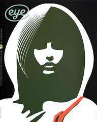
Winter 2001
Inspiration

The ruins of Baalbek in the Lebanon
Photographs from India, the Near East, southern France, the Iberian peninsula, Italy and Greece were sketches for my typographic pictures, and served as the basis for translating aspects of architecture and landscape into type.
In addition to using the typesetter’s standard letters and symbols as individual elements, I was searching for the means to emphasise the planar areas of a composition; in other words, to consider text blocks as shapes. The ruins of Baalbeck in Lebanon, in particular the staircases leading up to the temple precincts, were compelling. I noticed similar stepped patterns on the surfaces of stone walls. Such observations provided sources for many of my (typo)graphic variations and were a significant influence for a brief period on what I called Step Typography.
My contention then was that Swiss Typography needed a fresh impulse. Based as it was on a reductionist philosophy, for instance, was considered suspect - a noisy extravagance. An exaggeratedly long paragraph indent would have been regarded as decoration. The preferred solution was an additional line space because it maintained a flush left-hand margin.
In order the break down such rigid concepts, it was helpful to have a practical knowledge of typesetting. This I had gained as an apprentice, obediently and willingly entrusting myself to the guidance of the master typographer of our printing firm, Wilhelm Ruwe.
During the working day a typesetter would set type properly; letterspacing was fixed by the individual pieces of type or optically adjusted with tiny slivers of metal or paper. After hours, however, a typesetter could set a word according to individual whim and imagination, but not many trained in the craft had the interest. Maybe they just considered it inappropriate.
To me, visual rules in typography were not inviolable. My challenge was to renew a fascination with basic design relationships through the medium of typography: slant, weight, size, the character or various types, the limits of readability, and most interestingly, the effects of letterspacing.
From Typography, Wolfgang Weingart, Lars Mueller Publishers, 2000.
Wolfgang Weingart, designer, Basel
First published in Eye no. 42 vol. 11, 2001
Eye is the world’s most beautiful and collectable graphic design journal, published quarterly for professional designers, students and anyone interested in critical, informed writing about graphic design and visual culture. It is available from all good design bookshops and online at the Eye shop, where you can buy subscriptions and single issues.
