Spring 1997
The price of peace

The bland new Euro provides an object lesson in how design represents historical reality.
The idea of a common currency in Europe, for long the subject of abstract argument and dispute in the European Union member countries, took a sharp turn towards real presence at the end of last year, with the unveiling of the competition-winning Euro banknotes. On 1 January 1999, these notes, supplemented by eight coins whose design is yet to be revealed, will start to circulate in countries that meet the EU’s convergence criteria for monetary union. The design of the set of seven notes is bland and unexceptionable. A collage of visual motifs includes the EU flag and a map of the region, but less expectedly also features architectural details. On one side are gates, openings and entrances. On the other are bridges. The explanation from the European Monetary Institute is that these are signs of hope and connection; and they have a pleasing echo of the eternal dialectic of female and male.
It wasn’t well explained at the time of the launch, but the open space at one end of the notes is there for each participating country to add what it will in the way of national identification. This function of the notes, as a ground to be qualified by a national addition, explains their symbolic generality, lack of visual heft, and retiring colours. It is necessary to imagine the design filled out with the name of the issuing country and a queen’s head or a republican bird. The prospects for visually successful final results are not good.
So, like the great project of which they are part, these banknotes have quite a way to go before they become printed reality. Nevertheless, one can draw some lessons from what we have been presented with so far. The project of European Union has its roots in the wish to end the bloody history of the region. That we Europeans have gone through 50 years without armed conflict – overlooking the former Yugoslavia, Northern Ireland and many other less sustained outbreaks of violence – is something new. This relative peacefulness and prosperity is an achievement of secular social democracy, rather than the older European qualities of religious enthusiasm, national vanity and commercial ambition. If one small price of a better life is visual blandness in place of blood-curdling symbolism, then it is worth paying. One could dream that these banknotes had gone much further along the road of pan-Europeanism and worldliness. Thus, a single design with no space for national variants. Rather a common pantheon of famous heads: Chaucer, Comenius, J.S. Bach, Immanuel Kant, Diderot… Then one could try to emulate the highest standards of banknote design – as, for example, in Switzerland – with strong and dignified forms and colours. But in a region where religious and national differences are still alive and raw, this wouldn’t wash. What would the Roman Catholic countries make of Lutheran Bach? If Kant, then why not Descartes? And so on.
In England, I suppose the reaction to this approach would be extreme. These bloody foreigners on our banknotes! The debate over monetary union in this tardy member statelet has brought the constitutional troubles of the “United Kingdom of Great Britain and Northern Ireland” to a head – a queen’s head. Scotland still has its own banknotes, rather stronger in design than the cheapo English efforts, and there the project of union is greeted with more enthusiasm, or at least with the indifference that one often finds on the mainland of Europe. For the Scots, European union could provide the context for some national freedoms that they cannot have in the present constitutional arrangement. Any banknotes free of the face of an English monarch would be welcome. If the Euro notes show a map, dreary fragments of a flag and of Italian classical architecture, and use unmemorable sans-serif letterforms, so be it. But if the head of the House of Windsor’s visage is added, then that is no gain.
The launch of the Euro notes was a rare occasion when graphic design played its part in a public debate. For an evening and a morning, pundits spoke and wrote about forms, colours, symbolism, and what it all meant. And what did it all mean? Despite – or rather, because of – the visual blandness, it was one of the clearer demonstrations that graphic design can’t help but express historical reality, whatever else its makers might think they are doing.
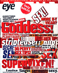
First published in Eye no. 24 vol. 6, 1997
Eye is the world’s most beautiful and collectable graphic design journal, published quarterly for professional designers, students and anyone interested in critical, informed writing about graphic design and visual culture. It is available from all good design bookshops and online at the Eye shop, where you can buy subscriptions and single issues.
