Winter 2016
A single-minded art director
Willy Fleckhaus: Design, Revolt, Rainbow
MAKK (Museum für Angewandte Kunst Köln), An der Rechtschule, 50667 Köln, Germany, 26 August – 11 December 2016
A stone’s throw from the building in Cologne where Twen, Germany’s Zeitgeist magazine of the 1960s, was launched, MAKK’s exhibition of the work of Twen’s art director Willy Fleckhaus was a chance to assess his reputation.
The revolution Fleckhaus set in motion with Twen was not just in the creation of stunning visuals but in the fact that he made the art director’s role central to the conception of the magazine itself. Such was his dominance at Twen that numerous editors came and went, each reputedly nursing a battered ego. Twen was the embodiment of a single-minded vision, a synthesis of New York editorial chutzpah and Germanic rationalism – Madison Avenue meets the Ulm School.
From a generation that came of age during the Second World War, Fleckhaus relished the new-found political, social and sexual freedoms of the late 1950s and 60s and Twen came to represent their flowering, pushing at the boundaries in terms of content as well as visual daring.
The war disrupted Fleckhaus’s education and he learned on the job, beginning his career as a journalist before taking on the role of designer at Aufwärts, a trade union publication, and later at a student paper, Student im Bild, before launching Twen in 1959.
Cover of Twen no. 12, 1963. Here, Fleckhaus repurposes an Irving Penn shot.
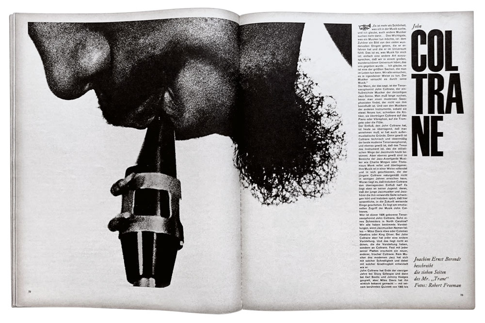
Top: Spread from Twen no. 11, 1962, opening a sequence of jazz portraits by Robert Freeman. Pictured here is Eric Dolphy.
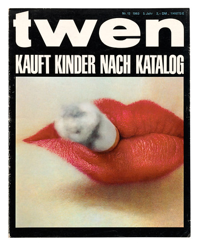
The early issues of Twen are the purest illustration of his approach. Headlines are set in all caps Schmalfette Grotesk. The photography is mostly black-and-white reportage in style. Fleckhaus had a brilliant eye for the visual drama of images, using extremes of scale, contrast and repetition. He was able to draw on a pool of new photographers, some of whom would be showcased at the yearly Photokina show in Cologne. Will McBride, for instance, became a regular contributor, reportedly creating a furore in 1960 when Twen published images of his wife giving birth that were considered obscene. Another highlight is the very graphic and loose early 1960s work of the Czech-German illustrator Heinz Edelmann, who went on to art-direct the 1968 animated Beatles film Yellow Submarine.
Fleckhaus was a master, not only of arranging photographs, headlines and neat columns of text on his trademark twelve-column grid, but also of marshalling often daring amounts of either white or black space into the mix. What was remarkable in the spreads on display was the confidence and conviction with which, for instance, he would blow up a single-word headline across a double spread – such as ‘EHE’ (‘marriage’) in an issue from 1969 – or crop or enlarge a film star’s head or a woman’s breast to larger-than-life proportions, subjecting them to rigorous close-up examination. While it was a shame that some examples in this show were reproductions of spreads, and others were positioned too high on the gallery wall to examine closely, the original prints from some of the photo shoots Fleckhaus commissioned were a treat.
The rainbow effect created by the Edition Suhrkamp series of books, designed by Fleckhaus in 1963 and still in production.
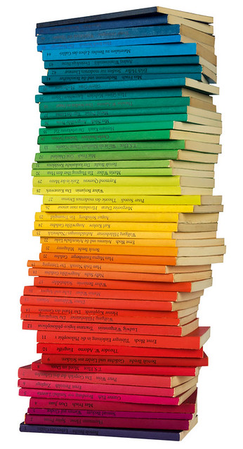
A smaller section of the show displayed his work for the literary publisher Suhrkamp, a regular client for more than twenty years. This work, mainly book jackets, demonstrates a more conceptual side of Fleckhaus’s output. Most remarkable were the covers of the Edition Suhrkamp series, each printed in one of 48 different single-bleed colours, the titles overprinted black in one-size Garamond within a set of eight fine rules. The discipline of these designs is most rewarding seen en masse, when the spines create a rainbow effect. Suhrkamp has been publishing the series since 1963, creating a huge library of titles that survives to this day.
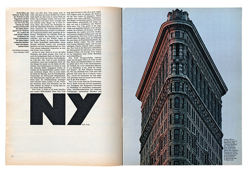
The show concluded with pages from the weekly supplement to the newspaper Frankfurter Allgemeine Zeitung – Fleckhaus’s second stint as a magazine art director, this time for just three years from 1980 until his death in 1983 at the age of 58. As at Twen, he employed an all-black cover, but Fleckhaus’s designs for F.A.Z. Magazin were more controlled and complex than the earlier work. Cut-out images butting into text columns with runaround type would have meant laborious work for subeditors; often these were images of objects reproduced at 1:1 scale, giving the pages a 3D quality. This later work is beautifully crafted but lacks the raw energy and risk-taking of Twen, which still looks as fresh as it must have done 50 years ago.
Spread from Frankfurter Allgemeine Magazin no. 29, 1980. Photograph by Reinhart Wolf.
Stephen Coates, designer, art director, London
First published in Eye no. 93 vol. 24, 2017
Eye is the world’s most beautiful and collectable graphic design journal, published for professional designers, students and anyone interested in critical, informed writing about graphic design and visual culture. It is available from all good design bookshops and online at the Eye shop, where you can buy subscriptions, back issues and single copies of the latest issue. You can see what Eye 93 looks like at Eye before You Buy on Vimeo.

