Winter 2011
Concrete evidence

London Buildings: An Architectural Tour
Robin Farquhar and Hannah Dipper<br> Batsford, £9.99<br>

It is not unusual for the work of artists and designers to make the transition to tableware, as a visit to almost any museum shop makes clear. William Morris mug, anyone? Edward Bawden bowl? In the case of Hannah Dipper and Robin Farquhar, it has been the other way round: the pair’s architectural illustrations are familiar from their People Will Always Need Plates chinaware, popular with design-conscious consumers since 2004.
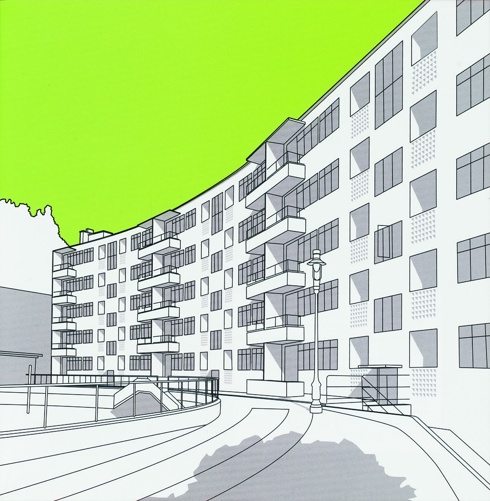
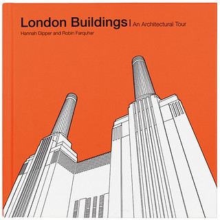
Now we have London Buildings: An Architectural Tour (Batsford, £9.99), a book of Dipper and Farquhar’s precise, crispy-clean line drawings. There are 44 images, each dedicated to a place particularly loved by the designers, including Kensal House (above) and Battersea Power Station (on the cover). Tourist traps are notably absent, so no London Eye, no Nelson’s Column. Classical architecture is represented (Wren, Nash, Soane) but it is the often derided concrete towers and brutalist icons – Centre Point, Barbican, Goldfinger’s Trellick Tower – that seem closest to the authors’ hearts. Denys Lasdun’s National Theatre – likened by Prince Charles to a nuclear power station – becomes an extraordinarily lovely arrangement of orthogonal lines.
All the buildings are drawn in black and white and set against bold blocks of colour – skies of lime, orange, purple. Tall structures are often peered at from street level; 30 St Mary Axe is instantly recognisable from just a chunk of its elliptical outline. People and cars appear only very rarely; birds, litter and urban mess are never allowed to cloud the picture, and only occasionally does anything as fluffy as a grey shadow intervene. Elsewhere it’s all flat colour and precision-ordered lines. This is a book that makes you see the urban landscape with a fresh eye. Looked at through a Dipper and Farquhar filter, almost every tower block and bus station becomes a thing of beauty.
A depiction of Kensal House, one of 44 images dedicated to places particularly loved by the designers.
Top: Cover of London Buildings: An Architectural Tour showing Battersea Power Station.

Jane Lamacraft, editor, writer, London
First published in Eye no. 82 vol. 20 2012
Eye is the world’s most beautiful and collectable graphic design journal, published quarterly for professional designers, students and anyone interested in critical, informed writing about graphic design and visual culture. It is available from all good design bookshops and online at the Eye shop, where you can buy subscriptions and single issues.

