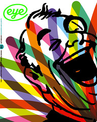
Autumn 2011
Enforced focus

Composition No. 1
By Marc Saporta<br>Published by Visual Editions <br>www.visual-editions.com, £25, $40Visual Editions, the company founded by Anna Gerber and Britt Iversen, has quickly established a reputation for publishing titles in niche editions that exploit the benefits of the books’ visual and physical elements over their digital counterparts – suggested by many to be the only viable future for print publishing (see ‘A nose for type’, in Eye 77 about The Life and Opinions of Tristram Shandy, Gentleman, designed by Apfel). All the publications on VE’s list, both published and proposed, are titles that play with the expected form of the book.
VE’s latest book, Marc Saporta’s loose-leaf Composition No. 1 (www.visual-editions.com, £25, $40) breaks additional ground. Designed by Universal Everything’s Matt Pyke (his first book assignment), this unconventional text is also published as VE’s first foray into the world of iPad apps (£4.99).
Many readers will have seen the ‘book in a box’ format elsewhere – from The Unfortunates by B. S. Johnson (see ‘Random thoughts’, Eye 36) to McSweeney’s (see Eye 79), but Saporta’s original edition of 1962 was one of the first examples in modern literature. Composition No. 1 comprises 150 single pages that can be read in any order. Readers shuffle and select the unbound sheets, defining the narrative for themselves (the author suggests that if you don’t like the story, you should re-shuffle and try again). The text is printed on standard book stock (perhaps too thin for the shuffling required), and each page is backed with a generative illustration that uses every word from the book.
The iPad edition takes the shuffling process one step further. Upon opening the app, the book’s pages flick by, both rapidly and endlessly, until the reader intervenes by pressing their thumb to the screen. The reader is required to keep that thumb in place while reading, too: lift it, and pages resume their hectic transitional blur.
At first, this might sound like an annoyance, perhaps even a bit of a gimmick. However the enforced interaction results in the very thing analysts claim is missing from digital media: focus. With a hundred other apps, bells and whistles at the fingertips of every reader, an immersive sense of engagement is the holy grail for any app developer. With Composition No. 1, there’s no possibility of distraction, since your constant attention is required to make the app functional. Whether this increased concentration reveals that the conceit of the book’s structure is more interesting than the story it contains is another matter.
First published in Eye no. 81 vol. 21 2011
Eye is the world’s most beautiful and collectable graphic design journal, published quarterly for professional designers, students and anyone interested in critical, informed writing about graphic design and visual culture. It is available from all good design bookshops and online at the Eye shop, where you can buy subscriptions, back issues and single copies of the latest issue.
