Summer 2011
Font of all type knowledge

Letter Fountain [on Printing Types]
By Joep Pohlen, Taschen, £44.99, €49.99, $69.99
With fine traditions in type and graphic design, but small sales volumes, Dutch books about typography rarely ever break out of their own domestic market. They tend to be admired, but not read, by the English-speaking world and this is a pity. Letter Fountain, which is an exception, originated in 1994 when Joep Pohlen and Geert Setola identified the need for a comprehensive type reference book for students at the St Joost Academy in Breda, NL, where Setola was teaching at the time.
Working under their own imprint, Fontana, these two designer-educators managed to write, produce and sell 15,000 Dutch, German and French copies within six years. Setola left when Pohlen decided to expand and revise the book, culminating in the fourth Dutch edition (2009), which sold out within a couple of months and won both a German Red-Dot Communication Design Award and a TDC Certificate for Typographic Excellence in 2010.
The page layouts, designed by Pohlen in black and red, use Martin Wenzel’s FF Profile for the main text and Tobias Frere-Jones’ Interstate Light Condensed for the captions and indices throughout. At 640 pages, the book comes with three coloured ribbon bookmarks to help cross-reference entries in its three sections.
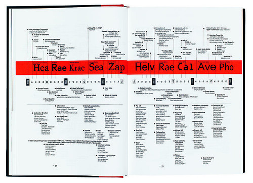
Spread from Letter Fountain: The anatomy of type, published by Taschen in 2010. Design: Joep Pohlen.
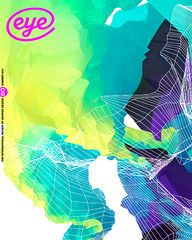
Top. Cover of Letter Fountain, published by Taschen in 2010. Design: Joep Pohlen.

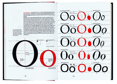
Part one, the main text, offers chapters on historical development, measurement, classification, selection and usage, and a survey of near-contemporary font formats, type designs, foundries and designers. These include diagrams showing the spread and longevity of the older written scripts of Europe, a seven-page timeline that correlates historical developments in type design with landmarks in fine art and design, and a proposal for extending the traditional Vox-based classification of type. For good measure, there are also sections detailing anatomy and construction of letterforms, type design processes (including Walter Tracy’s spacing method), and an introduction to grid-based publication typography.
Part two, the type specimen, comprehensively showcases 35 need-to-know typefaces in differing weights, styles and sizes, in a method owing much to Alan Bartram and James Sutton’s Atlas of Type Forms. Every typeface in this section is accompanied by six well-chosen alternatives, each with a sample setting and the author’s detailed captions. Symbol typefaces are helpfully shown in keyboard charts but, despite the book’s earlier arguments about type classification, the ‘Miscellaneous’ section is badly organised.
Part three, the appendices and indices, runs to 140 pages and provides the clinching purchase decision-maker: a well illustrated historical survey of type-founding companies since Gutenberg (based on the work of John A. Lane, Mathieu Lommen and Jan Middendorp, among others), which is also presented as a graphic timeline.
This ‘Index of Type Companies and Timeline of Type Publishers’ may be a first in English-language histories of the subject, as others have always concentrated on individual rather than company histories – although it is clear that the institutional mergers and acquisitions of historical type collections (both in Europe and further afield) have had a profound influence on what has come down to us today.
Spread from Letter Fountain: The anatomy of type, published by Taschen in 2010. Design: Joep Pohlen.

Unsurprisingly, Letter Fountain shares much with other typography textbooks; Phil Baines and Andrew Haslam’s Type & Typography is probably its nearest existing model. It also has arguments and methods in common with Robert Bringhurst’s The Elements of Typographic Style, Lewis Blackwell’s 20th Century Type Remix, and Karen Cheng’s Designing Type, but in the scope of its ambition, Letter Fountain really presents as a kind of jumbo multipurpose tool for typeface selection and use. Hence the type specimens found in part two, and the typographic ruler calibrated in four units (inch, DTP point, Didot point and mm), which supports Pohlen’s repeated argument for using both metric and point systems.
As a successful self-generated project now aimed at new audiences, Letter Fountain requires better editing and translation than it has received to date. However, the overall impression is one of astonishing value for money. Taschen’s new foreign language editions mean that Spanish, French, German and English-speaking typophiles can enjoy the fruits of Pohlen’s labour. However, if Letter Fountain still intends to address student enquiry, some portion of it probably deserves to be delivered online – otherwise an important younger audience will miss out due to the choice of medium alone.
First published in Eye no. 80 vol. 20 2011
Eye is the world’s most beautiful and collectable graphic design journal, published quarterly for professional designers, students and anyone interested in critical, informed writing about graphic design and visual culture. It is available from all good design bookshops and online at the Eye shop, where you can buy subscriptions, back issues and single copies of the latest issue.

