
Summer 2026
Pop-up type
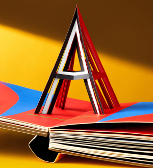
Alphabet in Motion: How Letters Get Their Shape
Designed and written by Kelli Anderson. Published by Katherine Small Gallery, $85, £70. Reviewed by Amy Henry
Alphabet in Motion: How Letters Get Their Shape (Katherine Small Gallery, $85, £70) addresses the history (and dynamics) of typography and letter shapes in a grand-scale two-volume book, with an immersive and sensory approach that invites the reader to play along. Featuring seventeen pop-ups and activities, this substantial hands-on, crowdfunded publication highlights the technologies, histories and philosophies that have shaped letterforms through the ages.
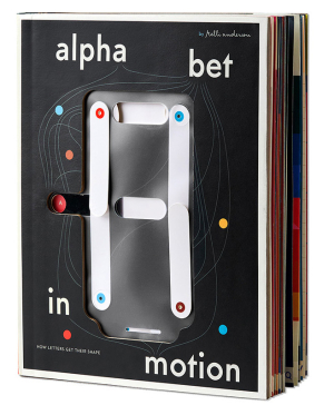
Designed and written by US graphic artist and paper engineer Kelli Anderson, it works its way from A-Z while connecting history and technology to the evolution of type. It covers many topics, from the ancient Egyptian origins of the letter ‘A’ to typesetting technology and more.
The cover is a playful nod to the lettering style of a segment display, seen on digital clocks or calculators, transitioning from an ‘A’ letterform to a ‘Z’ with a simple drag of the finger.
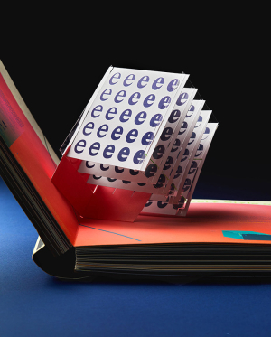
Ultimately, this book draws you into the intricate inner workings of typographic architecture, history and the logic of letterforms, while having fun along the way. Images and captions add context to the pop-ups and detailed information, including film and book recommendations. An accompanying 124-page risograph-printed companion adds scholarship.
Amy Henry, designer, writer, lecturer, London
First published in Eye no. 110 vol. 28, 2026
Eye is the world’s most beautiful and collectable graphic design journal, published for professional designers, students and anyone interested in critical, informed writing about graphic design and visual culture. It is available from all good design bookshops and online at the Eye shop, where you can buy subscriptions and single issues.