Summer 2016
The unsung stencil master

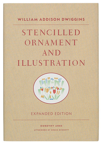
William Addison Dwiggins: Stencilled Ornament and Illustration (Expanded Edition)
By Dorothy Abbe and Bruce Kennett<br> Princeton Architectural Press, 2015, $29.95, £15.99<br>

W. A. Dwiggins (1880-1956), the US designer best known for his typefaces Metro, Electra and Caledonia, has always been an anomalous figure in the history of design. He gets a brief nod in textbooks because he is commonly credited – wrongly in my view – with coining the term ‘graphic design’, but his actual work tends to be ignored. Part of the problem is his love of lettering and decoration, two aspects of design that were swept aside by the new typographers. Although Dwiggins has gained cult status in the past two decades, his new admirers tend to be confounded by the prevalence of ornament in his work.
His youthful work at the dawn of the twentieth century contained decoration influenced by William Morris and the Arts & Crafts movement. Then, under the sway of Daniel Berkeley Updike, classical ornamentation, often from eighteenth-century French sources, entered his vocabulary. But in the mid-1920s, Dwiggins’ decorative work took a sharp turn towards Art Deco – much to the dismay of Updike and others. This aesthetic shift coincided with a change in the method he used to create his decoration, from pen-and-ink drawing to stamping with small woodblocks to constructing designs using home-made celluloid stencils. The stencil was Dwiggins’ universal tool: he used the process to create ornaments, borders and patterns for the books he designed; as a means of ‘drawing’; as an aid in designing type; and even for decorating his home.
Stencilled Ornament and Illustration: A Demonstration of William Addison Dwiggins’ Method of Book Decoration and Other Uses of the Stencil, compiled, arranged, designed and produced by Dorothy Abbe in 1979, was the only attempt to understand and explain these stencils. Abbe’s book was beautiful, informative, inspirational, but fewer than a hundred copies were printed and the edition was quickly snapped up. The Boston Public Library, repository of the Dwiggins collections, reprinted it in paperback a year later but that, too, was quickly exhausted. Princeton Architectural Press has now reissued it with an afterword by Bruce Kennett.
The new book is in two parts: a facsimile of Abbe’s original book in black on warm white paper at the beginning, followed by Kennett’s afterword on bright white paper with a small number of Dwiggins’ stencil designs in colour. Although not as luscious as the original, the facsimile looks good. Nothing has been changed, other than the absence of a stencil ‘tree’ designed for paper company S. D. Warren. The text is set in Dwiggins’ Winchester Roman and Italic – a typeface not released commercially during his lifetime – with large folios in ATF Garamond. Since the book was originally printed letterpress, the type has a robustness that matches the stencil designs.
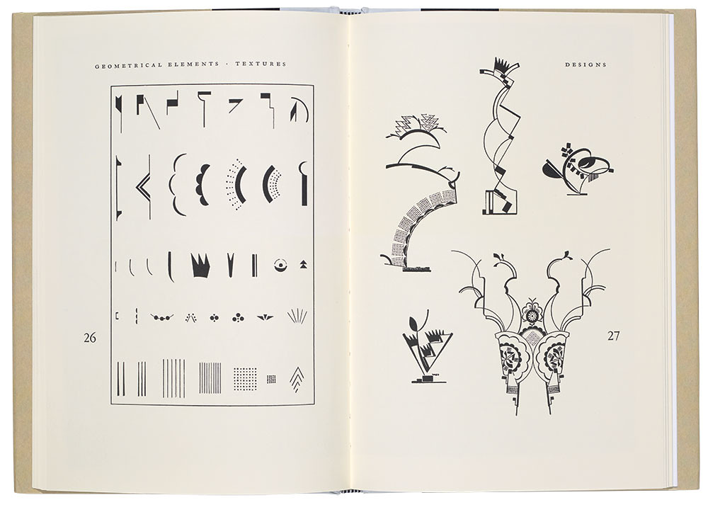
The written part of the facsimile is brief: a preface by Abbe explaining its genesis and purpose; a ‘Note by the Artist’ in which Dwiggins briefly describes the origins of his stencilling, categorises his specimens, and summarises his methods and tools; and a supplement in which Abbe expands upon Dwiggins’ stencilling process using notes he left behind at his death. The supplement is illustrated with photographs of his tools: stencils, brushes, ink slabs and printing frames. The remainder of the Abbe book is a methodical record of the stencils (and their woodblock stamp forebears). Each group of basic stencil units is shown, followed by designs made from them. There are geometrical elements; ‘stems, leaves and flowers’; rule and border elements; ‘special units’ (e.g. human and animal figures); and patterns. At the end there are lettering and musical notation stencils.
Kennett’s afterword describes the relationship between Dwiggins and Abbe and summarises the former’s career and the role stencils played in it. The afterword is set, widely leaded, in Metro Nova Pro Light, Toshi Omagari’s recent update of Dwiggins’ first typeface for Mergenthaler Linotype.
Kennett’s text is supplemented by illustrations in colour of the stencils in use for tickets, bookplates, announcements, greeting cards, books and paintings. It is good to have Abbe’s book back in circulation and to see some of Dwiggins’ stencil designs in colour, but this new book only scratches the surface of what he accomplished. His stencil designs are astounding in their stylistic diversity, the fecundity of their inventiveness and the unpredictability of their colour combinations. Had they been painted large on canvas rather than printed small as part of books and graphic ephemera Dwiggins would be considered one of the great abstract artists of the twentieth century. Now that Modernism and its anti-ornament attitude have been relegated to the past, this aspect of Dwiggins’ peculiar genius can finally get its due.
Cover designed by Paul Wagner.
Top: Spread from William Addison Dwiggins: Stencilled Ornament and Illustration (Expanded Edition) showing geometrical elements, textures and designs.

Paul Shaw, letter designer, design historian, New York
First published in Eye no. 92 vol. 23, 2016
Eye is the world’s most beautiful and collectable graphic design journal, published quarterly for professional designers, students and anyone interested in critical, informed writing about graphic design and visual culture. It is available from all good design bookshops and online at the Eye shop, where you can buy subscriptions and single issues. You can see what Eye 92 looks like at Eye before You Buy on Vimeo.

