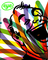
Autumn 2011
When all the dials were set to ‘lurid’

The Lost Album: A Visual History of 1950s Britain
By Basil Hyman<br>Booth-Clibborn Editions, £25‘The past,’ as L.P. Hartley opened The Go-Between in 1953, ‘is a foreign country: they do things differently there.’ The 1950s are no longer the recent past (my past) – they’re ancient history, another world: Gulliver’s Travels. Everything, we now see, was topsy-turvy back there, back then. Telephones were so big and heavy a child would struggle to lift the receiver from its cradle. Televisions were tiny; at least their screens were, peeping like grey eyes out of veneered sentry-boxes, beaming a single flickering channel via a capital H strapped to the chimney-pot.
Nearly everything was black and white, and when colour appeared, it was invariably processed with all the dials set to ‘lurid’. Roads were seemingly empty except for occasional black saloons and milk floats. Even dog turds were black and white in the 1950s.
Basil Hyman sets out to recreate this distant landscape primarily using his own archive, a large box of negatives he had long thought lost. Such a venture might be simply embarrassing, like re-reading your adolescent verse, but in this lavishly presented, chunky edition, it is totally engaging.
Hyman did not take photos like the average 1950s boy, carefully counting off the 24 snaps on his box Brownie, trying to eke them out for the whole holiday. He had acquired a decent camera, a German Baldinette, on his ninth birthday, and his own developing and enlarging equipment. It gave him the rare luxury of photographing indiscriminately; first in and around his house and then out into an ever-wider world, observing the Festival of Britain, the Coronation, work, play, holidays, beer, cars and girls. His photographs are complemented by flashes of colour: brochures, magazine clippings, ration books, tickets, recipes, bills and a football pools coupon – printed alongside, but also tipped in as perfect facsimiles, and used to construct an intriguing cover that sucks you straight in: this is a lovely and loving piece of work.
A simple book has thus grown into a truly three-dimensional object, exploiting the qualities of different paper stocks and sizes; you are immersed in the experience, rather than simply observing it.
This, of course, is exactly what publisher Edward Booth-Clibborn does, and such an approach has never been more important or relevant. ‘Books need to work a lot harder these days,’ he told me. ‘I believe in the importance of good design as well as an original idea. Books need to be tactile and exciting; this is what makes the difference. We’ve been doing this for a long time now, working with artists such as Damien Hirst to create unique books that go just that little bit further.’
However ‘further’ also usually means a trip to the far East, and this book is no exception: it is printed in China.
First published in Eye no. 81 vol. 21 2011
Eye is the world’s most beautiful and collectable graphic design journal, published quarterly for professional designers, students and anyone interested in critical, informed writing about graphic design and visual culture. It is available from all good design bookshops and online at the Eye shop, where you can buy subscriptions, back issues and single copies of the latest issue.
