Wednesday, 4:14am
12 September 2012
Information inspiration
Commercial Type’s Paul Barnes will give the annual Beatrice Warde lecture at St Bride Library.

Type design and lettering today stands atop of a pile of historical information collected over many centuries. Much of this is still visible if we look hard enough.
But how should contemporary designers deal with it, if at all? Should we just ignore past details as unnecessary baggage and push forward to create new forms? Or should we become better informed about the past and see how it relates to our present and our future.
Top: sans serif inscription, Penzance, Cornwall, ca. 1850.
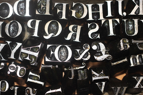
Right: Five Line Pica Roman, as cut by Hugh Hughes for the Caslon and Catherwood type foundry, ca. 1805. Courtesy St Bride Library, London.
In the annual Beatrice Warde lecture at London’s St Bride Library next month (Thu 18 Oct), Paul Barnes, a graphic designer who makes typefaces, will explain how he explores the richness and possibilities of history through his typeface designs without becoming a slave to the past.
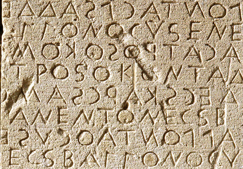
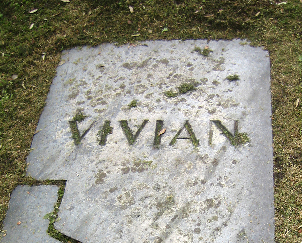
Barnes will show how graveyards (top) inspired his Renaissance style stencil Dala Floda.
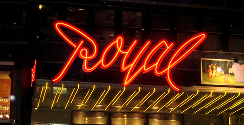
Royal cinema, Stockholm neon sign.
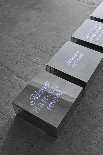
Boxes from ‘Thieves Like Us’ show, New York, October 2011. A collaboration between Dino Sanchez and Commercial Type, Based on the Marian typeface, designed by Paul Barnes, Commercial Type 2012.
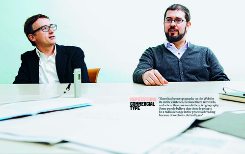
Paul Barnes is a graphic designer who specialises in typography and type design. With Christian Schwartz he is a partner in Commercial Type, a London & New York based digital type foundry. Read more about Barnes, and Schwartz in the Reputations interview in Eye 82 (which features Marian on the front cover).
Opening spread from Eye 82 interview with Commercial Type.
‘You can’t repeat the past’
The Beatrice Warde Memorial Lecture
Thursday 18 October 2012, 7pm
Bridewell Hall, St Bride Library, Fleet Street, London EC4Y 8EE
Admission £5.
eventbrite.com/event/3854498910
After the lecture Paul Barnes will be signing copies of Marian, une collection de revivals (Ypsilon Éditeur), a bilingual book about the creation of the typeface.
Eye is the world’s most beautiful and collectable graphic design journal, published quarterly for professional designers, students and anyone interested in critical, informed writing about graphic design and visual culture. It is available from all good design bookshops and online at the Eye shop, where you can buy subscriptions and single issues. Eye 83 is out now, and you can browse a visual sampler at Eye before You Buy.

