Sunday, 11:51pm
29 March 2009
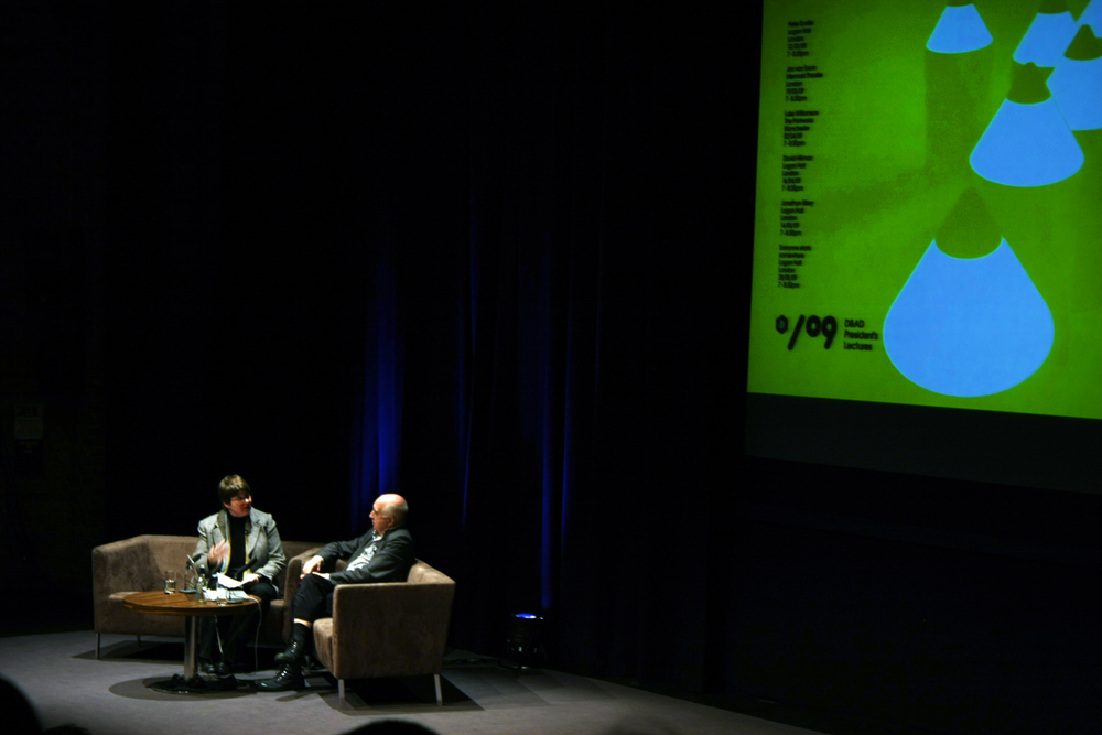
Jan van Toorn at the Mermaid
David King
Jan van Toorn
simon esterson
Design education
Design history
Graphic design
Visual culture
‘Collecting images is not enough. How democratic is it?’

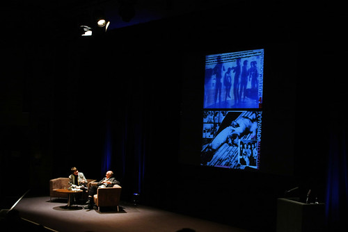
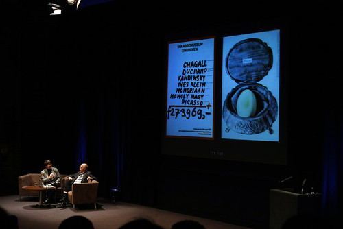
In a very polite, and very Dutch way, writes Simon Esterson, Jan van Toorn used the latest D&AD lecture to remind the audience at London’s Mermaid Theatre about graphic design’s social possibilities. He told us we should break out of our design stereotypes because, ‘it’s boring to produce neat things’.
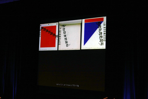
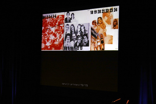
In conversation with the LCC’s Teal Triggs, Van Toorn talked about the importance of content, of a project having meaning that is reflected in its form. Every job should have something to say, rather than just looking good. Indeed, looking good might be the worst result, as the subjective and challenging stand out. He showed his calendars for the printer Mart.Spruijt, where each year Van Toorn worked around a different theme, acting as editor and designer. Deliberately uncomfortable and juxtaposed images and awkward typography are used to make the viewer react and think.
‘Collecting images is not enough’, says Van Toorn, ‘editing is needed to produce meaning.’
It’s a very journalistic way of thinking, and Van Toorn cited the Sunday Times magazine of (art directors) Michael Rand and David King as one of the influences on his approach to picture editing.
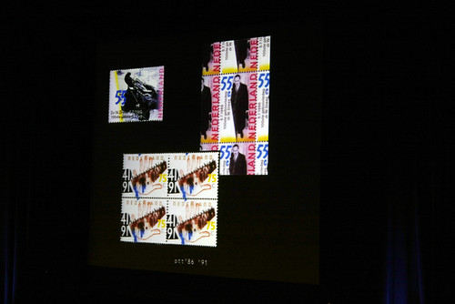
For Van Toorn, Holland was a fertile place to work in the 1970s and 80s, with socially aware clients such as the printers Mart.Spruijt and Rosbeek as well as art galleries, government institutions and the PTT (post office) who were prepared to let him direct the content and form of their printed matter. For the PTT in 1972 Van Toorn produced an annual report with simple, montaged images of the organisation’s workers. ‘It was to be informal … but all that’s over now, the PTT was privatised.’
‘Design,’ he says, ‘should contribute to a better world.’
For Van Toorn the way a project communicates is critical: ‘How democratic is it? The more commercial the world … the more designers accommodated it and design became stereotyped and abstract. In Holland today the form is wonderful … but when we come to the content and meaning then we have a lot of questions.’
See Peter Bi’lak’s review of Jan van Toorn, Critical Practice in Eye no. 68 vol. 17. And the Reputations interview with JvT in Eye no. 2 vol. 1.
Eye is the world’s most beautiful and collectable graphic design journal, published quarterly for professional designers, students and anyone interested in critical, informed writing about graphic design and visual culture. It is available from all good design bookshops and online at the Eye shop, where you can buy subscriptions and single issues.

