Friday, 5:01pm
12 August 2016
Reportage lives
Long reads, big pictures. Newspaper magazines rise to the challenge of telling real stories

This weekend two newspaper magazines step out of their usual structures and remind us what is possible with their formats when you think about content in a different way, writes Simon Esterson.
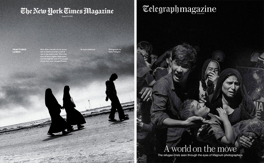
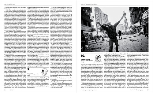
In America, the New York Times Magazine has produced an issue about ‘the castrophe that has fractured the Arab world’ over the past thirteen years: a single 40,000 word piece of journalism by Scott Anderson with twenty black-and-white photographs by Magnum photographer Paolo Pellegrin. The design, by Matt Willey, is book-like with austere monochrome typography and bold title pages that fit the mood of the story. Design Director: Gail Bichler. Editor: Jake Silverstein. The issue runs with no advertising.
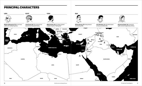
Cover of The New York Times Magazine, ‘Fractured Lands’, 14 August 2016, showing civilians fleeing Basra, Iraq, in March 2013. Photo: Paolo Pellegrin / Magnum Photos.
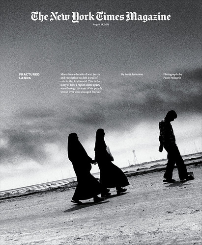
Refugees arriving from Libya at the border near Ben Gardane, Tunisia in March 2011.
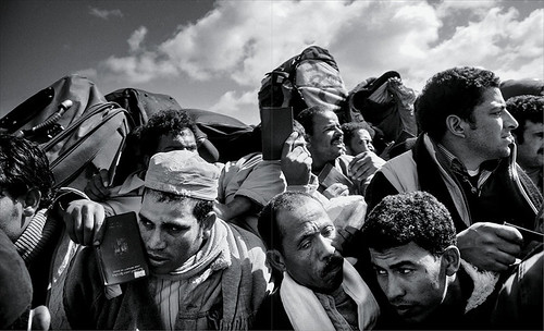
Map and portraits of the six characters featured in Anderson’s reportage. Illustration: Louise Zergaeng Pomeroy.
Spreads from The New York Times Magazine, 14 August 2016. Design Director: Gail Bichler. Art Director: Matt Willey. Editor: Jake Silverstein.
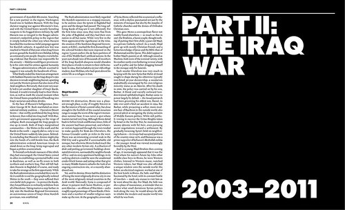
The ‘Fractured Lands’ issue is accompanied by a virtual reality film by video journalist Ben C. Solomon which can be viewed on the NYT VR app (no headset required).
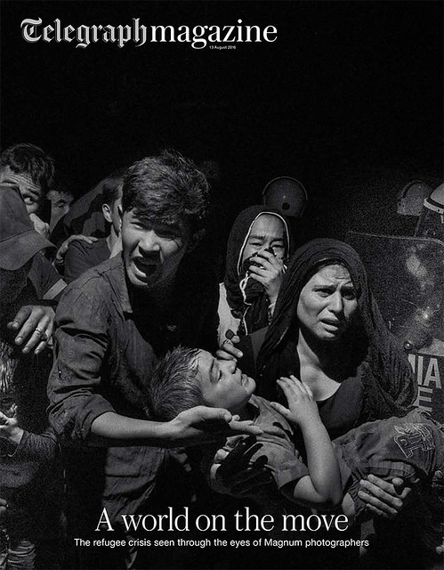
Meanwhile in the UK, this weekend’s Saturday Telegraph magazine has worked with the photo agency Magnum to make an issue that documents the European refugee crisis in pictures.
The issue’s designer Sara Martin told Eye about the process of making this Saturday’s edition:
‘Magnum approached the Telegraph with an opportunity to showcase some of the most powerful images taken of the refugee crisis by the agency’s photographers. With the editor and picture editor of the Saturday magazine, we had access to their vast archive of photographs, each one capturing a poignant moment of the crisis. We edited the pictures and put a story together to take the reader on a journey from making the decision to leave the country and embarking on the migration and ending with the positive stories of host nations and families taking people in and giving them a home. The photographers gave interviews telling the stories behind their images, but we kept the text to a minimum, feeling that the images themselves told the strongest story.’
Cover of Telegraph magazine, ‘A world on the move’, 13 August 2016. Creative Director: Jon Hill. Art director of this issue and special projects art director: Sara Martin.
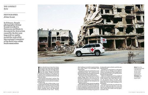
Spread showing a Red Cross vehicle in central Homs, Syria, in February 2016. Photo: Jérôme Sessini.
Spread showing aid workers in South Sudan gathering sacks of grain at the World Food Programme airdrop site. Photo: Matt Black.
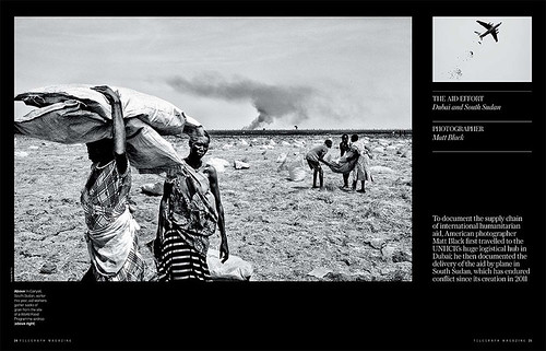
Spread from Telegraph magazine, 13 August 2016.
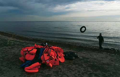
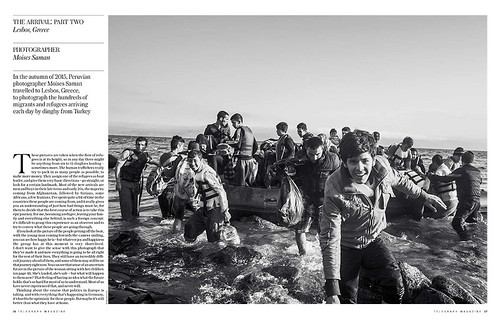
Spread showing migrants and refugees arriving at Lesbos, Greece, on dinghies from Turkey. Photo: Moises Saman.
Simon Esterson, Eye art director, London
Eye is the world’s most beautiful and collectable graphic design journal, published quarterly for professional designers, students and anyone interested in critical, informed writing about graphic design and visual culture. It is available from all good design bookshops and online at the Eye shop, where you can buy subscriptions and single issues.
