Thursday, 2:50pm
14 June 2012
Noted #38

noted
Design history
Graphic design
Illustration
New media
Photography
Posters
Technology
Details, webfonts, operatic Len Lye, torn posters and Olympic variations

Here are some links to things that have caught the attention of the Eye team over the past week or so.
Handsome website for today’s Ampersand in Brighton, designed by Clearleft. This uses a logo designed by Aegir Hallmundur, and fonts from Jeremy Tankard’s Trilogy family. (There is also an alternative ‘Swiss’ version, using Ian Lynam’s ‘Clobber Grotesk’.)
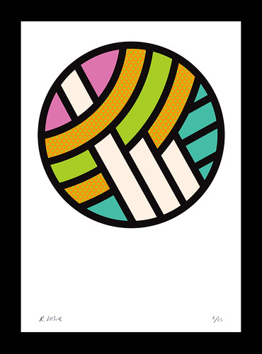
There’s a new show, ‘Details’, at Kemistry Gallery in London with artwork by Rob Lowe (aka Supermundane), who is also the art director of Fire & Knives, Anorak and Cagoule.
Above: Rob Lowe, Round Two, 2012.
Sarah Hyndman continues to defy London Olympics over-branding with her ‘Olympic logo a day’ project.
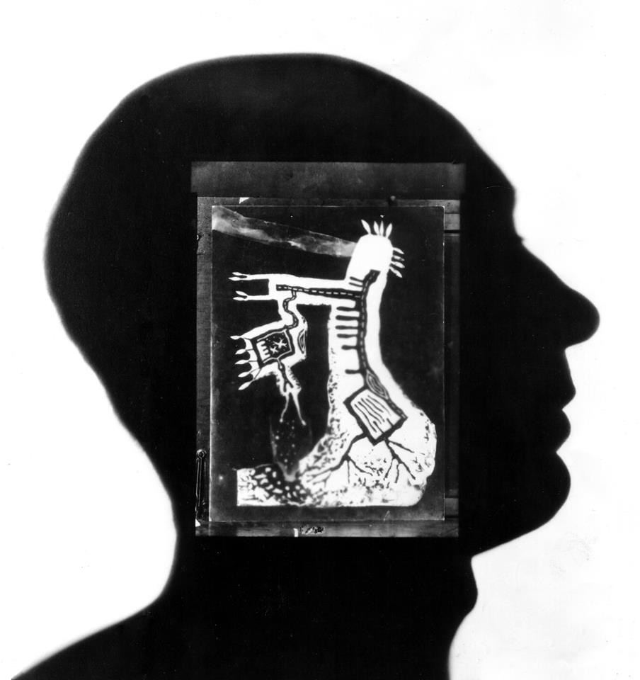
Intriguing images (top) from Auckland in New Zealand, where preparations for Len Lye the Opera are under way.
Photographs of torn posters and other East End views by John Claridge, with elegant commentary from The Gentle Author. (See also ‘Surface wreckage’ by Rick Poynor in Eye 43.)
Eye is the world’s most beautiful and collectable graphic design journal, published quarterly for professional designers, students and anyone interested in critical, informed writing about graphic design and visual culture. It’s available from all good design bookshops and online at the Eye shop, where you can buy subscriptions and single issues. Eye 81 has the theme of ‘Designers and clients’. Eye 82 is out now.

