
Tuesday, 8:30am
21 April 2026
Books received #63
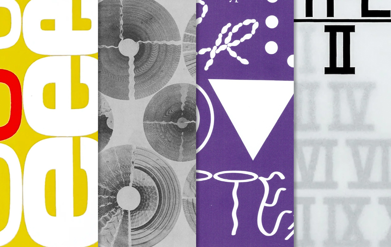
Type Designers of the Twentieth Century, Après la typographie, A Queer Year of Love Letters and Slanted’s Support Independent Type II
Eye’s latest Books received post features four publications covering different aspects of typography: type designers, typographic history, independent type foundries and approaches to typography based on rarely featured histories.
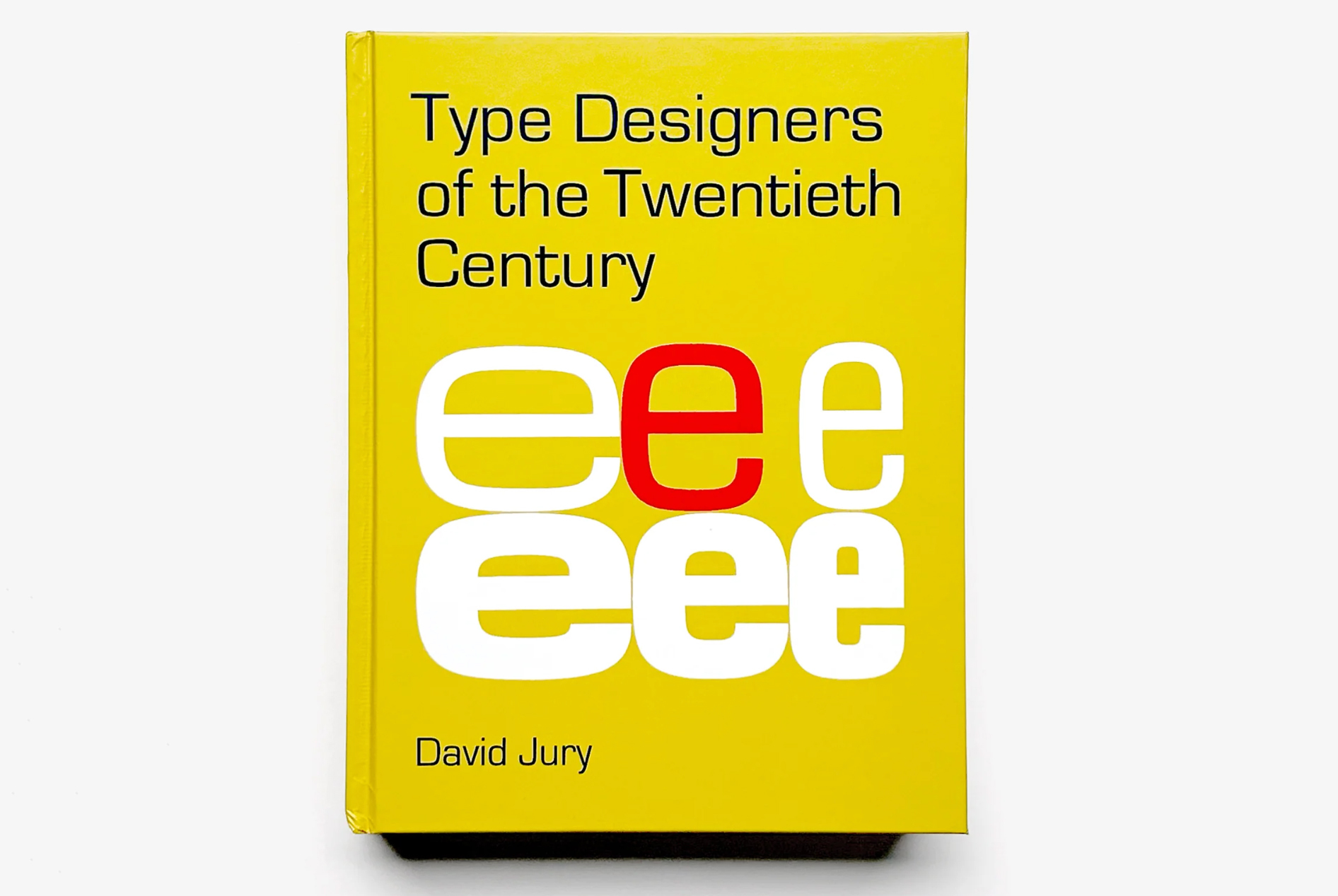
Type Designers of the Twentieth Century (Bodleian Library Publishing). By David Jury. £40
In this book, writer, type historian and designer David Jury features 37 type designers who represent evolving technologies through time, along with styles and tastes. Included are a designers such as Frederic Goudy, Edward Johnston, Hermann Zapf, Adrian Frutiger, Neville Brody, Carol Twombly and many more.
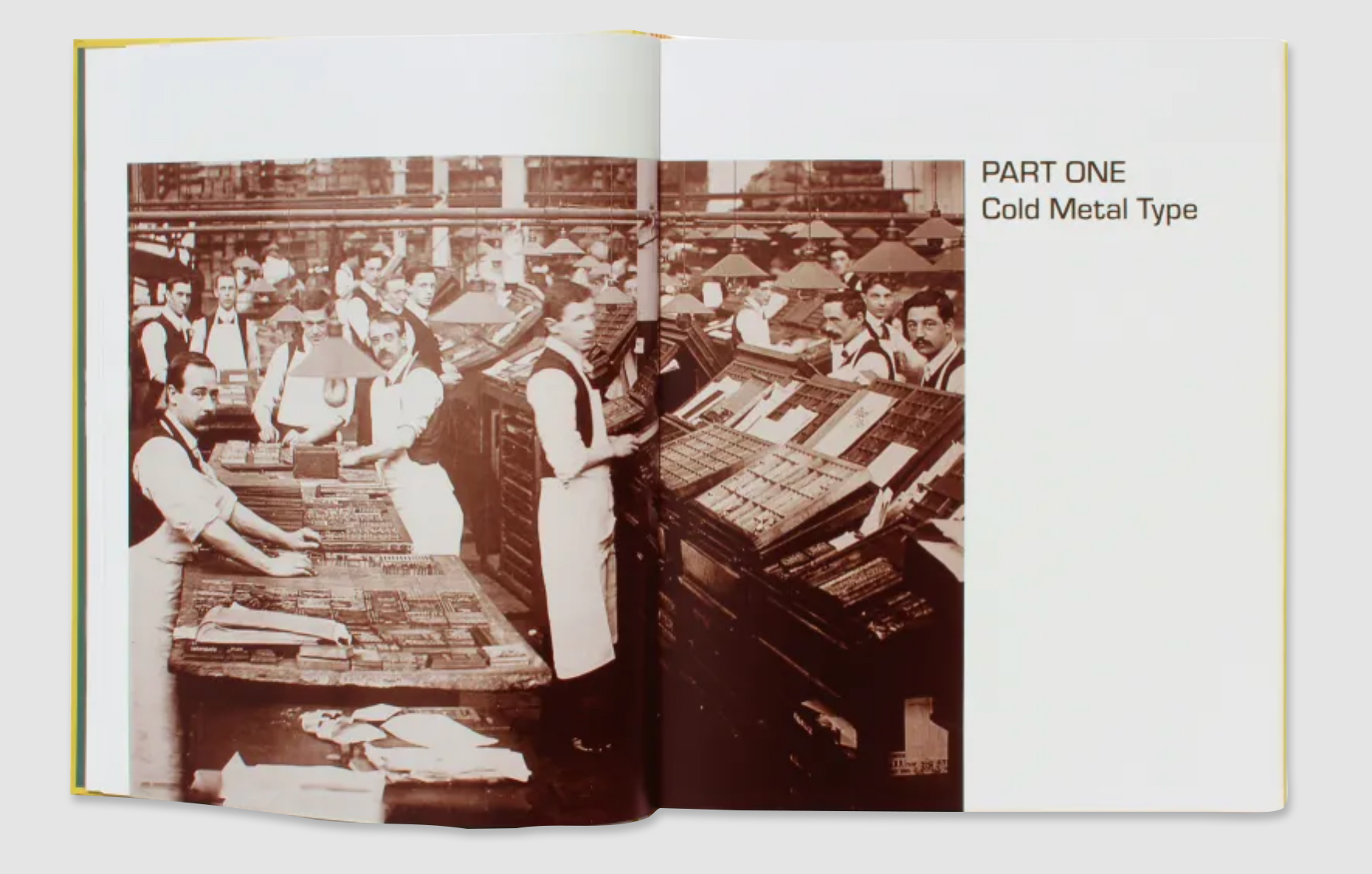
Part One of the book, ‘Cold Metal Type’, features a hand-setting foundry type in a busy UK newspaper printing office, ca. 1930s. Above. Cover of Type Designers of the Twentieth Century.
This book is underpinned by the background story of technological evolution in printing technology which impacted the world of typeface design. Alongside a selection of historical imagery, the publication is sectioned into four parts: Cold Metal Type, Hot Metal Type, Phototypesetting and Digitisation.
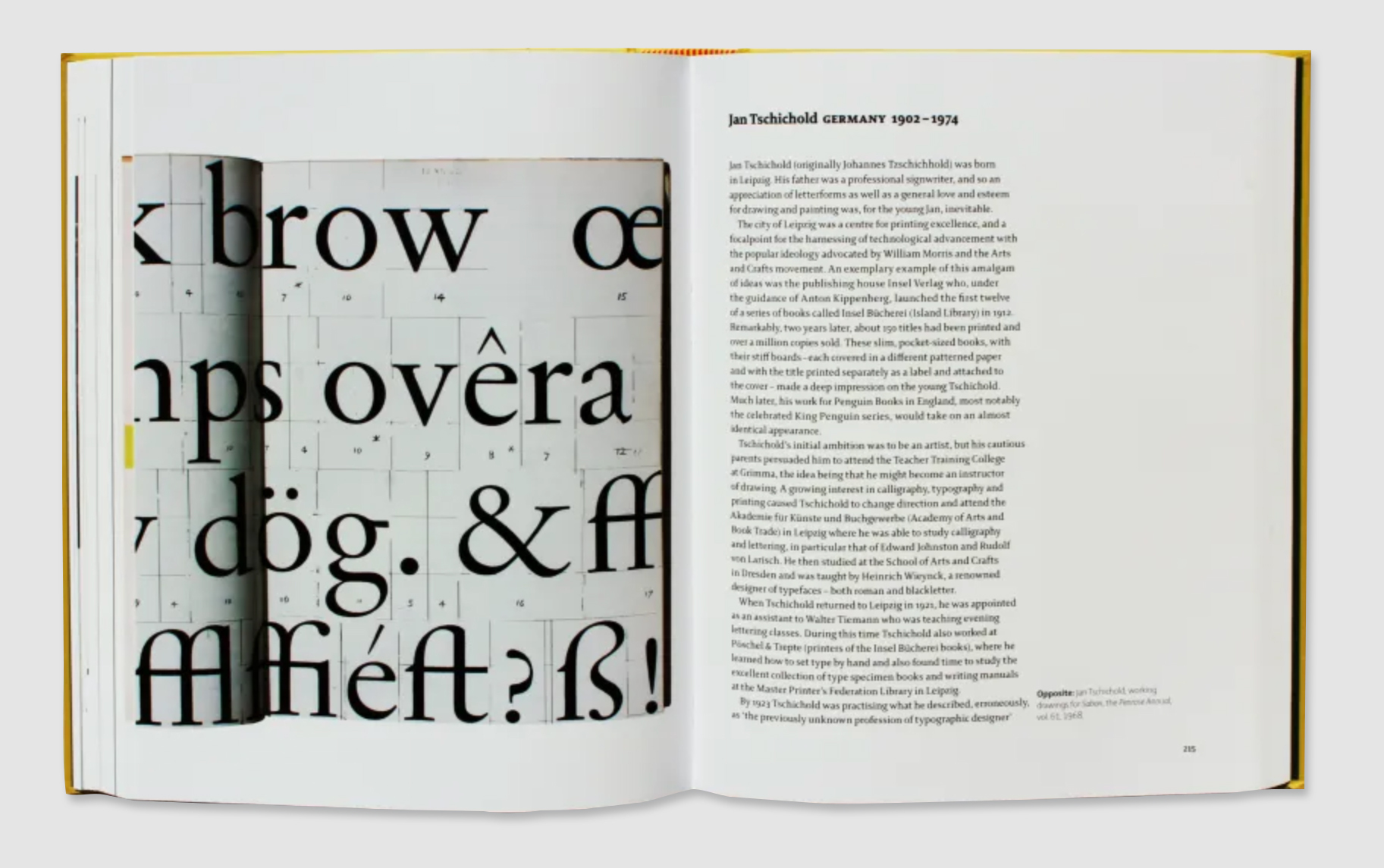
A spread from the book in Part Two, ‘Hot Metal Type’, featuring Jan Tschichold and his working drawings for Sabon, the Penrose Annual, vol. 61, 1968.
Accompanied by extensive notes, this book explores the development of type design through the rise of the advertising agency and the changing function of the printer. Jury includes in-depth descriptions of the working methods implemented by each designer, along with the typefaces they designed.
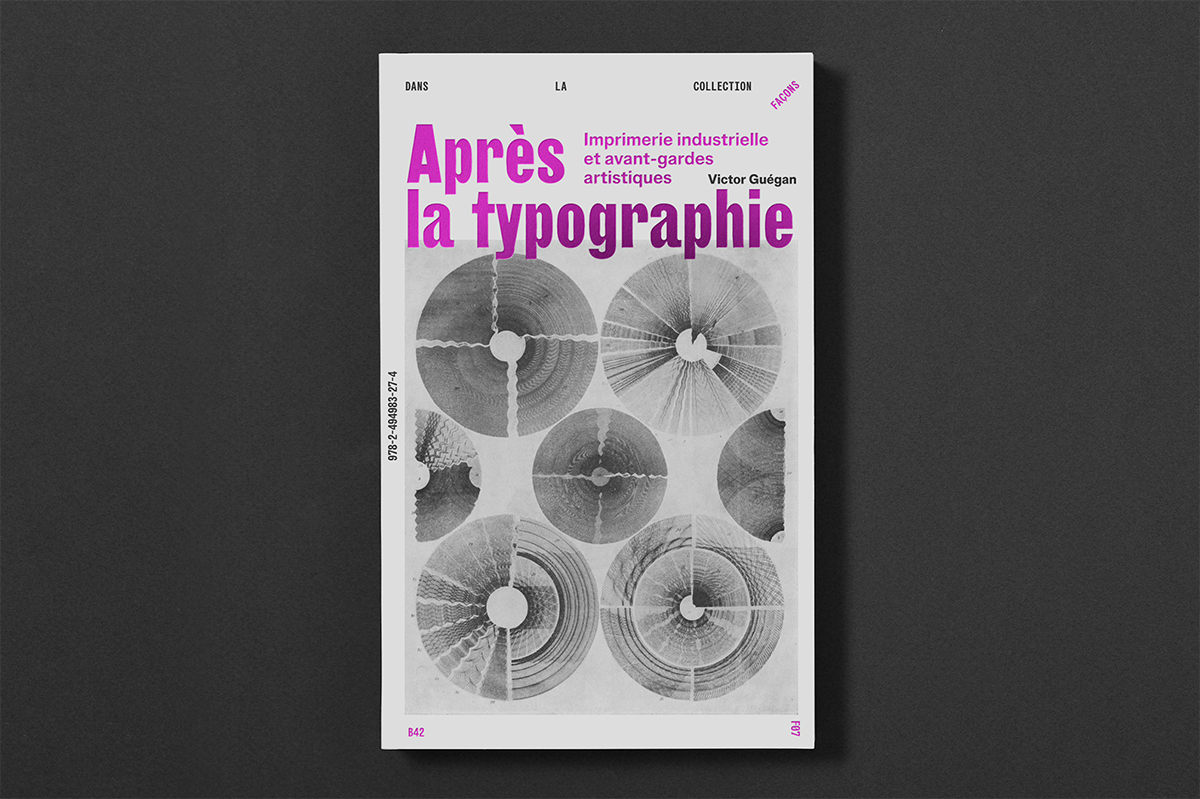
Après la typographie: Imprimerie industrielle at avant-gardes artistiques (Éditions B42). By Victor Guégan. In French. €23
From a typographic perspective, this book examines how the graphic revolution was driven by avant-garde artists of the interwar period, predominately in Germany. Featuring work by artists such as Herbert Bayer (see ‘Big business, big world’ on the Eye blog), László Moholy-Nagy and El Lissitzky. It asks ‘How should we interpret, in the long history of European printing, the incursion of artists into the relatively closed field of print design?’
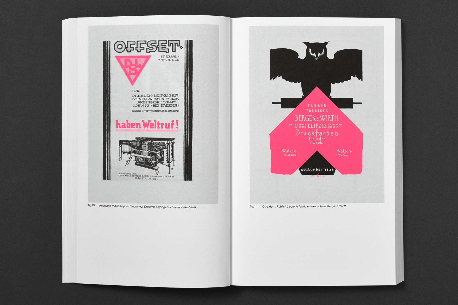
A spread from the book featuring an advertisement for the Dresden-Leipziger Schnellpressenfabrik printer on the left and an advertisement for the paint manufacturer Berger & Wirth by Otto Horn on the right. Above. Cover of Après la typographie.
Investigating a very specific timeframe in graphic design and typography history, this book acts as a modern re-examination of the issues surrounding Jan Tschichold’s concepts presented in his book The New Typography. Guégan examines the role of the typographer and how technical processes surrounding typography shift and disappear with industrialisation.
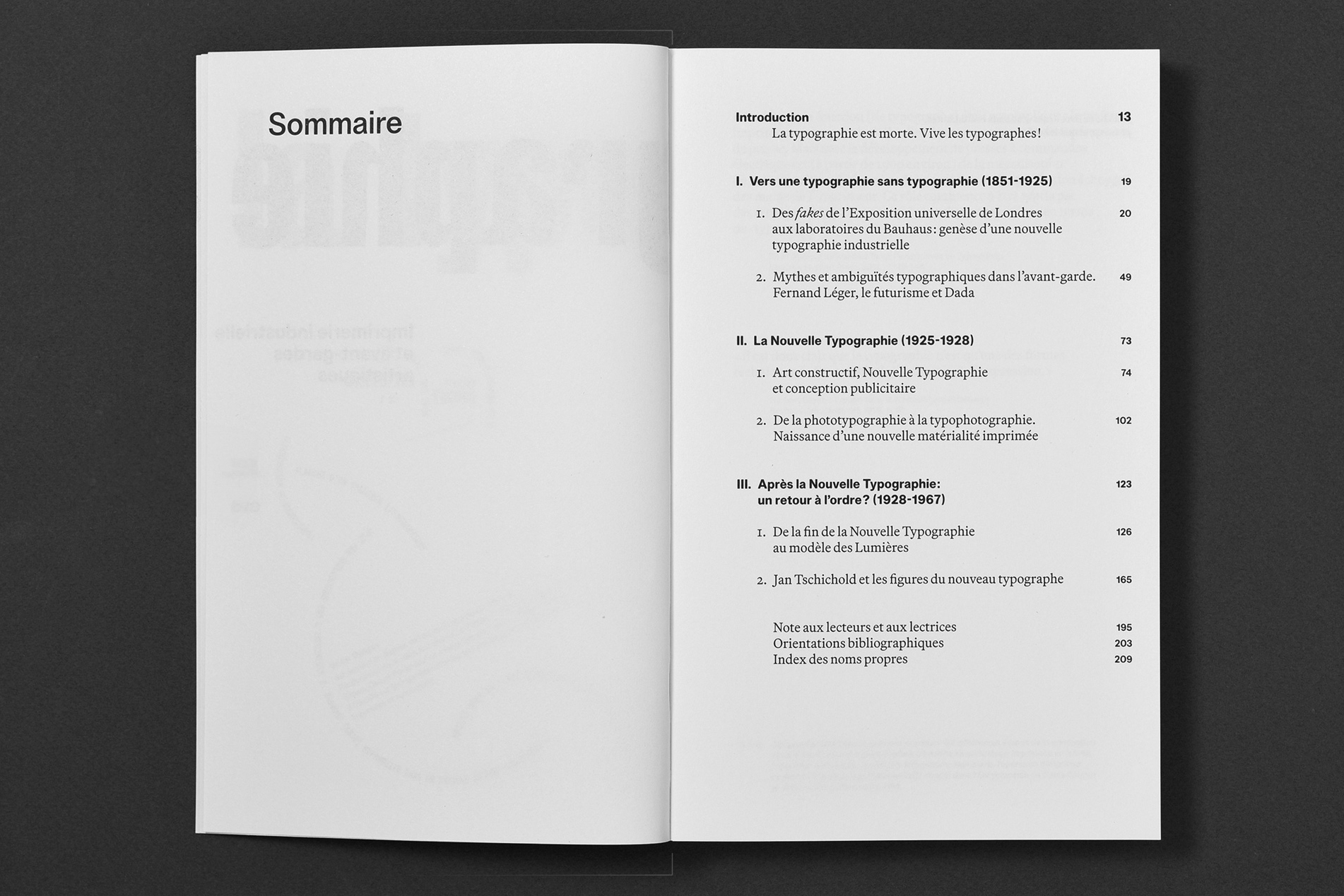
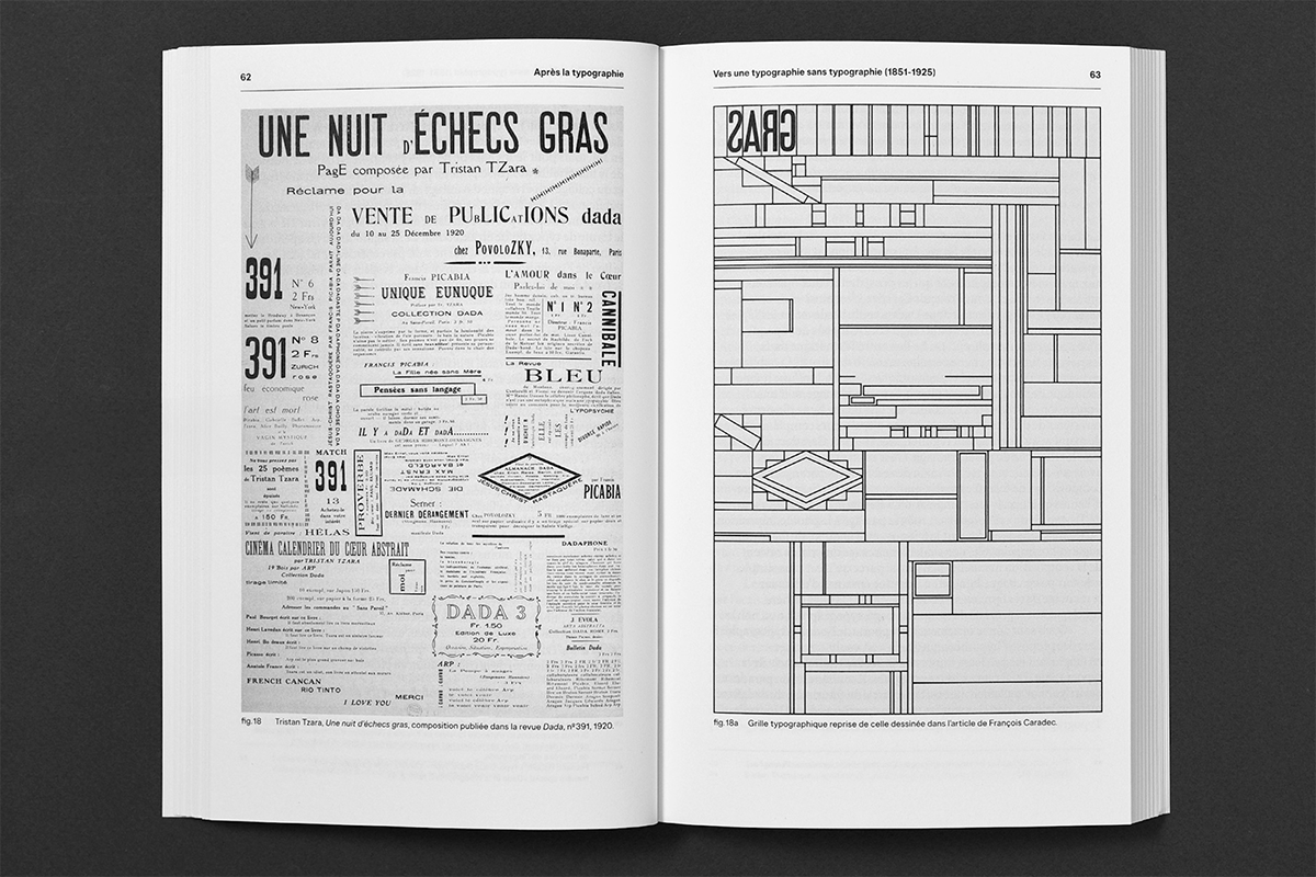
A spread from Après la typographie featuring the table of contents. Below. A spread featuring a composition published in Dada magazine by Tristan Tzara named ‘A Night of Chess’, 1920 (left) and a typographical grid taken from an article drawn by François Caradec (right).
The sections in this richly illustrated book include: ‘Towards a typography without typography’ (1851-1925), ‘The New Typography’ (1925-1928), ‘After the New Typography: a return to order?’ (1928-1967), looking into the evolving nature of the role of type and typographers throughout these periods.
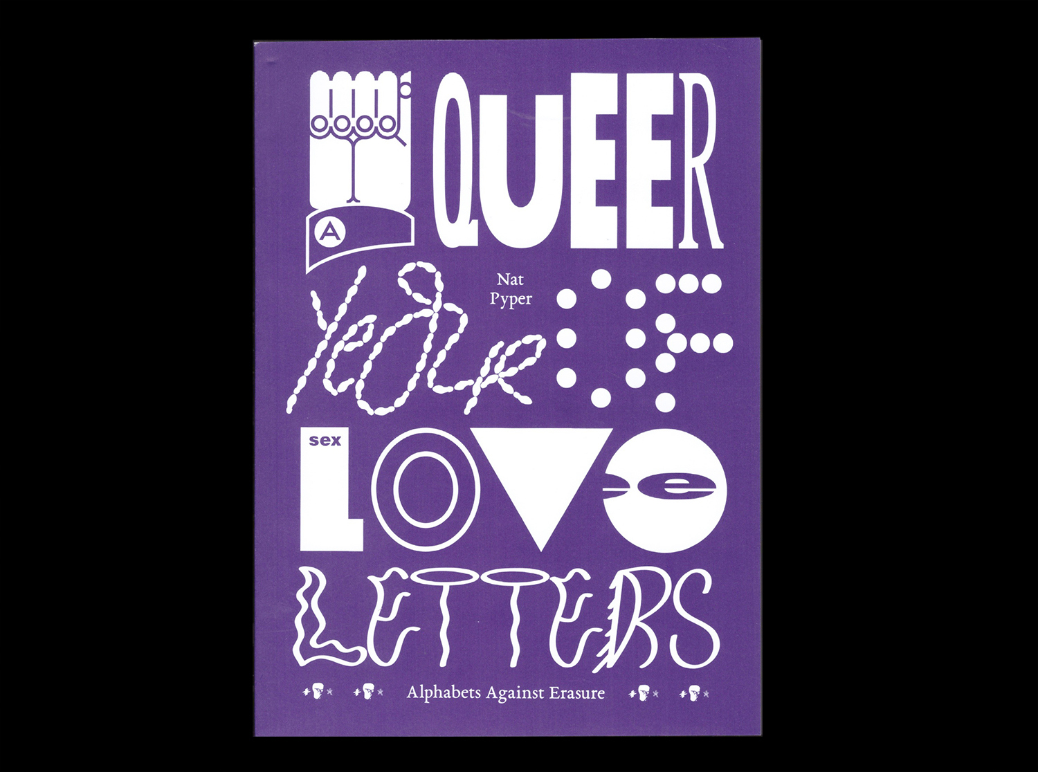
A Queer Year of Love Letters: Alphabets Against Erasure (Inventory Press & Library Stack). By Nat Pyper. Design by IN-FO.CO. $24.95
Described as a toolkit for writing and remembering queer and trans histories, this publication by Brooklyn-based designer and alphabet artist Nat Pyper features a collection of fonts whose letterforms stem from life stories, printed ephemera and vernacular scripts of countercultural queer figures, publications and collectives from the last several decades.
A spread from A Queer Year of Love Letters. Above. Cover designed by IN-FO.CO.
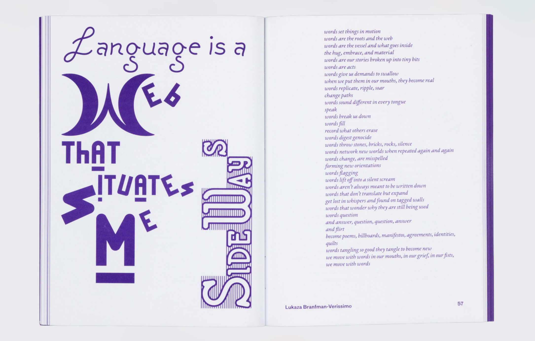
Including contributions from artist and educator Paul Soulellis, experimental writer and performer Claire Star Finch, designer and writer Silas Munro (see Eye 100), among others, the publication expands upon the series of twelve free typeface fonts created by Pyper, currently hosted on the digital lending library and media archive Library Stack.
A spread from A Queer Year of Love Letters, showing a range of work including the work Traffic Signs for the Hearing Impaired: Stop by the Chinese American painter Martin Wong, 1990.
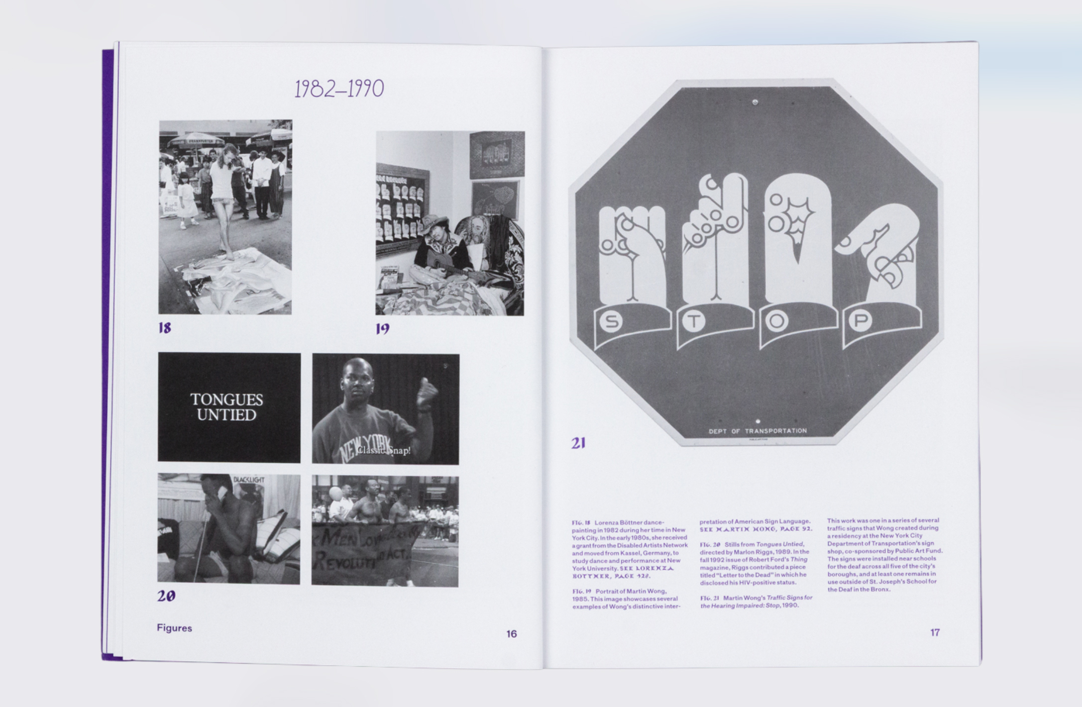
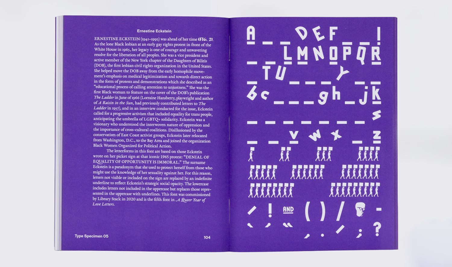
Part reader, part type specimen and part love letter, this book showcases the biographies of figures such as Robert Ford of THING magazine, gay rights movement activist Ernestine Eckstein, the Third World Gay Revolution collective and the Women’s Car Repair Collective, alongside previously unseen archival materials. Connecting font design to queer culture, this project remembers important overlooked figures through a focus on accessibility and creation of type design and comes at a crucial time of increased erasure and suppression of trans and queer histories.
A spread featuring the letterforms based on a 1965 protest sign created by Ernestine Eckstein, a visionary and leader in the gay rights movement.
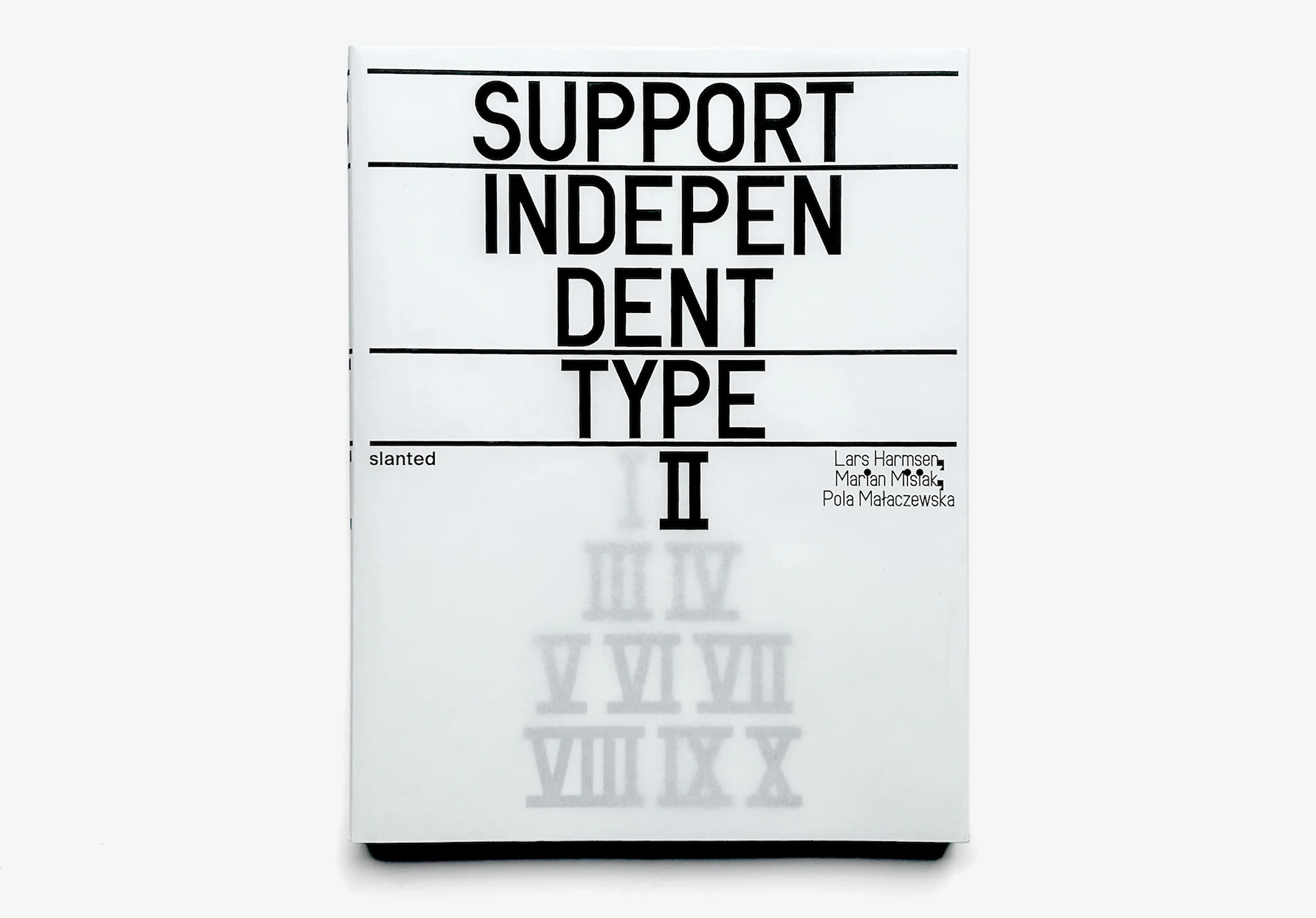
Support Independent Type II (Slanted Publishers). Editors & Design: Lars Harmsen, Marian Misiak, Pola Małaczewska. €42
As the second edition in the Support Independent Type series, this publication presents a curated collection of current type specimens, which range from digital to printed works and tactile type objects. It features more than 300 innovative type foundries, sharing new trends and cutting-edge designs.
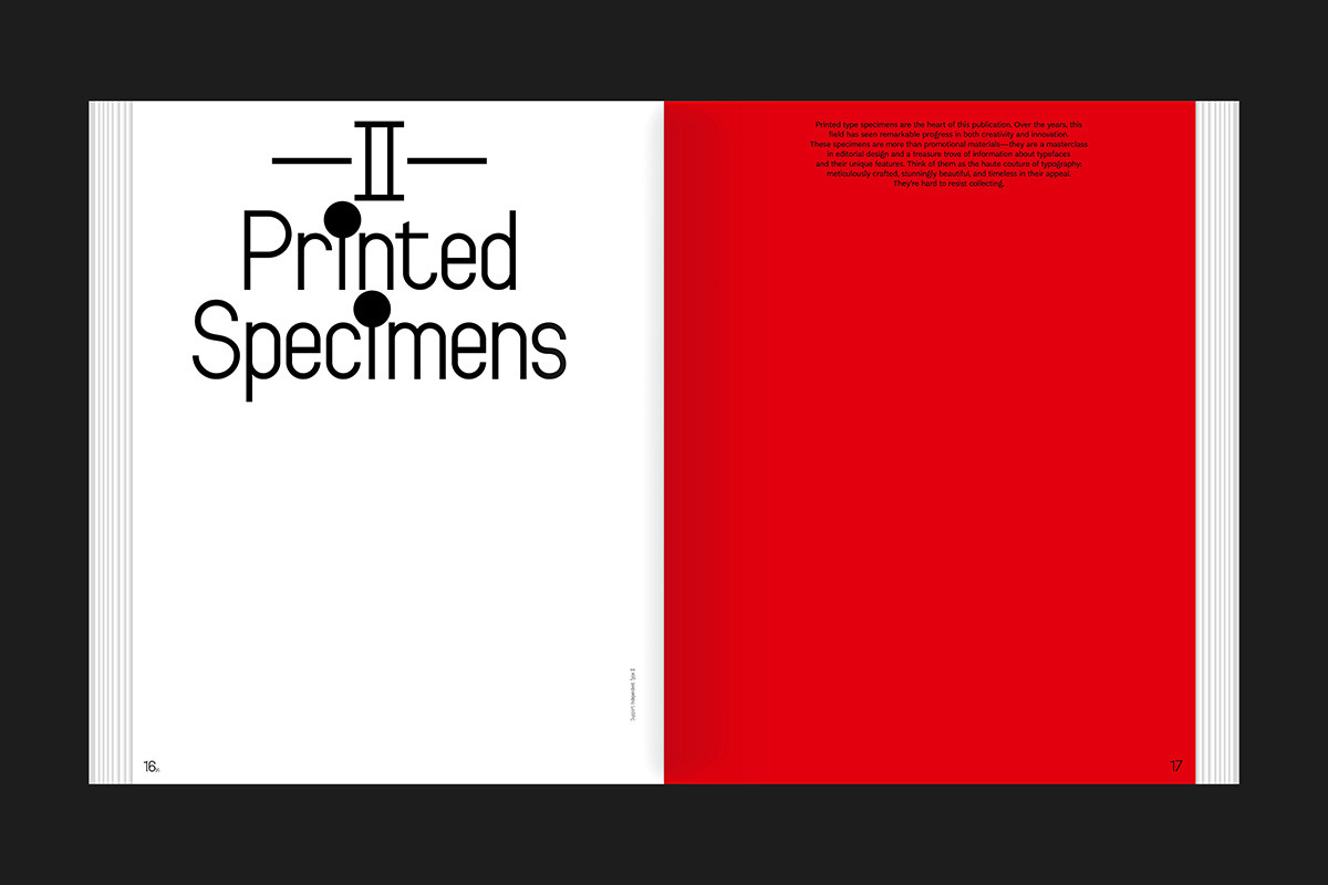
The publication is sectioned into chapters named Printed Specimens, 3D Specimens, Instagram and PDF Specimens. Above. Cover of Support Independent Type II.
Using uncoated and high-quality transparent papers, this open thread-stitched softcover book celebrates the vibrant culture of independent type foundries and their influence on design and typography, further emphasising how these practices and their work reflect cultural shifts and sparks creative innovation.
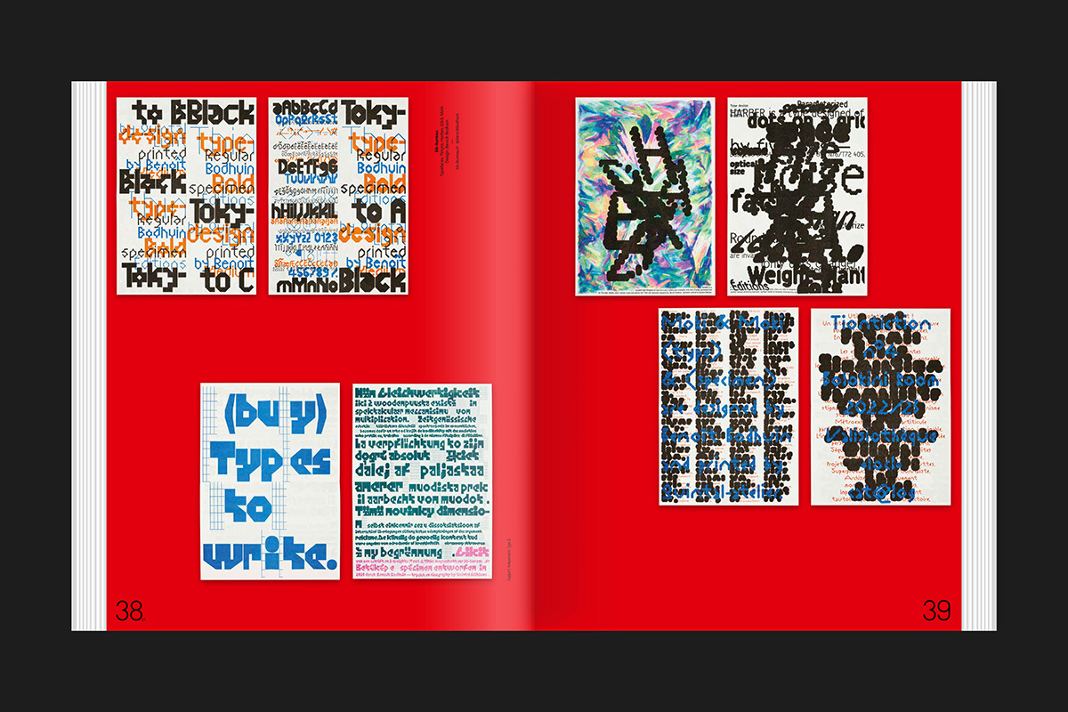
A spread featuring the typefaces Tokyto, Harber, Gikit and Moki by Benoit Bodhuin (bb-bureau) in the section Printed Specimens.
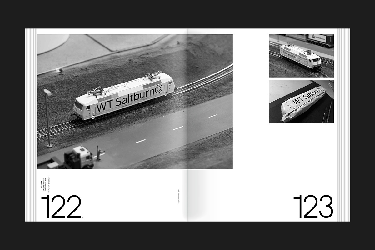
A spread featuring the typeface Saltburn by Jacob Wise (WiseType) in the section 3D Specimens.
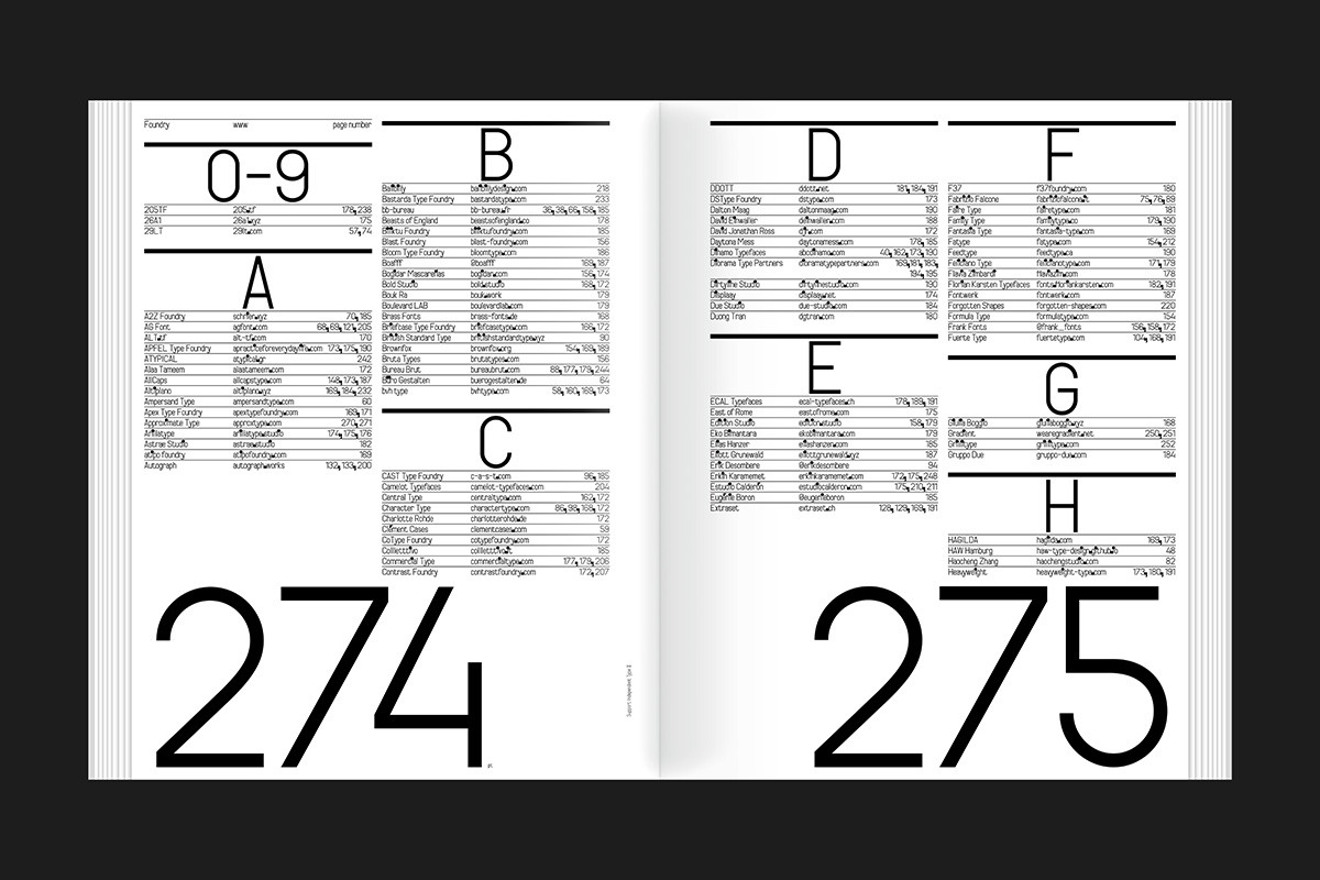
An alphabetised list of independent foundries listed near the back of the book.
Eye editors, London
Eye is the world’s most beautiful and collectable graphic design journal, published for professional designers, students and anyone interested in critical, informed writing about graphic design and visual culture. It is available from all good design bookshops and online at the Eye shop, where you can buy subscriptions and single issues.
Links
Type Designers of the Twentieth Century, Bodleian Library Publishing
Après la typographie: Imprimerie industrielle at avant-gardes artistiques, Éditions B42
A Queer Year of Love Letters: Alphabets Against Erasure, Inventory Press
A Queer Year of Love Letters, Library Stack
Support Independent Type II, Slanted Publishers