Saturday, 1:01pm
11 August 2012
Noted #42
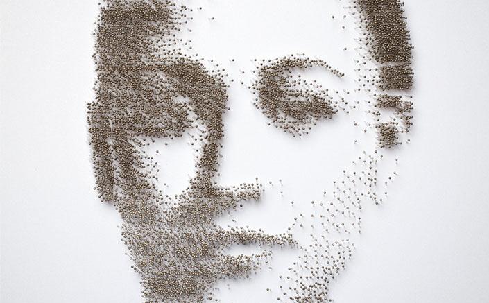
Olympic graphics watch 3 – stamps, steely Jess Ennis, ringing in the data and icons of the Times

More Olympic graphics (and more to come, once the Paralympics get going). Here are some more sightings from Eye readers and contributors.
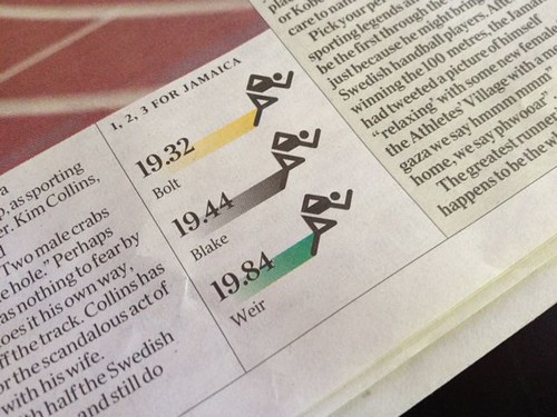
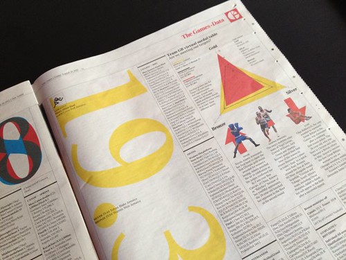
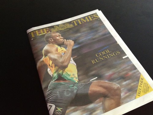
Newspapers have been active during the Olympics fortnight, and The Times has been outstanding, producing a dramatic wrap-around cover / poster (bottom) every day, while inside their special ‘The Games’ section smart infographics, based on the Olympic pictograms (right), visualise the data and don’t overwhelm the powerful action photography. Detailed results pages, all small type and detail, are enlivened by more graphics and data presented as huge type.
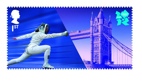
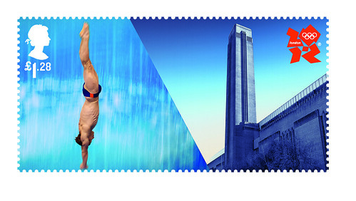
Hat-Trick’s stamps combine Olympic sports with London landmarks, with the infamous 2012 logo (see ‘Golden conundrum’) in the corner more usually occupied by the Queen’s head. (See also ‘Stamp Collection’ and ‘Just Add Stock winner, Stamps’ on the Eye blog.)
The Royal Mail is producing further gold medal stamps (see ‘Royal Mail's Olympic task nears conclusion’ in Print Week), printed the day after each gold medal is won by a Team GB athlete.
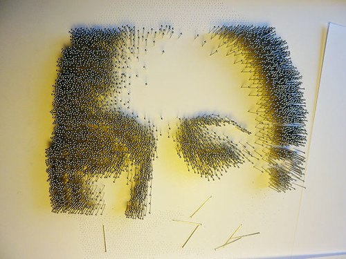
We asked illustrator Ian Wright about the race to make his portrait of Jessica Ennis (top) for the Adidas / Metro cover deadline:
‘There were a couple of false starts. Early attempts to visualise speed by pushing images on a photocopier proved a little beyond my own (and my machine’s) dexterity. Then some specially made rubber stamps of arrow designs got stuck in the post as the deadline loomed.’ Happily, his final inspiration – to make a portrait out of steel pins – came from Ennis’ birthplace, the industrial ‘steel city’ of Sheffield.
The commission came from The Church of London.
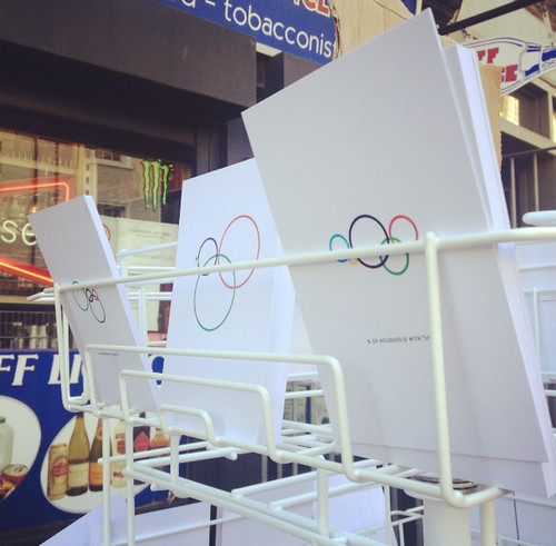
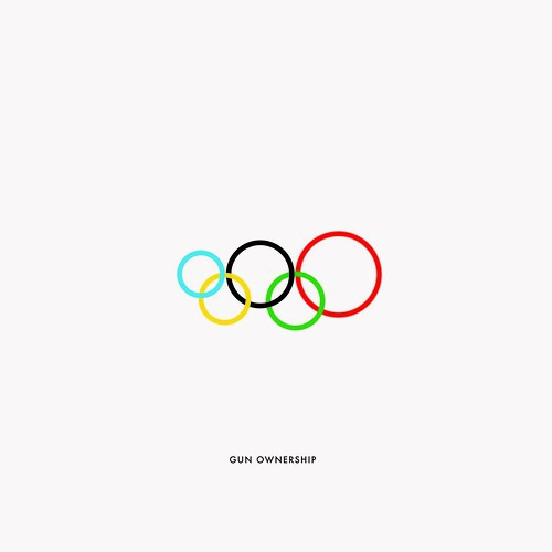
We appreciated these Olympic infographics postcards from Brazilian artist / designer Gustavo Sousa, briefly on display in Shoreditch yesterday, which use size and colour to demonstrate differences (TV ownership, HIV, no. of billionaires, etc.) between the five continents: Oceania (blue), Europe (black), Americas (red), Africa (yellow) and Asia (green).
The Guardian’s datablog has an interactive ‘Alternative Medal Table’, that allows readers to re-rank Olympic medal winners after adjustments for team size, population and GDP (the last two of which puts Grenada in the lead).
See also: Olympic Graphics watch #1 and #2.
And ‘Golden conundrum’, a ‘Critical path’ article about the London 2012 identity by Australian designer Elizabeth Glickfeld on the Eye blog.
Usain Bolt wraparound cover for The Times.
Eye is the world’s most beautiful and collectable graphic design journal, published quarterly for professional designers, students and anyone interested in critical, informed writing about graphic design and visual culture. It is available from all good design bookshops and online at the Eye shop, where you can buy subscriptions and single issues. Eye 83 is out now, and you can browse a visual sampler at Eye before You Buy.

