Wednesday, 9:00am
31 December 2014
Noted #65
various designers
Julian Rothenstein
Lilli Gartner
Brianna McCarthy
Holly Catford
Peter von Freyhold
Design Project
Rose Nordin
Graphic design
Information design
Magazines
Typography
Noble Rot and OOMK magazines, the Redstone Press diary and two calendars in glorious colour

Here are a few things that caught our attention as 2014 crossfades into 2015.
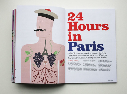
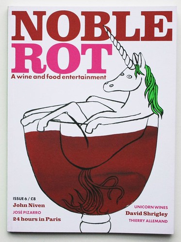
Quarterly wine magazine Noble Rot edited by Dan Keeling and Mark Andrew has a new look. The recent redesign, by magCulture Studio and Holly Catford, says goodbye to the former handwritten logotype and zine aesthetic in favour of a sleeker appearance. Issue six features a wine bar tour of Paris, an interview with David Shrigley, a look at New Zealand’s growing Pinot Grigio vineyards and some cheese suggestions to accompany your favourite glass of wine. For example, a Chardonnay pairs well with Comte, and a Pays Basque blue cheese such as Zelu Koloria.
Opening spread from Noble Rot no. 6, 2014, showing illustration by Ritchie Xavier, for ‘24 Hours in Paris’ written by the magazine’s co-founder Mark Andrews.
Noble Rot cover illustration by Lilli Gartner, 2014.
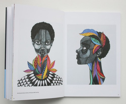
The third issue of One of My Kind (OOMK) magazine is ‘The Drawing Issue’ and focuses on female artists and their stories. OOMK is a creative collaboration that supports women all around the globe and is edited by Sofia Niazi and designed by Rose Nordin. This issue includes features on the illustrator Zoë Taylor, documenting the War on Terror, Reiko Chen’s project ‘Fabulous Generation’ and the independent Malaysian magazine Odd One Out. OOMK is now seeking submissions for issue 4, ‘The Internet’. (See ‘Noted #61’ on the Eye blog.)
Spreads and cover from OOMK no. 3. Illustrations by Brianna McCarthy.
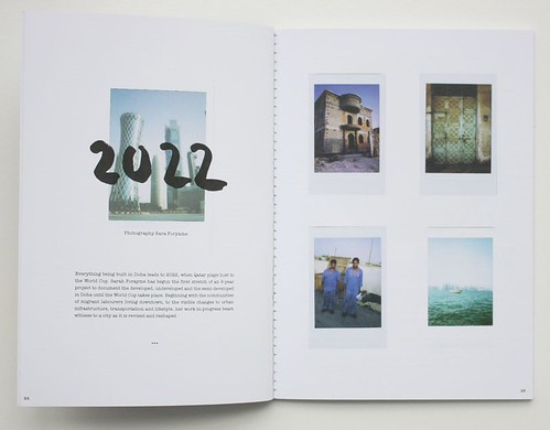
Spread showing photography by Sara Foryame.
Cover design by Sofia Niazi and Rose Nordin.

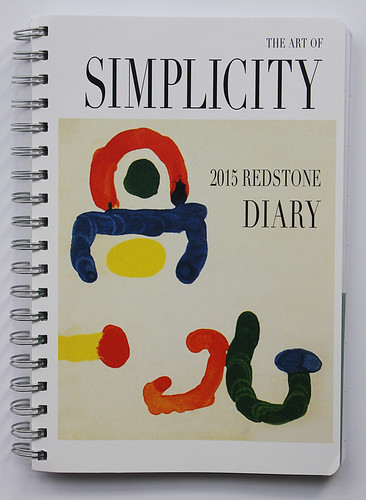
The latest spiral-bound desk diary from Julian Rothenstein’s Redstone Press has the theme of ‘Simplicity’.
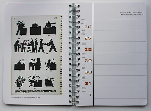
Spread from the Redstone Press diary for 2015 featuring Pictographs Today and Tomorrow by Rudolf Modley, 1938.
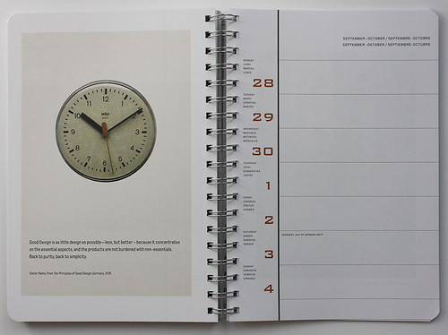
From Dieter Rams Ten Principles of Good Design, 1978.
Cover of the 2015 Redstone Diary featuring a page from Miró by Joan Miró, 1968.
And there is a ‘CMYK Color Swatch’ calendar from German designer Peter von Freyhold (Verlag Hermann Schmidt Mainz, €39.80) that is made up of 371 detachable swatches with the CMYK values printed on the reverse.
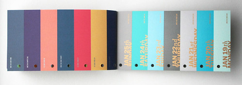
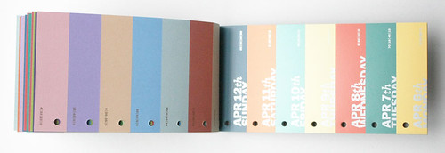
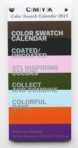
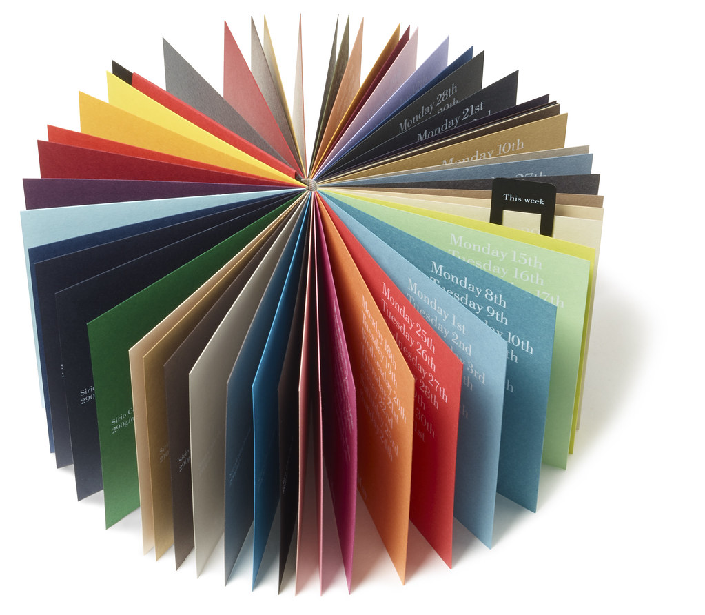
Though it appears to be a small book at first glance, the 2015 Fedrigoni desk calendar (below) opens out to become a vibrant fan of colour. Conceptualised and developed by Design Project in Leeds, the calendar displays 55 diverse papers all with different shades, textures and paper weight and comes with six marker tabs to identify important dates.
See ‘Noted #56’ on the Eye blog.
Fedrigoni desk calendar for 2015.


Eye is the world’s most beautiful and collectable graphic design journal, published quarterly for professional designers, students and anyone interested in critical, informed writing about graphic design and visual culture. It is available from all good design bookshops and online at the Eye shop, where you can buy subscriptions and single issues.
