Monday, 11:59am
11 May 2015
Noted #67
Noma Bar
Jop van Bennekom
various designers
Illustration
Magazines
Music design
Visual culture
Chineasy, The Happy Reader, Yellow, Brick and Puss Puss

Here are a few projects that have caught our attention in recent weeks.
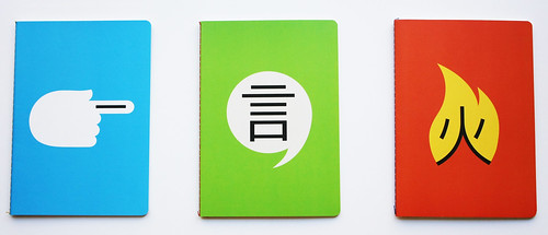
The three Chineasy notebooks are sold together and feature three of Noma Bar’s ideograms.
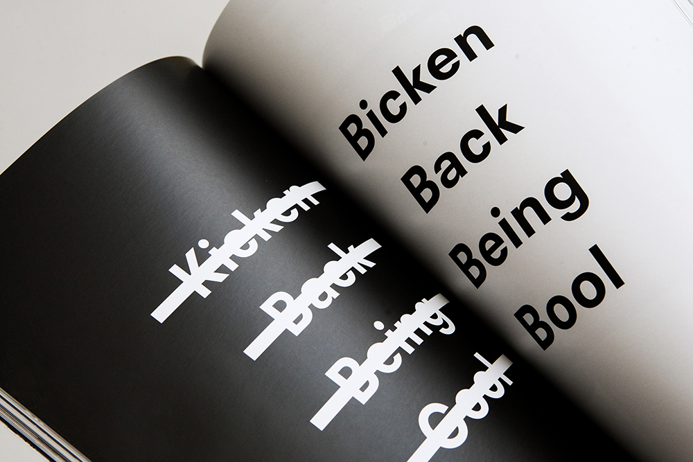
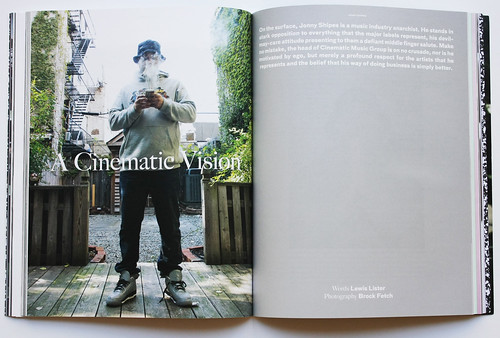
Top: Spread from new hip-hop magazine Brick.
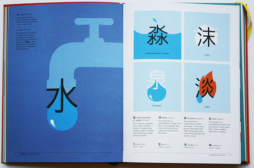
Hsueh uses the core ‘building block’ characters to explain complex forms. The character for ‘wide expanse of water’ logically contains three ‘water’ building blocks. Others such as ‘plain’ are more difficult to rationalise – constructed of the building blocks for ‘water’ and ‘burning hot’.
Cover of Chineasy: The New Way to Read Chinese. Author and concept: ShaoLan Hsueh. Graphic design: Brave New World Publishing. Art direction: Crispin Jameson. Ilustrations: Noma Bar.
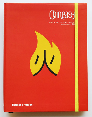
ShaoLan Hsueh’s Chineasy: The New Way to Read Chinese (Thames & Hudson, £12.95) aims to ‘help bridge the cultural gap [between East and Western cultures] by demystifying the Chinese language’. The book is concisely illustrated by Noma Bar whose ideograms compliment Hsueh’s short texts which rationalise the character combinations that form other words and phrases – the characters for mountain and east in combination mean Shandong Province, the characters for sun and foundation / origin together mean Japan.
The Happy Reader no. 2.
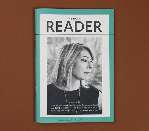
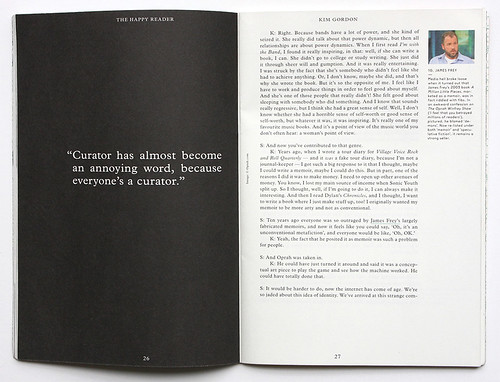
Spread from the ‘sprawling chat’ with Kim Gordon in The Happy Reader no. 2.
Spread from The Happy Reader no. 2 featuring photographs by Marius W. Hansen.

The ‘bookish quarterly’ Happy Reader is a collaboration between Penguin Classics and Fantastic Man edited by Seb Emina with creative direction by Jop van Bennekom and Gert Jonkers (see Eye 61). Its second issue is a publication of two halves, the first a transcription of a long conversation with Kim Gordon of Sonic Youth; the second half is steeped in Kakuzo Okakura’s 1906 treatise The Book of Tea.
The Happy Reader includes texts by Nicholas Lezard, Thomas Chatterton Williams, Jeff Koehler, Roland Kelts, Noel ‘Razor’ Smith and Alexis Taylor with photography by Colin Dodgson, Damian Noszkowicz, Marius W. Hansen, Jason Evans and drawings by Clym Evernden.
The Project Twins on leaked torture reports for Yellow week four.
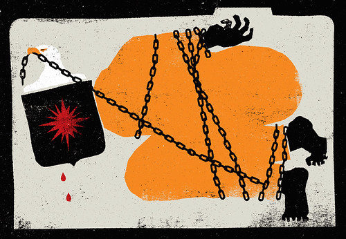
Sofia Niazi on the counter terrorism debate for Yellow week fifteen.
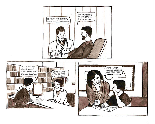
Offlife founding editor Daniel Humphry launched the 52-week project Yellow late last year. Every Monday, a new image is uploaded to the site. ‘Artists have no set guidelines or briefing’ says Humphry, ‘They are free to illustrate any story they chose from their allowed week. We’ve had artists lambast counter-terrorism debates, the wealth gap, environmental whitewashing – we’ve really been amazed at how the artists have had the balls to tackle huge, sensitive stories with such conviction.’
In its first 25 weeks, the project has featured illustrators, designers and comic artists such as Neasden Control Centre, Crispin Finn and Gavin Strange, among many other familiar names. The project will culminate in an exhibition and a book to be published in December 2015, and future artists include Jean Jullien and Louise Pomeroy.
Today’s contribution is a pointed response to last Thursday’s UK General Election by Mitch Blunt.
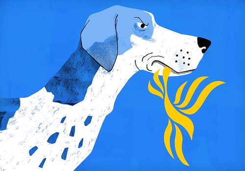
Mitch Blunt’s week 25 illustration for Yellow is about the British Liberal Democrats – ‘punished for coalition and ultimately being chewed up and spat out by the public last Thursday. The foxhound … relates to the Tories [and the possibility] of them bringing back fox-hunting (!) .’
Spread from Brick no. 1, 2015.
Cover of Brick no. 1, 2015, featuring Wiz Khalifa.
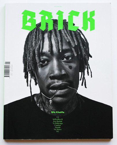
New hip-hop magazine Brick celebrated its launch party last March in London at Protein Studios. Founder Haley Louisa Brown writes, ‘It was 2011 … New York was reaffirming its Beast Coast status and Kendrick Lamar’s Section 80 was breathing new life into the west.’ Brick’s mission is to document the energetic new artists that have revitalised the genre over the past five years, deeming itself the ‘music and lifestyle magazine representing the new age of hip-hop culture.’
Its debut issue features an array of rappers from cover-star Wiz Khalifa to T. I. and Schoolboy Q. The pages feature a diverse array of images, from vintage backstage snapshots of the Wu-Tang Clan from archivist Mike Lewis, hand-written notes and portraits in settings that highlight the rap genre’s urban sensibilities. Brick’s restrained design is by Ric Bell’s London agency Post.
Photographs by Agata Pospieszynska in Puss Puss no. 2. Styling by Ina Lekiewicz.

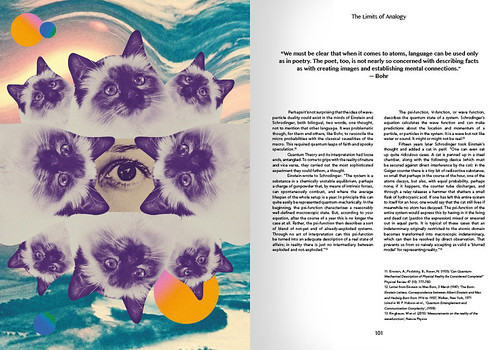
Spread from Puss Puss no. 2. Illustration by Chrissie Abbott.
Cover of Puss Puss no. 2. Photo by Agata Pospieszynska.

Good news for fans of cats and fashion – another edition of Puss Puss (see ‘Meow meow’ on the Eye blog) has crept up on us, with features about designer Charlotte Olympia, ‘The Limits of Analogy’ by Dr Leah Kelly and cats in the cinema – from Breakfast At Tiffany’s to Inside Llewyn Davis.
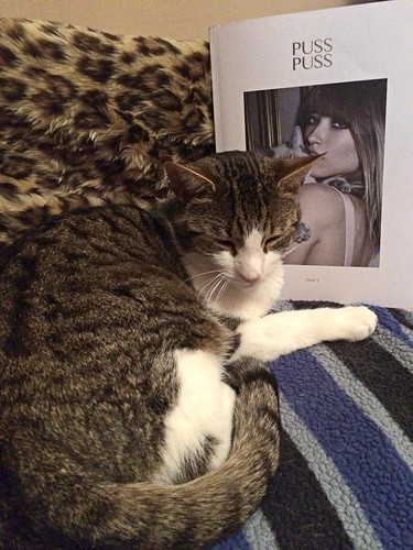
Designer Holly Catford’s cat George takes a favourable stance towards the cat-adorned cover of Puss Puss no. 2.
Eye is the world’s most beautiful and collectable graphic design journal, published quarterly for professional designers, students and anyone interested in critical, informed writing about graphic design and visual culture. It is available from all good design bookshops and online at the Eye shop, where you can buy subscriptions and single issues.

