Tuesday, 7:00pm
11 June 2019
(Typographic) Noted #92

various designers
Altiplano
Marian Bantjes
Hélène Marian
Production Type
Kris Sowersby
Sylvain Labs
Barrie Tullett
Imogen Van Goethem
Räphael Verona
Book design
Graphic design
Type Tuesday
Typography
WNBA rebrand; Caseroom’s Gun Dog; Swiss / Bolivian foundry Altiplano; Bantjes reloaded; Klim’s Sincerity / Irony

Here is a selection of type-related things – a rebrand, a new foundry and a some typographic books – that have caught our attention in recent weeks.
Production Type and Hélène Marian have worked with Sylvain Labs on the rebranding of the Women’s National Basketball Association (WNBA) in the US. Hélène Marian designed the logotype and a bespoke type system comprising thirteen fonts that range from WNBA Varsity (for jerseys) to WNBA Extended Black (for high-visibility display type).


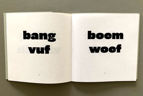
Gun Dog was conceived by Imogen van Goethem and designed and produced by Van Goethem and Barrie Tullett of The Caseroom Press. The book is an onomatopoeic adventure, from ‘bang woof’ to ‘blam ruff’, inspired by the gun of Hergé’s Tintin and the bark of his dog, Snowy.
See ‘Bubbles black as ink’ and ‘Eye on campus’ on the Eye blog.
Cover and spreads from Gun Dog. Design: Imogen Van Goethem and Barrie Tullett.
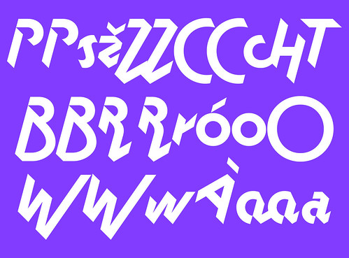
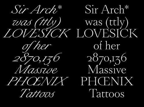
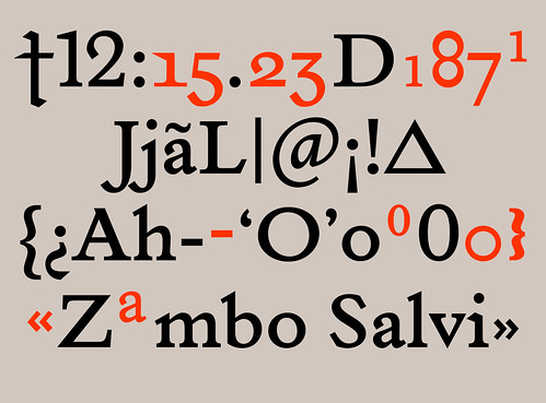
New type foundry Altiplano – ‘type from the Alps to the Andes’ – was launched on 3 June 2019 by Swiss designer Räphael Verona, who divides his time between Switzerland and Bolivia. The foundry’s initial release includes three retail typefaces – Monaako, Millionaire and Dominicale – which combine extensive historical research with expressive techniques. Verona says: ‘Our font catalogue is developed according to the evolutionary and narrative potential of the alphabetic characters. Altiplano sees the letter not only as a vector of meaning,
but also as an image.’
Monaako, Millionare and Dominicale, the three retail typefaces recently released by the new type foundry Altiplano.
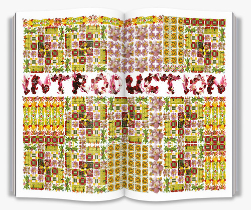
Marion Bantjes’ 2010 book I Wonder has been reissued by Thames & Hudson in paperback with a new essay on the subject of ‘Heaven’. The book is a wondrous collection of written and visual stimulation, drawing on themes such as heraldry, wonder, and the politics of ornament.
See ‘Reputations: Marian Bantjes’ and ‘Slow print’ in Eye 72.
Spreads and cover from the paperback version of Marian Bantjes’s I Wonder. Design: Marian Bantjes.


The Klim Type Foundry’s type specimen Sincerity / Irony is a handsome showcase of contemporary serif family Heldane (see also ‘Type now’ in Eye 98). The cross-genre, double-sided book – sincerity on white paper and irony on black with a silver-foiled pink dividing section titled ‘A short lecture on Sincerity & Irony’ – contains witty meditations by poet Hera Lindsay Bird such as the following:
You love someone/
so you set them free /
but just before they leave, they look back /
at you with tears sparkling in their eyes /
& whisper /
I hate freedom.
Sincerity / Irony is a collaboration between the Klim Type Foundry, Hera Lindsay Bird and design agency Alt Group.
See ‘Reputations: Kris Sowersby’ in Eye 79.
Cover and spreads from Klim Type Foundry’s Sincerity / Irony, a type specimen for their Heldane font family. Design: Alt Group. Text: Hera Lindsay Bird.


Eye is the world’s most beautiful and collectable graphic design journal, published quarterly for professional designers, students and anyone interested in critical, informed writing about graphic design and visual culture. It is available from all good design bookshops and online at the Eye shop, where you can buy subscriptions and single issues.


