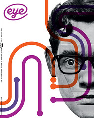
Winter 2007
Baby steps

Designers of new wireless software should take their cue from the medium’s nature to forge its aesthetic
Within a decade (according to some estimates), we’ll see two billion mobile telephones capable of internet access. To designers of a certain sensibility, the prospect of so many visually anaemic devices in the hands of so many people might be gut-wrenching. If in desktop Web browsers we’ve lost a certain sensitivity to typographic delicacy and visual elegance, then viewing a world of text through a handheld browser might seem like peering on a wasteland of aesthetic primitivism.
Nobody says that we will necessarily reach that two billion mark still beholden to the limited designability of today’s mobile technology, though. Some cite the iPhone as reason to believe that ‘good design’ will eventually make its way to handhelds as well. Hype aside, Apple’s foray into wireless devices sports a rich, high-resolution screen that makes the display of highly controlled typography a possibility, at least, which is a step forward. And its built-in Web browser, Safari, can render the Web exactly like its desktop namesake, returning us to the level of visual compromise we already have on our personal computers.
While a convenient hedge against a poorly designed mobile internet, this sort of faithfulness to the desktop Web is deceptive. The fact is that a new medium, as it emerges and looks for its footing and its particular place in the world, tries to emulate old media, at least at first. Over the past century-plus of rapid technological innovation, we have seen this play out again and again.
Movies looked very much like filmed stage plays in their first decade of life. Similarly, television worked much like visual radio in its inaugural decade. And the World Wide Web – the desktop version, where typography and layout bear at least some resemblance to the intention of designers – went to great lengths in its early years to imitate the values of printed matter.
Eventually, all media will leave behind these chameleon-like baby steps and assume their own dynamic; they each establish a nature of their own that is separate and apart from their predecessors. In the case of the Web, we are still in the midst of this evolution now; over time we have become more comfortable with it as a form of communication unlike any other – even as it continues to change with greater rapidity and turbulence than anything we’ve seen in the past.
The mobile internet is no exception to this pattern of ‘emulate-then-innovate’. When technology allows it, wireless software eagerly apes the ways of its immediate predecessor, as in not just the iPhone’s Safari browser but also the Opera mobile browser, which is available on a multitude of devices and similarly attempts to render the Web in a desktop fashion. As wireless technology gets more powerful, we’ll surely see more applications that are emulative of the desktop Web experience.
Pursuing this path is a mistake, however. Even with dramatically improved resolution, a mobile device is used differently: often while standing rather than sitting; in short bursts rather than for prolonged periods; to achieve simple, pointed goals, rather than to perform wide and varied perusals. A site or page designed for a desktop browser can be flatly inappropriate for handheld viewing. The mobile-specific sites that pre-date the iPhone, as rudimentary as they are, were more appropriate to the medium than the iPhone.
Mobile devices may not achieve the controlled visual integrity of desktop devices. They may not be as aesthetically luxurious as print. But they don’t need to. For each new medium, designers should remember that they are beholden primarily to the way that medium is used, to its true nature, and only secondarily to the precedents established by earlier media. Aside from their curiosity value, those early, emulative films, TV shows and websites are forgotten: the most successful creations of any medium are the ones that are truest to their native dynamic. And within the primitive aesthetics of each, the best designers manage to find a new, innate beauty.
Khoi Vinh, design director, NYTimes.com, The New York Times
Eye is the world’s most beautiful and collectable graphic design journal, published quarterly for professional designers, students and anyone interested in critical, informed writing about graphic design and visual culture. It is available from all good design bookshops and online at the Eye shop, where you can buy subscriptions and single issues.
