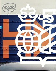
Autumn 2019
Designing with urgency

From politics to culture to business, Dutch studio Thonik strikes a balance between adventurous concepts and pragmatic resolutions

Since Thonik was founded in 1993 by Nikki Gonnissen and Thomas Widdershoven, the Dutch practice has established itself as a crucial voice in the continuing dialogue of international graphic design. With clients that include political parties, cultural institutions and city municipalities, Thonik has managed to strike a balance between adventurous concepts and pragmatic, articulate resolutions.
[…]
An image from the Dutch Socialist Party’s 2005 campaign, produced in collaboration with Ari Versluis and Ellie Uyttenbroek, featuring Thonik’s redesign of the party’s tagline and logo. Thonik replaced the SP’s traditional ‘flying tomato’ logo, long associated with the violence of political protest, with a more friendly version that reinvented the SP tomato as a symbol of ‘feeding the people’.
Top. One of the five identities that Thonik has designed for the Holland Festival since 2015.

Alex J. Todd design historian and writer, London
Read the full version in Eye no. 99 vol. 25, 2019
Eye is the world’s most beautiful and collectable graphic design journal, published quarterly for professional designers, students and anyone interested in critical, informed writing about graphic design and visual culture. It is available from all good design bookshops and online at the Eye shop, where you can buy subscriptions and single issues.

