
Summer 2026
Empire of posters
Stefan Sagmeister
Noel Douglas
Liza Enebeis
Jonathan Barnbrook
John Warwicker
Tadanori Yokoo
A recent Berlin exhibition and its hefty catalogue demonstrate the enduring power of Japanese designer / artist Tadanori Yokoo, who turns 90 this year
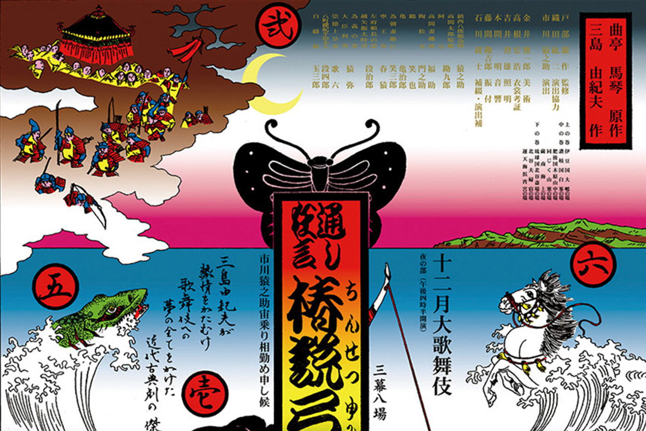
For more than seven decades, Tadanori Yokoo has been making posters. A recent exhibition in Berlin’s Center for Visual Arts (CVA), curated by Jumping He, demonstrated the exuberance and sheer invention of the work made during this long career, displaying more than 200 of his posters, most of them more than a metre high. An accompanying two-volume book, The Complete Posters of Tadanori Yokoo (designed and published by Hedesign with Phillipp Majdamin) catalogues 1111 of his posters, the last dozen made in 2025. The two books also feature informative essays by He, Marta Sylvestrová and Haruka Kogure, Kazumasa Nagai and Eishi Kitazawa, the former senior curator of the Ginza Graphic Gallery (ggg) in Tokyo.
Yokoo (b.1936) has been labelled Modernist, psychedelic, postmodern and subversive. His personal graphic style skids and freewheels through a sequence of bewilderingly wide-ranging approaches, veering from grids and typophoto to action painting; from overstuffed collage through to unabashed pastiches (both subtle and unsubtle) that encompass every historical period and genre that has caught his eye.
His near-contemporary Nagai (b.1929) describes Yokoo as a painter who is also a master of the poster, an artist who knows every nuance of printing techniques. Kitazawa places him alongside such international giants of the poster as Cassandre, Savignac and Müller-Brockmann.
Eye asked five graphic designers to say just what is it that makes Tadanori’s posters so different, so appealing. John L. Walters
Ballad
for a Little Finger Cutting Ceremony 1028 × 716 mm, silkscreen, 1966.
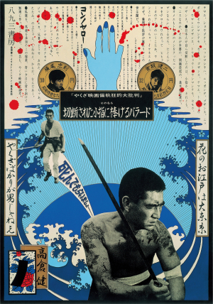
‘Transmissions from some fever dream.’
Stefan
Sagmeister, New York
Tadanori Yokoo’s posters – saturated with rising suns, severed heads, erotic tension and Buddhist symbolism – read less like commercial work than like transmissions from some fever dream where Warhol and Hiroshige are sharing a futon. No-one before or since has made death, desire and pop culture feel quite so gorgeously interchangeable.
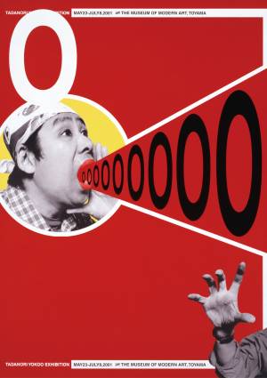
O Toyama Prefectural Museum of Modern Art, 1029 × 728 mm, offset, 2001.
Read the full version in Eye no. 110 vol. 28, 2026
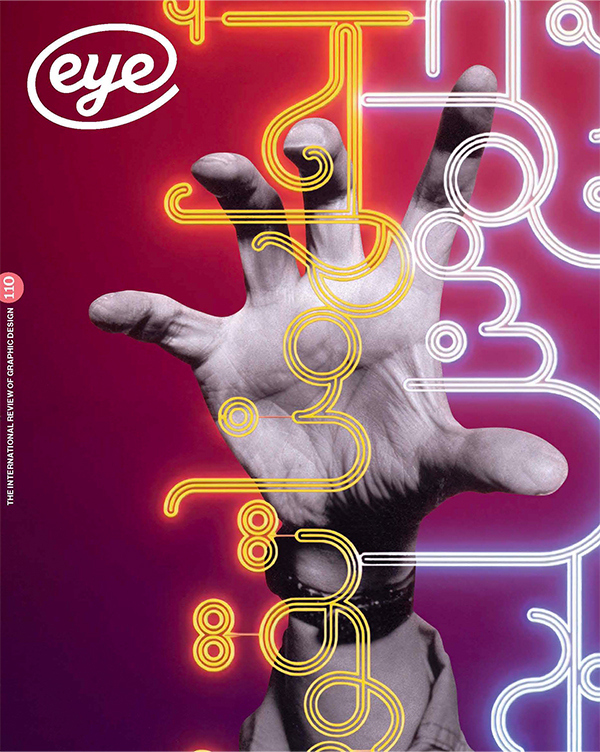
Eye is the world’s most beautiful and collectable graphic design journal, published for professional designers, students and anyone interested in critical, informed writing about graphic design and visual culture. It is available from all good design bookshops and online at the Eye shop, where you can buy subscriptions and single issues.