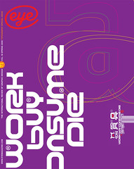
Spring 2009
Nick Bell

'The cool allure of Modernist style refuses to die’
Nick Bell is the director of Nick Bell Design, visiting professor at the Royal College of Art, London, and was creative director of Eye magazine from 1998 to 2005.
It is the Modernist sensibility (or more accurately its aesthetic) that defines the current Zeitgeist. The cool allure of Modernist style refuses to die. When typefaces such as Helvetica and Univers were originally crafted, their designers believed that typographic form could be neutral.
Typefaces accumulate associations and meanings through their use, and typographic form can never be neutral. As designers we kidded ourselves it could – that reductivist approaches producing pared-down forms had a whiff of objective science – not actually neutral, but symbolic of our idea of neutrality.
We continue to like the idea of neutrality (especially in a mediated world so heavy with bias, spin and self-interest) and its aesthetic ideals seem at odds in a competitive world bent on differentiation. So we are experiencing a ‘Golden Age’ in which typeface designers are scrutinising the infinitesimal variants the reductivist approach can produce.
Here are some examples of the Modernist-style fonts that typify what is going on now: Effra by Dalton Maag, Slate by Rod McDonald, ARS Maquette by ARS Type, Gloriola by Tomas Brousil (a 21st-century take on the grotesque) and National by Kris Sowersby.
They are all related to the holy grail of Modernist typefaces – not Helvetica but Akzidenz Grotesk. We are using Gloriola and National in two current exhibition design projects at Nick Bell Design.
First published in Eye no. 71 vol. 18 2009
Eye is the world’s most beautiful and collectable graphic design journal, published quarterly for professional designers, students and anyone interested in critical, informed writing about graphic design and visual culture. It is available from all good design bookshops and online at the Eye shop, where you can buy subscriptions and single issues.
