Autumn 2007
South Bank show
The Royal Festival hall has regained the thoroughly English lettering of its origins in the Festival of Britain – on one side only

Restoration of buildings is a difficult art. How to go back to an original state, when the use of the place has changed continuously, with so many modifications as to make an exact return impossible? And when ‘original’ might be better described as ‘provisional’? Something of this kind is true of London’s Royal Festival Hall, which this summer, after two years’ closure for refurbishment, was reopened in a restored state that in important respects regains the condition of its opening in 1951, as the centrepiece of the Festival of Britain.
Lettering and type design featured prominently in the graphic style of the Festival of Britain. The Festival’s ‘typography panel’ included Nicolete Gray, the country’s wisest and most imaginative lettering historian. It was Gray and her colleagues (including Charles Hasler and Gordon Cullen) who determined the style of letter used in the two large signs on the Royal Festival Hall: the name of the building spelled out in sloping slab serif (‘Egyptian’) capitals. This thoroughly English letter played its part in tempering the international-Modern architecture of the building.
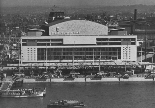
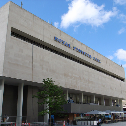
The story of these two signs is complicated and reflects the changing patterns of use in the building. The north-west-facing river side of the hall – the side that is visible from what is still the socially and culturally more dominant north bank of the Thames – originally carried the name in sloping Egyptian capitals, plus the coat of arms of the now disappeared London County Council. This sign was replaced, presumably during the renovations of the 1960s, by one using upright sans serif capitals.
The Royal Festival Hall just completed in 1951. The London County Council’s crest is delicately positioned as part of the asymmetric ensemble.
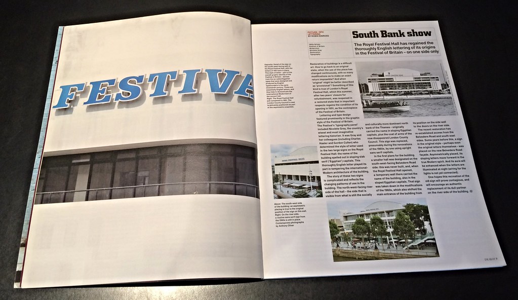
Top: Spread showing a detail of the sign on the south-west-facing wall of the Royal Festival Hall, with the letters of 1951 back in place. This style of letter – part of the overall graphic identity of the Festival of Britain – derives from the so-called Egyptian types that were designed and produced by English typefounders in the early nineteenth century. These are essentially English letters, and they help to domesticate the international Modernism of the concert hall.
In the first plans for the building a smaller hall was designated on the south-west-facing Belvedere Road side: this was never built, and, when the Royal Festival Hall opened, a temporary wall there carried the name of the building, also in the sloped Egyptian capitals. That sign was taken down in the modifications of the 1960s, which also shifted the main entrance of the building from its position on the side wall to the doors on the river side.
The recent restoration has re-established access from the Belvedere Road and south-east sides. Some years before this, a sign in the original style – perhaps even the original letters themselves – was placed on the new Belvedere Road façade. Asymmetrically placed, its sloping letters move forward in the true Modern spirit. And its aura will be enhanced when the letters are illuminated at night (wiring for the lights is not yet connected).
One hopes this recreation of the old sign will prove contagious, and will encourage an authentic replacement of its dull partner on the river side of the building.
Robin Kinross, writer, publisher, Hyphen Press, London
First published in Eye no. 65 vol. 17 2007
Eye is the world’s most beautiful and collectable graphic design journal, published quarterly for professional designers, students and anyone interested in critical, informed writing about graphic design and visual culture. It is available from all good design bookshops and online at the Eye shop, where you can buy subscriptions and single issues.

