Spring 2009
The DNA of ABCs

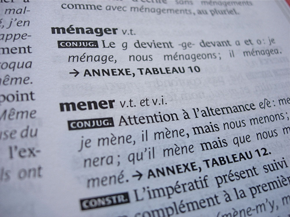
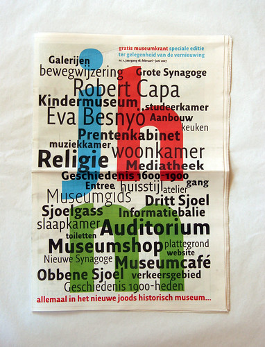
Multifunctional font families, crafted for every eventuality, are doing away with the need to seek out complementary faces

Before publishing his first book, the eighteenth-century printer John Baskerville spent more than seven years developing his type, ink and paper. Now that technology allows graphic designers to produce decent-looking typefaces in a fraction of the time, many professional type designers are returning to the meticulousness of the old masters, and creating fewer typefaces – but with greater care for the details. This can manifest itself in many ways: extended character sets with multilingual versions and contextual alternatives, or in typeface families that are extended to cover a multitude of uses and contexts . . .
Sofie Beier, designer, researcher, educator, Copenhagen, Denmark
Read full version in Eye no. 71 vol. 18 2009
Eye is the world’s most beautiful and collectable graphic design journal, published quarterly for professional designers, students and anyone interested in critical, informed writing about graphic design and visual culture. It is available from all good design bookshops and online at the Eye shop, where you can buy subscriptions and single issues.


