Winter 2010
The way ahead

Paul Stiff explains why the British road sign system simply works

Britain’s road and motorway sign system once appeared in a long list for the ‘Great British Design Quest’, which asked TV viewers ‘to choose their favourite example of British design from the past 100 years’. But it didn’t get through to the shortlist. That would have needed someone to explain to voters why, if there were Nobel prizes for design, this would be a winner. Here are eight reasons.
1. Jock Kinneir and his assistant, Margaret Calvert, were the first professional designers of a national system of road traffic signs. Elsewhere it is still usual for this to be done by engineers and surveyors – and it shows. Kinneir’s work, starting with the motorway system from 1957, was new. Existing signs did not meet standards of salience, conspicuity and discriminability, to support drivers’ planning and execution of often safety-critical decisions – at speed, sometimes under adverse conditions.
2. Kinneir’s proposals generated serious public debate in the professional and national press.
3. This led to some formal evaluation: the government’s Road Research Laboratory tested which combination of letterforms – serif /sans serif; all capitals / capitals + small letters – could be read at the greatest distance, ‘to keep the angle between the driver’s line of sight to the sign, and the road ahead, as small as possible’. It concluded: ‘Since there is little difference in legibility between the different types of lettering, it seems reasonable to make the choice on aesthetic grounds.’
4. More significant in Kinneir and Calvert’s work than this surface feature – letterforms – was that they designed a system for designing. Their modular system could be implemented by the thousand throughout the country by local traffic authorities following the specifications and templates.
5. Challenging though it was, the motorway work was a step towards a more complex project – signs for all other roads. It enlisted expertise, including that of members of the two government-appointed committees that reported on signs for motorways (Anderson) and all-purpose roads (Worboys). It was supported by engineers, planners and civil servants. Calvert recalled: ‘T. G. Usborne of the Ministry of Transport […] saw it as a two-stage job, stage one for motorways and stage two for all the roads.’
6. The committees sought to align British signs, as far as possible, with the 1949 Geneva Convention on Road Traffic but cut an independent and critical path, concluding, after inspection visits, that European signs, using engineers’ crude default letters, lacked both ergonomic and aesthetic merit.
7. After 50 years the system still looks good and works well – so well you barely notice it.
8. As a product of that motive of designing in the postwar period that sought ‘to make the world a better place’, the road signing exemplifies the role that open, outward-facing design can play in civic life.
Paul Stiff teaches in the Department of Typography & Graphic Communication, University of Reading.
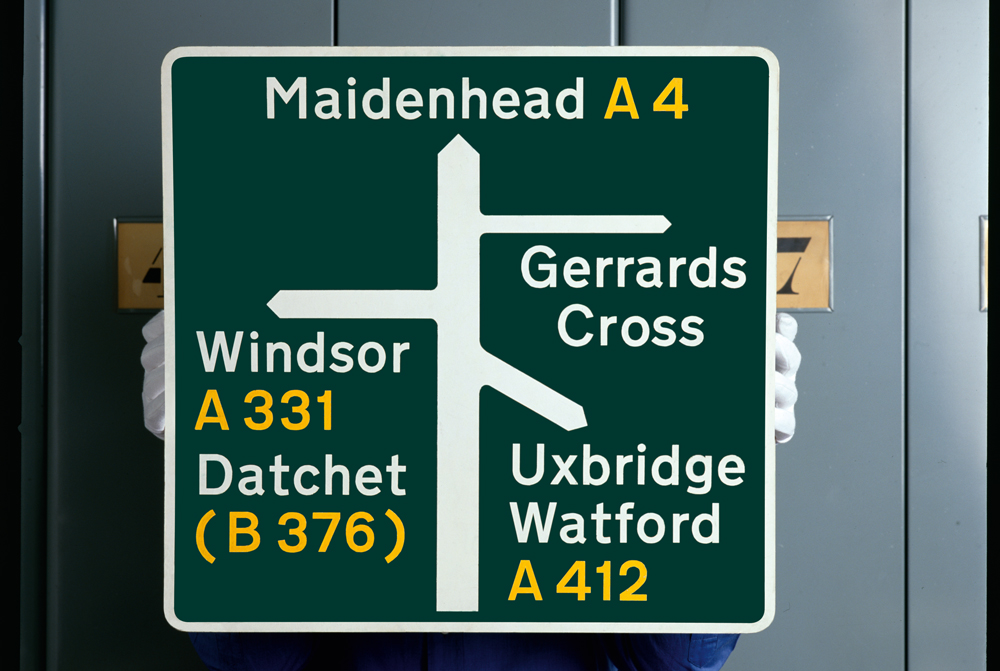
Top: scale models made by Jock Kinneir and Margaret Calvert for advance direction signs on ‘all-purpose’ primary routes in Britain’s national road signing system. Undated but ca. 1962. Image courtesy of St Bride Library, London.
First published in Eye no. 78 vol. 20.

