
Summer 2026
Truman’s show
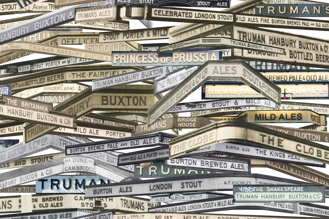
The
architectural lettering of these London pubs shows that enduring
visual identities can be built slowly and collectively. Elena
Veguillas tells the story
Truman’s visual identity was not authored from the top down, but built horizontally through making, by signwriters, carpenters, apprentices and architects working for the company.
When I first moved to London I walked everywhere. Gradually, I came to realise that every corner of the city held its own history. From monumental lettering, via the minuscule makers’ marks on Victorian pipes, to the tightly organised identity of the London Underground, layers of history were waiting to be uncovered.
And the ubiquitous London ‘public house’, or ‘pub’, sometimes systematic, sometimes improvised, sometimes corporate, sometimes independent, was always around the next corner. Among the myriad public houses I encountered during these meandering walks, The Old Blue Last in Shoreditch, which housed a spectacular mirror, covered with lettering that promoted ‘Truman Hanbury Buxton and Co.’s Pale & Burton Ales & Imperial Stout’, sparked my curiosity. Within a few years, my interest became a research project, an obsession …
Elena Veguillas, designer, researcher, writer, London
Read the full version in Eye no. 110 vol. 28, 2026
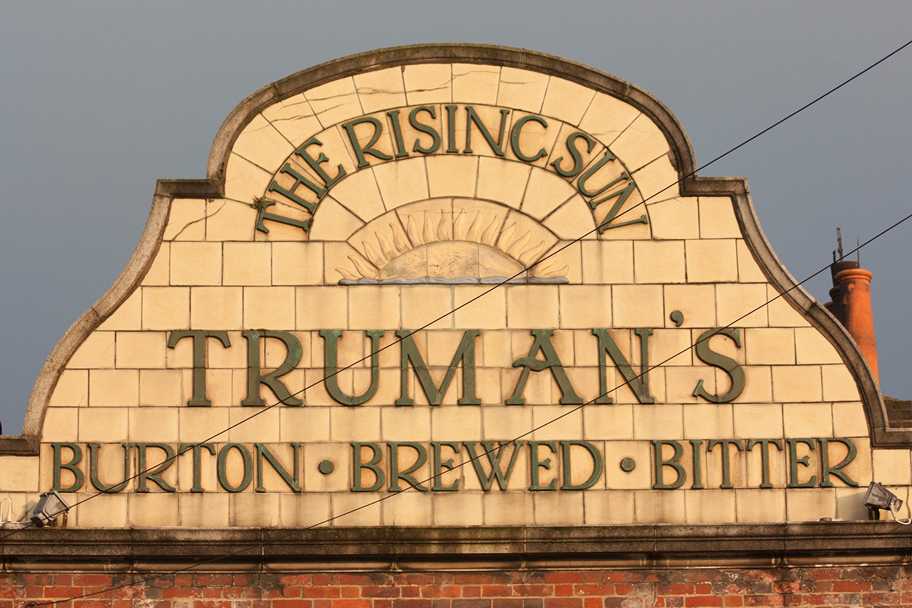
The Rising Sun
(1928), 69 Dennett’s Road, Deptford, Lewisham SE14. This unusual pub has a
particular gable shape holding curvilinear letterforms.
Top.
Digital collage
created by Veguillas to analyse the Truman’s lettering visually.
Eye is the world’s most beautiful and collectable graphic design journal, published for professional designers, students and anyone interested in critical, informed writing about graphic design and visual culture. It is available from all good design bookshops and online at the Eye shop, where you can buy subscriptions and single issues.