Wednesday, 12:00am
17 August 2005
86 minutes of greatness

The graphic sensibility of film-maker Geoffrey Jones. Critique by Rick Poynor

Web-only Critique written exclusively for eyemagazine.com
British film-maker Geoffrey Jones, who died this year at the age of 73, is not well known today. The body of work completed to his satisfaction amounts to just 86 minutes of screen time. After twenty years as a successful director, he made nothing in the last 25 years of his life.
Yet Jones was an exceptional film-maker. His work, created for global corporations and national institutions, is personal, passionately committed, experimental and ground-breaking in its fusion of film image and music. The subject matter - oil refineries and railway networks - may be more of its time than ours, but the technique still seems amazingly fresh and contemporary. Anyone putting music to moving images could learn from Jones's brilliant editing, his ability to hold a shot for just the right length of time, his mastery of visual nuance, image structure and flow. Jones's sights and sounds illustrate and intensify each other.
The British Film Institute's new DVD collection, Geoffrey Jones: The Rhythm of Film, offers a chance to reassess this neglected pioneer. Studying interior design at the Central School of Art in the early 1950s, he developed an interest in photography and began to experiment. He saw films by Norman McLaren and Len Lye and later, working in advertising, he borrowed their method of painting and scratching directly on to 35mm film. The DVD includes excerpts from these delightful early commercials.
Jones's first film, Shell Panorama (1959), was the only one he made with a commentary; later projects all used music as soundtrack. His innovations were noticed immediately. Shell Spirit, a two-minute commercial from 1962, received a D&AD gold award. Driven along by the insistent tune of a penny whistle, it follows a car journey from town to seaside. The world rushes by the car window in a sequence of wheels, telegraph wires, fences, fields and trees, often blurring to the point of abstraction. The sensibility is highly graphic and 40 years later designers are still doing the same kind of thing. We see a petrol pump and a few Shell logos at the beginning and end, but the exhilaration of travel leaves a stronger impression. By today's standards, the 'branding' communicates with the lightest touch.
It's exactly the same in the longer films. In Trinidad and Tobago (1964), made for BP, the company's logo is glimpsed just twice on a passing truck. This was the great era of public information films and educational documentaries produced in a spirit of idealism by in-house film units and freelance film-makers who possessed an unforced sense of social responsibility. By the 1980s, this had been replaced by the more business-oriented concept of corporate video. Later, companies found even more effective ways to deliver a tightly focused corporate message, using laser discs, CD-ROMs, satellite-broadcast business TV and, most recently, video-streaming by Internet and intranet.
This is a barren environment for film artists hoping for clients with the aesthetic vision and budgetary largesse to underwrite original work. In Jones's final interview in The Guardian, it was obvious why the commissions dried up. The director refused to compromise in his pursuit of the mesmerising film image. 'The mainstream is crap,' he said.
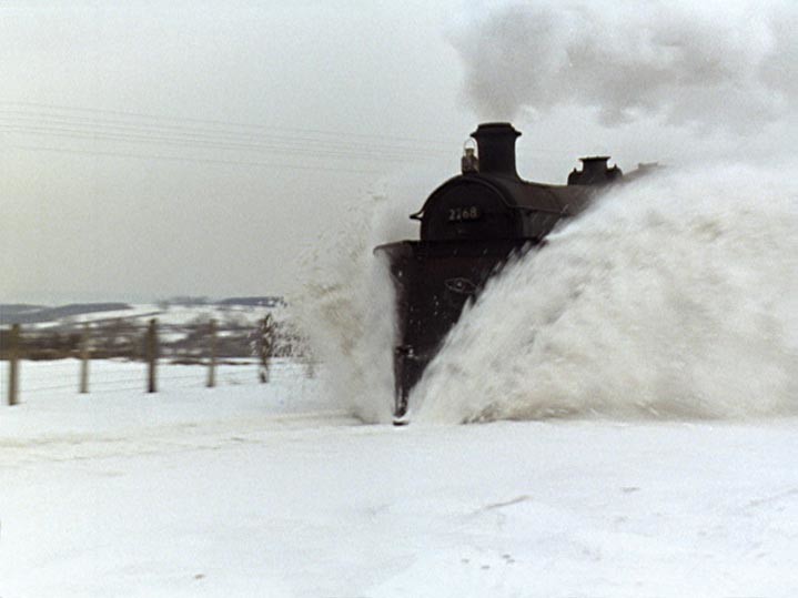
It's hard not to view these films without regret for the passing of enlightened patronage. Rail (1966), made for British Transport Films, was ostensibly about the introduction of modern design into the British Railways network. It ended up celebrating the feats of Victorian engineers and navvies and their successors. Reversing the usual way of working, Jones used Wilfred Josephs's score as his shooting script. Despite his virtuoso rhythmic editing, the explosive final three minutes devoted to clean-lined stations and the new high-speed electric trains look sterile by comparison with the architecture and engines of the steam era. Jones's sympathies are clear enough.
Nor had he finished with railway history. He pieced together Locomotion (1975) from 400 archive images underpinned by an astonishing, electronically processed score - written by composer Donald Fraser and performed by members of the folk-rock group Steeleye Span - that grows ever more frantic as it proceeds. This awesome chugging behemoth of a soundtrack seems to concentrate the power of the entire railway system.
The BFI has once again done an excellent job of presenting rich historical material to a new audience. The DVD comes with a booklet that traces the development of Jones's career and a rewarding 30-minute interview shot at his home in Wales, with some fascinating glimpses of the graphic scores he produced to plot the relationship of sound and image. These films are unmissable examples of the declining art of the industrial documentary.
Rick Poynor, writer, founder of Eye, London
Eye is the world’s most beautiful and collectable graphic design journal, published quarterly for professional designers, students and anyone interested in critical, informed writing about graphic design and visual culture. It is available from all good design bookshops and online at the Eye shop, where you can buy subscriptions and single issues.