Spring 2006
Digital history book
A website about Alvin Lustig pioneers the presentation of design history for the click-and-search generation. Critique by Rick Poynor

For those below a certain age – 25? – increasingly it seems that if something can’t be found with Google, then it doesn’t exist. Since most of human history happened before the mid-1990s and there is a vast amount of research, writing and imagery that is not available in digital form – so far, anyway – this is a strangely reductive view to take. But there is no getting around it: people who grew up with the internet expect it to tell them everything. A trip to the library is so yesterday. And books? Who wants to buy the things when you can probably find out what you want to know for free?
This cultural shift raises some dilemmas for design history. While some readers would still like to see overlooked figures and projects from the past rediscovered through well researched, absorbingly written, beautifully designed books, this may not be the best way to go about it. Perhaps the most effective strategy now is to reintroduce the material on the Internet. For the click-and-search generation, Web presence confers an impression of now-ness and validity that even the most carefully crafted monograph fails to deliver these days.
Cover for Industrial Design magazine, no.2, 1954.
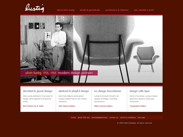
Top: Alvin Lustig website homepage. 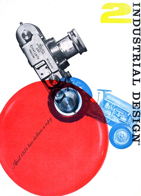
A new website devoted to mid-century American designer Alvin Lustig shows what can be achieved. Alvin Lustig 1915-1955: Modern Design Pioneer (www.alvinlustig.org) is so well done in some ways that you might think a foundation or publicly funded museum were behind it. In fact it is an initiative by an East Coast design firm called Kind Company (www.kindcompany.com). ‘Our research had indicated the difficulty in accessing public, educational, professional, easy to use and well-designed source[s] of online reference material celebrating Alvin Lustig, his career and his depth of work,’ they explain.
Lustig, who died in 1955 at the age of 40, was a dedicated Modernist whose visual ambitions knew no bounds. He wanted to be a total designer, and his projects embraced furniture, textiles, interiors, retail design and architecture; he also designed a helicopter for Roteron. It is as a graphic designer, however, that Lustig is best remembered today, although he is hardly a household name, even among designers. The book covers he created in the 1940s for New Directions (see Eye no. 10 vol. 3) rank among the most imaginative ever produced. In terms of early achievement, I would place him higher than Paul Rand. Lustig’s cover for Djuna Barnes’s experimental novel Nightwood, about obsessive love, represents the book’s theme by the interplay of lines, fluid shapes and menacing knots of scribble. It is both a piece of communication design and a work of art in its own right.
Annual Pictorial Review for Girl Scouts of America, 1954. 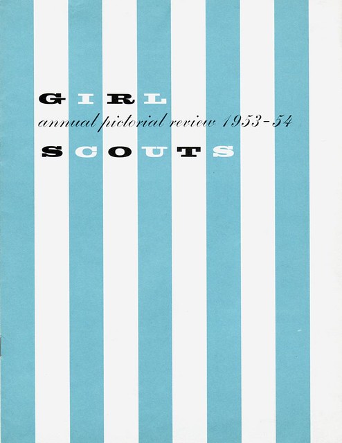
The Lustig website has been assembled with the cooperation of Lustig’s widow, Elaine Lustig Cohen, who worked alongside him. Lustig Cohen, co-founder of the Ex Libris antiquarian bookshop in New York, has done much to sustain her husband’s reputation. The site contains more than 400 images, making it equal in scope to the most extensive design monograph. Its clear, unfussy structure could not be easier to navigate. Clicking on an image in one of the image groups listed within each section expands it in the centre of the screen. In some cases, it is possible to view entire image groups, such as the New Directions Modern Reader series, on a single page, which greatly aids comparative study.
Several essays by Steven Heller, who is writing a biography with Lustig Cohen’s backing, provide information about Lustig’s cover designs, advertising work and office design projects. It would be good to see some alternative perspectives from other commentators. For instance, what do interior design historians make of Lustig’s interiors? There is a bibliography of his writings, but none of the texts is available to read at this stage – at least a few are essential if the site is to become an indispensable resource.
Invitation to Lustig exhibition, 1950. 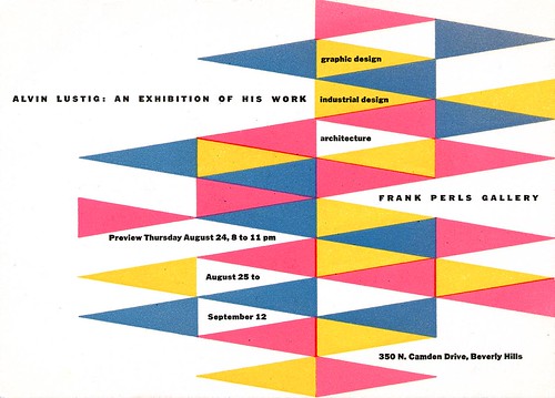
Short extracts could be used to give visitors a more vivid impression of his voice. Where the project stumbles is in the quality of the editing. The essays contain small errors weeded out of the published versions, and some of Kind Company’s incidental text also needs attention. No project editor is credited, but this time-consuming task has to be taken seriously if the site is to live up to its intentions. Often it is not sufficiently clear from the picture captions what we are looking at, while more discursive captions would enhance the site’s educational value. Someone would have to undertake this research and it is unlikely to happen without committed academic collaborators. This is a hugely ambitious project for a busy commercial studio. They have set themselves a whale of a challenge.
Rick Poynor, writer, founder of Eye, London
First published in Eye no. 59 vol. 15 2006
Eye is the world’s most beautiful and collectable graphic design journal, published quarterly for professional designers, students and anyone interested in critical, informed writing about graphic design and visual culture. It is available from all good design bookshops and online at the Eye shop, where you can buy subscriptions and single issues.

