Autumn 2006
Digital self-expression

The MySpace phenomenon makes graphic expression as simple as swapping photos or keeping a diary. Critique by Rick Poynor

The social networking website MySpace.com (‘a place for friends’) is rarely talked about as a design phenomenon; it is hard to imagine many designers feeling the need to create their own MySpace profiles. No self-respecting design expert would feel comfortable resorting to an off-the-peg template, even if this can be customised to suit personal taste. Automating the design process and handing people the chance to make their own visual choices flies in the face of every assumption that graphic designers used to make – and still do make – about the value of professional design.
Yet MySpace reveals how digitally enabled graphic expression is becoming as commonplace, as a means of self-documentation, as writing a diary or taking photos. Blogs offer similar opportunities, but MySpace makes the process of going online simpler and even throws in a blogging capability for good measure. You can, if you wish, leave the basic profile page exactly as you find it and simply fill in the sections provided with personal details. Once you start adding your own pictures, even the standard template will begin to take on its own aspect. Typed messages and visuals left by invited ‘friends’ further personalise a profile. Plenty of people stop there, but this is a highly public medium – yet another competitive environment in which to display the modern self – and undecorated profiles look bare and unimaginative.
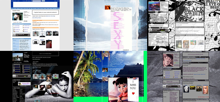
It is easy to change the text type, the style of text boxes, the background and basic layout, and sites such as Thomas’ MySpace Editor, MySpacetoolbox and PimpMySpace offer tools to make these adjustments. All that is required is to copy in a bit of automatically generated code. A limitless array of visual choices is possible within the general structure. Users who want to avoid anything too fancy sometimes opt for stark, heavy-framed boxes on a plain background. Others prefer backdrops of dense pattern, like wallpaper: stripes, geometrical motifs, snowflake effects. Some choose photographs or logos. As well as still pictures, it is possible to add slideshows, so that streams of images cross the screen at variable speed. Some people extend the width of the profile, allowing sideways scrolling of the entire visual field.
Much of the visual fascination of the profiles comes from the way the movable elements play against this framework. Graphic design has always been an art of layering and juxtaposition that gains impact through the collision of large and small elements of information. MySpace has two columns for picture material and comments that profile owners and their friends fill up with photos, avatars, symbols, postcards, YouTube video clips, glittery bits of type and animations.
The effect is something like a scrapbook except that, in the more elaborate profiles, the compositions constantly change as you move about the screen and the elements are pulled into new configurations over the backdrop. Using MySpace to communicate can become obsessive. Profiles alter by the day, generating new compositions between visits. Some people use their profiles as vast, memory-intensive repositories of everything that interests them. In the most vivid, you receive a strong impression of someone’s personality, achieved largely through visual devices and resources that were once mainly the preserve of the designer.
MySpace was launched in its current form in 2003. Now owned by Rupert Murdoch’s News Corporation, it has more than 100 million registered profiles and is reported to be the most visited social networking website in the world – others include Friendster and Bebo. The site has a following among teenagers and people in their twenties, and in the US it is common to see authors who are older. MySpace is used for self-promotion by everyone from stand-up comedians to porn stars. Indecency is not allowed, but people push it as far as they can. You can pretend to be anyone you like in MySpace (at least one of the profiles shown here is entirely fictitious). There are fan profiles devoted to everything from pioneering artists to cult TV, while MySpace Music is a phenomenon in its own right. No band today can afford not to have a profile, though these semi-official contributions rarely equal the raw expressiveness of ordinary users’ efforts.
The degree of visual awareness seen on MySpace varies enormously. Legibility is often the first casualty as authors pick ineffective type colour and background colour combinations, or use transparent text boxes on top of distracting pictures. MySpace offers a lesson in how to use graphic tools to embody personal identity, and this do-it-yourself design kit is available to all. The genie can’t be returned to the bottle.
Rick Poynor, writer, founder of Eye, London
First published in Eye no. 61 vol. 16 2006
Eye is the world’s most beautiful and collectable graphic design journal, published quarterly for professional designers, students and anyone interested in critical, informed writing about graphic design and visual culture. It is available from all good design bookshops and online at the Eye shop, where you can buy subscriptions and single issues.

