Winter 2008
Editorial Eye 70

Given the sophisticated times we live in, it is odd to note how often the word ‘magic’ crops up. David Crow uses the term in his piece about digital craft (pp.20-27), as does Anthony Oliver to describe the excitement of watching a photographic image appear in the old ‘wet’ darkroom (pp.72-73). The late Arthur C. Clarke famously said that any sufficiently advanced technology was ‘indistinguishable from magic’, an adage that probably applied to the invention of the wheel as well as antibiotics and powered flight. Yet we are so inured to technology that we become blase, and there is no enchantment in unopenable files, bad formats, software bugs and spam (more like evil spirits).
Crow’s argument is that the computer is a toolbox whose use and understanding requires an approach analogous to the ‘analogue’ craft practices of old. And we illustrate this with some cutting-edge (and beautiful) work from practitioners such as Karsten Schmidt, Robert Hodgin and Matt Pyke.
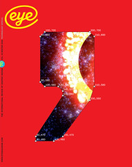
Technology and craft are woven together throughout this issue. The quirky contours of Replica, the latest typeface from Norm (see pp.34-39 and the cover), owe their genesis to the designers’ theories about digital font design, and a decision to reduce their options in the face of increasing sophistication. A Replica punctuation mark, complete with data, frames a sample of Hodgin’s Goldfrapp visualisation on the cover.
Though the paper models and ‘authentic’ spectacles of ‘Make it real’ (pp.26-33) can be viewed as a reaction against hi-tech reality, they also exploit it: online videos have become a quick and easy way to communicate authenticity. And the Pattern Foundry’s business model relies on the ease with which digital artwork can be bought and uploaded. DixonBaxi’s approach to running a studio (see ‘Power of two’, pp.40-47), which involves ‘no employees, lots of collaborators’, would be difficult to sustain at their high-flying level without the hi-tech kit – and the speed of contemporary communication – that we take for granted. In the current economic climate, DixonBaxi’s small and flexible approach might provoke other designers to look critically at the way they work – whether as employers or employees – and inspire some of them to set up independently . . . with manifestos of their own.
Our big feature about theatre programmes brings together a rich and varied collection of historical material alongside recent examples from the capital’s theatres, both ‘popular’ and subsidised. ‘Play and playbill’ (pp.50-61) is an extensive survey that examines critically the way designers have responded to the challenge. Richard Hollis has confined his researches to London (and Stratford), but the principles, problems and solutions involved would apply to any theatre, in any language.
All graphic design reflects the technology of its day, whether by default or deliberate engagement. In its day, the Curwen Press (see ‘Quiet spirit of joy’, pp.62-65) had one of the great letterpress composing rooms, a facility that made possible (and shaped) much exemplary design, typography and illustration. Technology continues to affect design, whether rendered in ink or pixels, and ‘Foot prints’ (pp.48-49) deals with the environmental implications of design for reading, a subject close to the heart of every Eye reader, whether online or immersed in these pages.
John L. Walters, Eye Editor, London
First published in Eye no. 70 vol. 18, 2008
Eye is the world’s most beautiful and collectable graphic design journal, published quarterly for professional designers, students and anyone interested in critical, informed writing about graphic design and visual culture. It is available from all good design bookshops and online at the Eye shop, where you can buy subscriptions and single issues.
