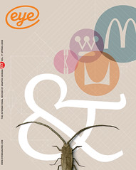
Spring 2008
Editorial Eye 67

I don’t know about you, but the world of origami, with its ‘molecules’ and ‘bug wars’ had passed me by completely. Which is why I’m grateful to Canadian designer Marian Bantjes for introducing Eye’s readers to this bizarrely beautiful world. In ‘Surface to space’, Marian (one of the stars of last year’s AIGA conference in Denver) delves into this weird and wonderful area – with its own stars, characters, conferences and fanatics – and finds parallels with graphic design. Except that we tend not to fold dollar bills into convincing koi fish or lavatory bowls. In the context of Eye 67, origami sits happily alongside graphics, photography (see Robert Polidari’s extraordinary images of post-Katrina New Orleans and Chernobyl in ‘Sumptuous ruins’), architecture, illustration and type design.
However the first section of Eye 67 is dominated by type, with two features, by John Berry and Andrew Haslam, that concentrate on type in the public domain. Our ‘Type special’ is kicked off by Garech Stone’s overview of single-letter logotypes. (You may recall the Stone Twins’ witty Logo R. I. P. from a few years ago.) And the section ends with ‘Lust and likeability’, a multi-author critique / appraisal of ten very different typefaces – including Odile, Jannon, Verlag and Meta Serif – by an opinionated, articulate and well informed jury of designer-writers.
Rick Poynor’s regular Critique column, tackles the carefully crafted (photographic) image of another kind of designer-writer. The subject is none other than Chip Kidd, whose second novel about graphic design comes out later this year. Notwithstanding such role models, the panel at Eye’s third Forum in London spent some time considering whether designers and design students read enough, and worrying that ‘25 per cent of [design] students claim never to read a book.’ Agenda features a short report from the event, plus some enthusiastic blog entries.
Literacy is no problem for one-time New Orleans resident (and designer of Not Caslon) Mark Andresen, described by Kenneth FitzGerald as a ‘graphic one-man-band’. (See in ‘Pesky illustrator’.) Andresen’s best work pulls together his various talents for reportage, design and illustration. The London-based design duo of Scott Williams and Henrik Kubel, called A2 / SW / HK, is self-sufficient in a different way. Despite self-effacing claims (‘They design themselves’), their careful analysis of each brief, combined with carefully crafted type, has enabled them to construct an impressive body of design work, from stamps (the James Bond series) to catalogues to identity projects. You can see two of their typefaces in the headlines of this issue of Eye.
On reflection, what links much of the work shown in this quarter’s Eye is an obsessiveness, an attention to detail, that goes way beyond the everyday business of solving design problems. From Robert J. Lang’s crease patterns to A2’s psychedelic plastic letters (see inside covers); from Paula Scher’s monster graphic for the New 42nd Street Studios in New York City – through Alessio Leonardi’s ‘geeky’ modular typeface Elettriche – to Chip Kidd’s unlit cigarette. Like the languorous connecting paths of Yugo Nakamura’s ‘Elastic Mind’ website (see ‘Problem unsolved!’), these adventurous and driven designers and image-makers are prepared to take a line for a walk, and follow it – wherever it might lead.
John L. Walters, editor of Eye, London
First published in Eye no. 67 vol. 17 2008
Eye is the world’s most beautiful and collectable graphic design journal, published quarterly for professional designers, students and anyone interested in critical, informed writing about graphic design and visual culture. It is available from all good design bookshops and online at the Eye shop, where you can buy subscriptions and single issues.
