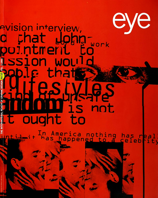
Autumn 1993
No to austerity
Letter from Gerard Unger in Eye 10
So far, most of its contents have made Eye a very valuable publication. However, once in a while you offer an opinion I cannot agree with.
In Rick Poynor’s article, ‘Whatever became of the content?’, I read about ‘dense layered work’ being on the way out. I do not regret this. But the kind of work you offer as a replacement, Dan Friedman’s Artificial Nature, is in my view equally misguided. A copy of this catalogue is not available in Holland, so I have to judge from your description and reproductions. But I think it comes close in its treatment of text to a Dutch publication Vak in Beweging by Titus Yocarini, designed by Armand Mevis and Linda van Deursen. This approach to the text by graphic designers smacks of the classic uncertainty also suffered by many authors: the fear of not being understood. It makes an author emphasise every other word by underlining, italicising, the use of caps, of caps and underlining, and so on. ‘Visual aids to help the reader understand the structuring of the text’ (as this method was once described) are a gross underrating of the reader's intelligence – as if they can’t decide for themselves whether a text is important and what the crucial parts are.
Is it a coincidence that Poynor’s article and Anne Burdick’s article ‘What has writing got to do with design?’ appear in the same issue? I expect it was planned this way, since both articles touch on the same problem: graphic designers’ habit of treating text as pictures. What Anne Burdick does not make clear, however, is that it is all right for a designer to treat a self-written text (usually a short one) in this way, just as Marinetti and Balla turned Futurist texts into visual statements. In their case the contents and the wrappings went naturally together. But what to do with a text written by someone else, for example, the standard work presenting the latest insights into the life of the bee, richly and beautifully illustrated, but otherwise a mass of text?
Although the role of graphic design in newspapers has grown over the last few decades, the newspaper is still the realm of the journalist. It is one of those pieces of print where the primacy of the written word prevails. I dread the day when newspapers might become products of graphic design rather than journalistic products, as I think you do, especially with the kind of visual aids described in your article. (This does not mean, by the way, that the written news should not come in for research into different presentations, but is should still be treated as a journalistic product.)
Graphic designers who revelled in layered graphics, in alternative legibility or in other kinds of graphic heroism are beginning to understand that the work they made essentially for their own amusement might not be suited to direct communication. It has been clear for some time that graphic designers should become aware once more of their audience. But what worries me is the kind of work that is put forward as a replacement. Presently, too many articles appear that wish for the ‘New Austerity’. It is to be regretted if instead of all the fun we had, we should go back to old-fashioned, humourless typography. That would really prove the past decade to have been graphically empty and superficial.
Personally I think that the future will be different, The work of many designers in Holland at present is showing more care for content and audience, less patience with gimmicks and ‘different’ typefaces. The treatment of typography uses fewer graphic effects and looks more closely at the interaction between the many aspects of a piece of printing: typeface in relation to printed area in relation to page format in relation to kind of paper in relation to sequence of pages in relation to binding and covers – but with wit and imagination. Designers like Irma Boom, Joseph Plateau (four designers) or Wigger Bierma are representatives of this sensible treatment of content. I am sure that you will have no difficulty in finding their equivalents in England. Would Phil Baines do?
Bussum, The Netherlands
First published in Eye no. 10 vol. 3 1993
Eye is the world’s most beautiful and collectable graphic design journal, published for professional designers, students and anyone interested in critical, informed writing about graphic design and visual culture. It is available from all good design bookshops and online at the Eye shop, where you can buy subscriptions and single issues.

