Winter 2008
17 things we know about Daniel Eatock

Imprint
Daniel Eatock<br>Princeton Architectural Press, USD60

1. British designer Daniel Eatock formed Foundation 33 in 2000 with American architect Sam Solhaug and made the 10.2 Multi Ply Coffee Table.
2. The table caught the attention of Lyn Winter, who introduced Eatock to Katie Hayes who worked for Channel 4, then looking for a new identity for the second series of Big Brother.
3. The rest is history: Eatock designed the ‘eye’ logo for Big Brother, and its subsequent reinventions. If anyone there worried about entrusting their brand to a designer who has kept all his nail clippings since 2000, they kept quiet about it.
4. Eatock once sent out posters containing all the lyrics to every song sung by the Beatles.
5. Eye editor John L. Walters invited Eatock to participate in Eye’s first Forum. He responded by giving a performance called ‘Saying NO!’.
6. At that forum, when Aaron Seymour asked why he had said ‘yes’ to Big Brother, Eatock answered that it was what funded his practice.
7. Eatock has made wrapping paper out of price labels, and a jigsaw out of jigsaw pieces.
8. Eatock’s Imprint (Princeton Architectural Press, ) is a big hardback monograph, with amusing ‘Pictures of the Week’, plenty of portfolio examples and a Q&A in which the author interviews himself.
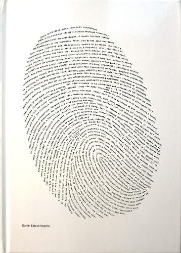
Cover of Eatock’s Imprint with ‘self portrait’ handwritten in the pattern of his thumbprint (an idea borrowed from fellow Ravensbourne student Richard Holley).
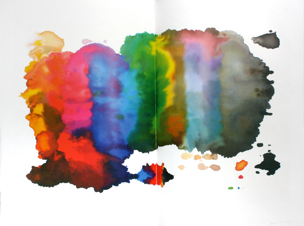
Top: Spread from Imprint. One of 73 prints created by leaving Letraset Pantone markers to soak through a stack of paper.

9. It uses American spellings such as ‘color’ and ‘favor’, which seem odd in Eatock’s Lancashire accent.
10. Much of his work seems concerned with materials and systems: one project involved a laser printer required to make repeated black A4 documents until the toner ran out.
11. Despite his commitment to process and dematerialisation, Eatock makes images of extraordinary beauty and / or visual power.
12. The book’s design, which features several dazzling spreads, does not ignore this.
13. However, there are no headlines or chapter headings.
14. The back cover shows his ‘Passport Photographs’, a strip of Photo-Booth pictures of his passport.
15. When Eatock was ten or eleven, his dad removed the badges from their brand new car, a VW Golf GTI, so that no-one would know what model he drove.
16. Eatock is a big fan of Formula 1 racing (see DixonBaxi article, pp.40-47).
17. Some of Imprint is laugh-out loud funny. Some of it makes you smile in an Alan Fletcher kind of way. Eatock has stumbled upon the great truth of design publishing known as the Sagmeister principle: if you say things that are nice, honest and blindingly obvious in a designer-y sort of way, then everyone will love you.
Martin Soames, design writer, Manchester
First published in Eye no. 70 vol. 18, 2008
Eye is the world’s most beautiful and collectable graphic design journal, published quarterly for professional designers, students and anyone interested in critical, informed writing about graphic design and visual culture. It is available from all good design bookshops and online at the Eye shop, where you can buy subscriptions and single issues.

